Motif: Creighton Michael. Schaffner Room Gallery, Pound Ridge, NY

by D. Dominick Lombardi

Opportunities for artists come in many different forms, especially when it comes to exhibition spaces. Once you understand your station on the outside looking in towards the big billion-dollar businesses at the top, it becomes like a chess game where countless artists vie for a variety of venues ranging from the more regional, community minded spaces to the secondary level of high-end galleries in major cities throughout the world. The higher you aim the more you need to be well connected, otherwise it’s best to have your own fleet of collectors to do your talking. But who has that? After all, the market is in constant flux; what’s in, who has the back story, where’s the new vision; it’s all subjective, controlled from the top down, often sociopolitical and rather unregulated.

Creighton Michael, Motif 1110, oil on acrylic on canvas, 40 x40 inches, 2010, (all images, courtesy of the artist named)

With the increased overhead, especially when there are economic downturns caused by natural or manufactured disasters, a noticeable percentage of mid and lower-level institutions close and opportunities decrease. I’ve often thought of the hybrid spaces, places where there are two businesses sharing a space or building that is common in places like Iceland, where a commercial gallery could lessen the strain of a fixed overhead when the level of needed population is not there. You see this in colleges and universities here, where not-for-profit galleries and museums are placed on campuses where it is a bit easier to keep the lights on, and where a very dedicated staff works tirelessly to keep their programs relevant and inspiring.

Libraries, locations commonly looked at as being for amateur artists, are more and more exhibiting seasoned professional artists with substantial careers, which in turn broadens the reach of both the institution and the artist. When I wrote for The New York Times from 1998-2005, I can recall reviewing excellent exhibitions at the Chappaqua Library gallery and the Manhattanville College Library Gallery. The Katonah Museum is a product of the Katonah Gallery, which was housed in the Katonah Village Library.

Works on Paper: Serdar Arat (installation view), 2023

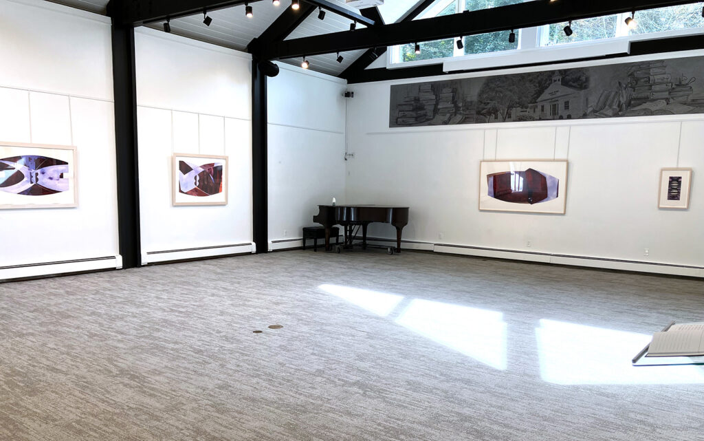
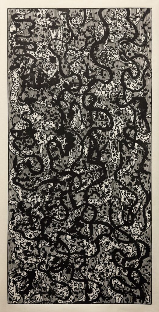
What first piqued my attention to the Schaffner Room Gallery located adjacent to the Pound Ridge Library, was a recommendation of a friend that Serdar Arat was exhibiting there, and I should definitely take a look. Arat, also a long-time friend, an excellent artist, and a brilliant lecturer with titles like Creative Flows: Islamic and Western Art to The Harlem Renaissance and Modernism creates alluring painted reliefs, room-sized sculptural installations and refined prismatic prints that address a number of topics such as architectural fluidity, the spiritual effects of color and the depths of visual rhythms. His show at the Schaffner Gallery focused on his well-known prints.

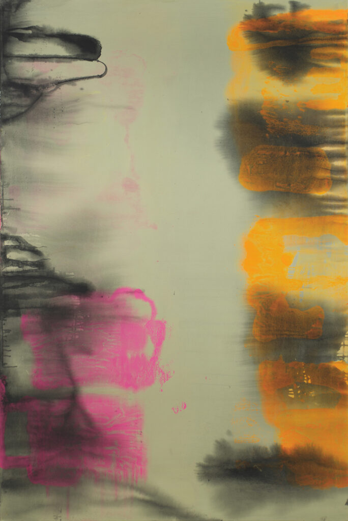
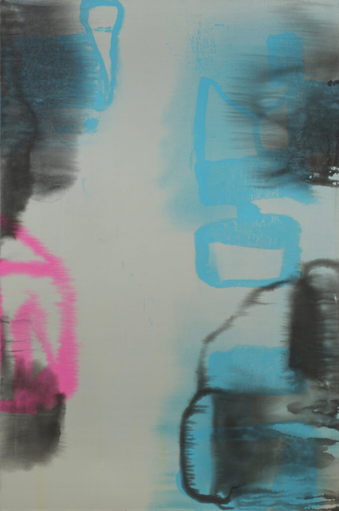
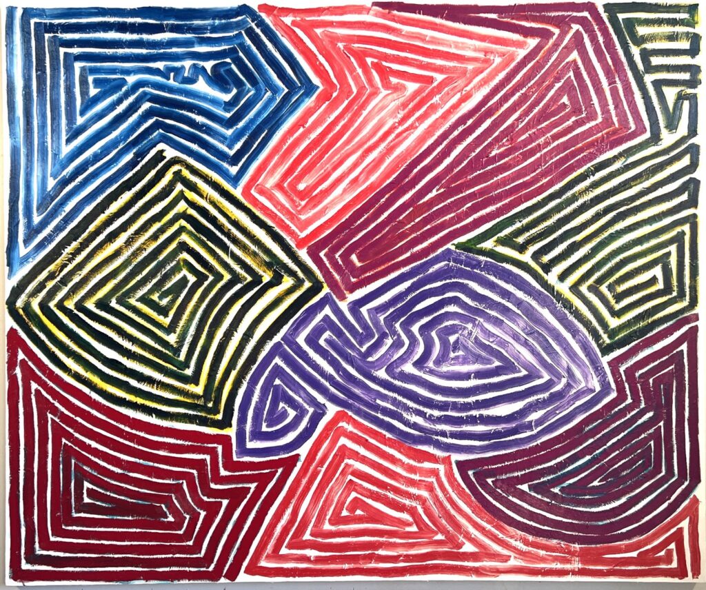
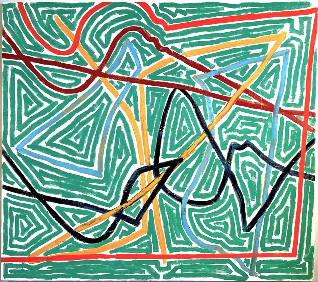
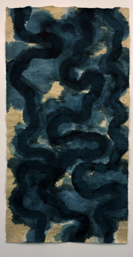
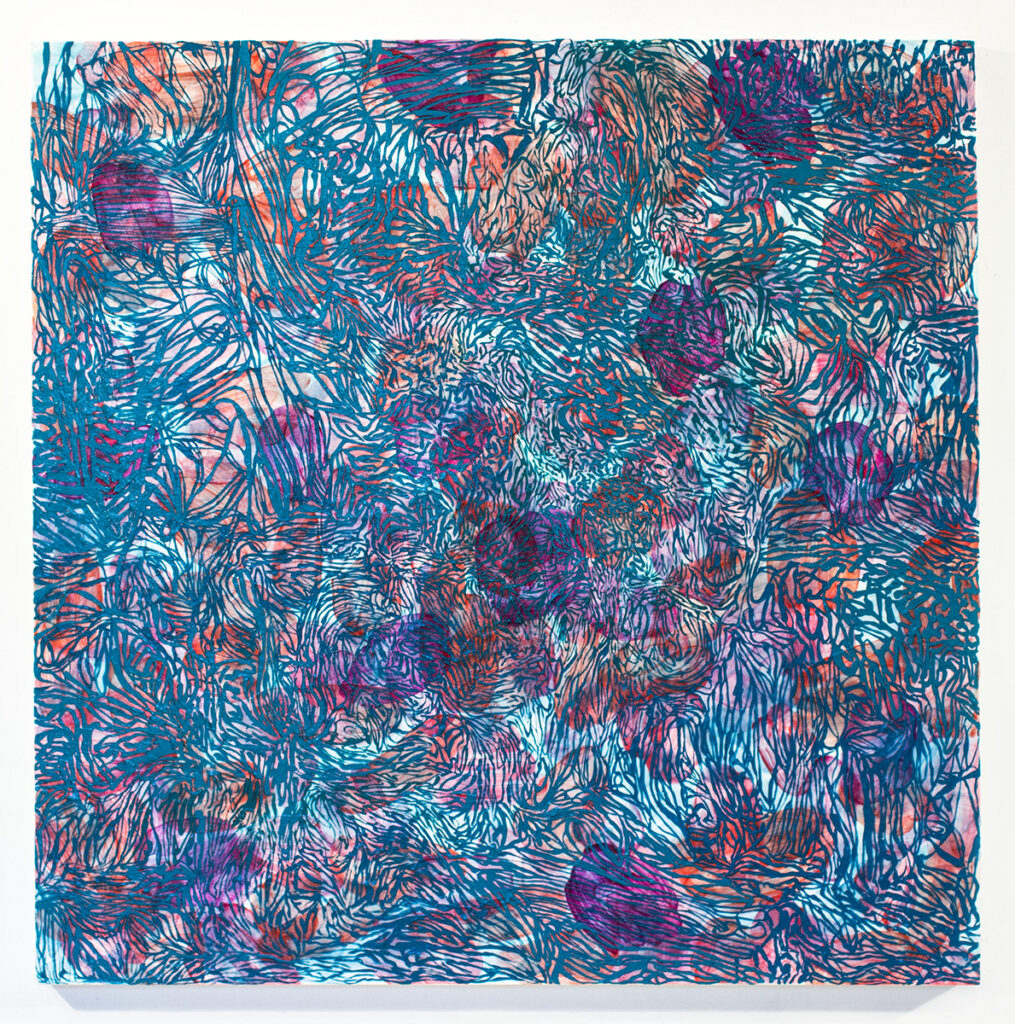
That same friend who told me about Arat’s past exhibition, Creighton Michael, has the current show at the Schaffner Room Gallery, which features seven key paintings from his Motif series. As an attendee of the opening, I was immediately impressed by an audience of mostly accomplished artists all engrossed in the paintings at hand, which in turn prompted stimulating conversation. The artist mentions in his statement “…the Motif series are the product of two unique marking strategies both using a motion capture process but deviate in their use of time and color.”

Creighton Michael, Motif 1810, oil on acrylic on canvas, 48 x 48 inches, 2010

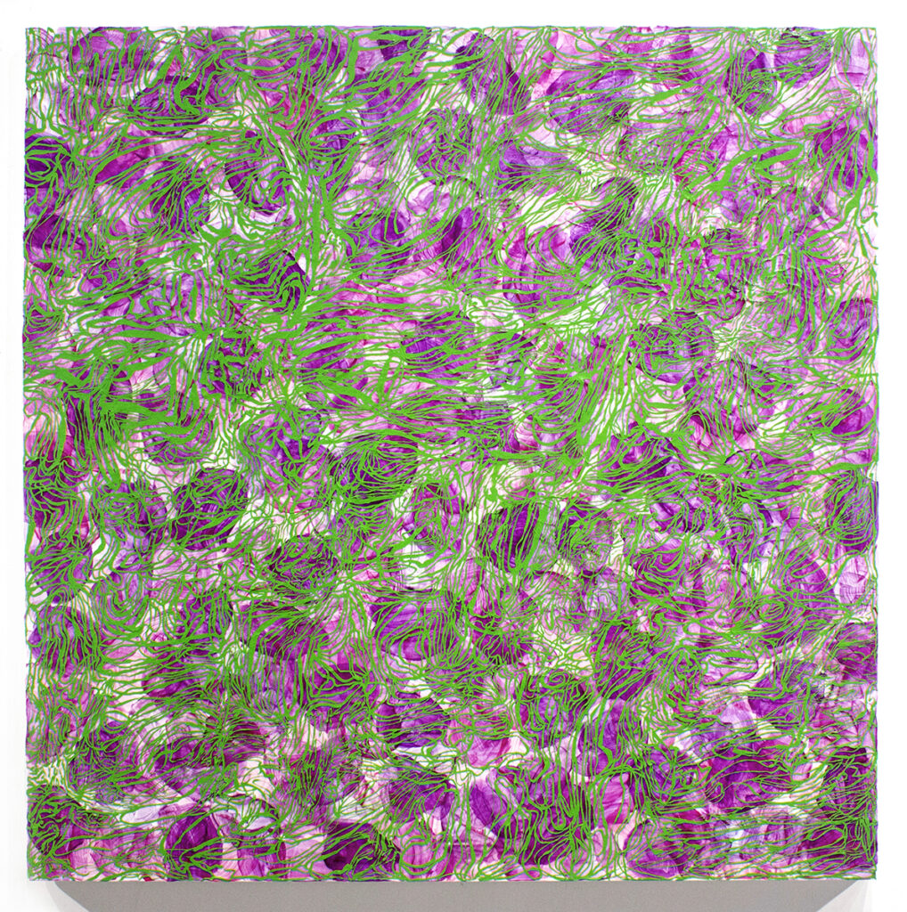
Michael’s approach is to first lay down what he refers to as his ‘deferred’ ground of vibrant color. Here we see leaf-like applications of transferred veneers of dried brush strokes that modulate slightly in intensity and opacity; all looking something like flattened fall leaves or flower petals only much more intense in color. Over this layer of acrylic ‘skins’ the artist applies the ‘direct’ half of his process: oil paint in a mesmerizing matrix of thin lines in a color complement, a powerful element that further triggers the underlying hues, which in turn creates a push/pull of optical sensations.

Creighton Michael, Motif 409, oil on acrylic on canvas, 40 x 40 inches, 2009

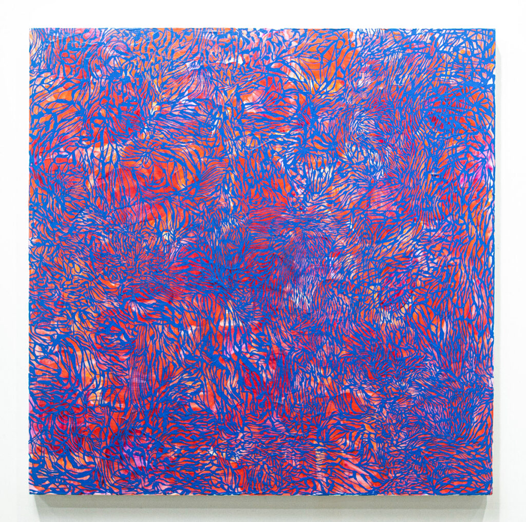
The Motif series is a tour de force of optical effects, as we easily see how visual stimulation entices thoughts of things experienced. Like Hans Hofmann’s paintings of the 1950’s and 60’s, when he was advancing as a teacher his “push and pull” theory, or “expanding and contacting forces” thesis, there was that same sort of non-representational dance in space we see in Michael’s paintings. But unlike Hofmann, Michael’s work has a more organic feel, suggesting things like ripples in a stream or a cluster of twigs atop fallen leaves. On the other hand, it is hard not to think of back-lighted stained-glass windows when viewing Michael’s paintings, as the background colors always penetrate the foreground, or what would be the lead lines of the window, even when the foreground is a ‘fast’ color like orange or red.

Creighton Michael, Motif 1710, acrylic on oil on canvas, 30 x 30 inches, 2010

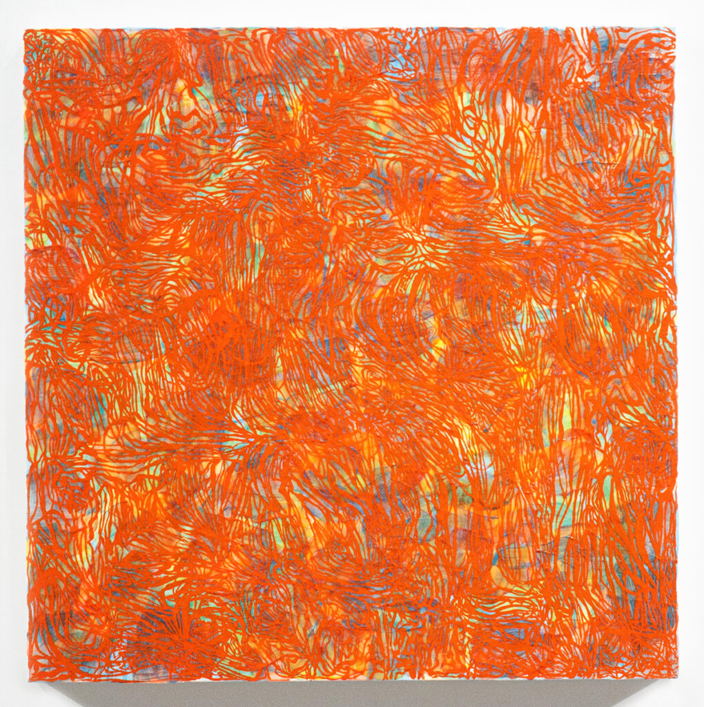
In the end, the Motif series is about the artist’s deep understanding and distinctive use of color within the non-representational realm. Michael plays with our preconceptions of color, and how it manages space and time – what we may have experienced peripherally, that curious something that disappeared when we turned to look. That is what gets in our subconscious. That is why these works have a lasting effect, something all artists hope to achieve.

Motif: Creighton Michael runs through May 4th, 2024. For more information please visit https://poundridgelibrary.org/exhibit/

Three Short Takes on Painting Exhibitions in New York

by John Mendelsohn

Bobbie Oliver, RV Grey/Green, Orange, Pink, 2023 acrylic on canvas, 72 x 48 in.
Photo: KC Crow Maddux / courtesy of the artist and High Noon Gallery
Bobbie Oliver, RV Grey/Green, Orange, Pink, 2023 acrylic on canvas, 72 x 48 in. Photo: KC Crow Maddux. Courtesy of the artist and High Noon Gallery

The paintings of Bobbie Oliver have undergone a transformation. They have moved from monochrome to full-color, and from clouds of troubled washes to more defined shapes floating in humid atmospheres. The revolution in Oliver’s work goes beyond the formal – it is attitudinal, with the emergence of a complex of moods.

The four large paintings in the exhibition are six-feet tall, with strong passages on the left and right that open up to a central emptiness. The canvas surfaces are painted in a variety of tones, from soft pink to a range of subtly warmer and cooler grays. The grays evoke the colors of aged paper, while passages of diffused pigment suggest an affinity of Oliver’s work with the tradition of Chinese landscape painting, in which form is continually dissolving into space.

On top of the nearly neutral grounds are suspended blocky forms in fluorescent orange and yellow, and in highly saturated turquoise and pink. The forms variously recall signs of urban life such as road repairs and graffiti. There are echoes of earlier pictographic practices such as Mayan glyphs and Chinese seals.

Bobbie Oliver, RV Grey, Blue, Pink, 2023 acrylic on canvas, 72 x 48 in.
Photo: KC Crow Maddux / courtesy of the artist and High Noon Gallery
Bobbie Oliver, RV Grey, Blue, Pink, 2023 acrylic on canvas, 72 x 48 in. Photo: KC Crow Maddux / courtesy of the artist and High Noon Gallery

Transparent clouds of black pigment pass over the vivid shapes like disturbing thought or diesel exhaust. The fugitive forms suggest organic life, magnified, passing across a microscope slide. Oliver’s is an improvisational art, laying down forms, flooding them with water, allowing blotted color to appear in the wash, only to dissipate.

In the exhibition are four smaller works, which share many of the elements of the larger ones. However, here they are concentrated in the paintings’ centers with a few large entities filling our view.

The overall effect of the paintings, both larger and smaller, is a kind of joyful melancholy which recognizes that phenomena arising and passing away encompass many things – the weather, the city, the art of painting, and our life and times.

Bobbie Oliver: Found Objects. High Noon Gallery, 124 Forsyth Street, New York. March 7-April 21, 2024

Dana Gordon, Maze-L Tov, 2023, oil on canvas, 60x72 in.
Photo: Courtesy of the artist
Dana GordonMaze-L Tov, 2023, oil on canvas, 60×72 in. Photo: Courtesy of the artist

Dana Gordon’s exhibition of twenty-eight paintings, all from 2023, is too much. We are asked to navigate many walls of paintings that seem to slowly progress from one related mode to another. Why so many paintings? We could hazard a few guesses: the artist as obsessive completist, or as chronicler of his own productivity. Despite the challenge it may present the viewer, the best reason for the plethora of work is witness a painter’s progress – finding his way by impulse and invention, to some unanticipated place.

Early on, the paintings move in this sequence: first, fields of jangly, black linear gestures on white grounds, that then become arrays of colored lines, again on white. In both cases, the thick, brushed strokes do not touch, but move around each other like touchy guests at a cocktail party. These are energized, anxious marks, too charged to coalesce – distant relatives of Keith Haring’s graphic, social bacchanals.

Dana Gordon, Ariadne's Thread, 2023, oil on canvas, 60x72 in.
Photo: Courtesy of the artist
Dana GordonAriadne’s Thread, 2023, oil on canvas, 60×72 in. Photo: Courtesy of the artist

In their next phase, the colored lines become thicker, and begin to cross over each other many times, creating a dense tangle on patterned and then solid colored grounds, suggesting an anarchic play on Paul Klee. Then something interesting happens at painting eighteen in the exhibition – the restless, impatient brushstrokes take on a new deliberateness and solidity. The structure is labyrinthine, suggesting that a path out of life’s coils might somehow be possible.

The last turn in the exhibition is the simplest and most satisfying. The layered, competing lines have been combed smooth into a new order of discrete, concentric triangular webs. Resembling plowed fields crisscrossed by diagonal roads, these final seven works have a kind of resolution that is both formal and emotional. The blunt, brash attack is still there, but it is at the service of something that feels like hard-won grace.

Dana Gordon: Signs of Life. Westbeth Gallery, 55 Bethune Street, New York. February 3-24, 2024

Bill Pangburn, 7 Drawings #1, 2009, watercolor and gouache, 80x40 in.
Photo: Courtesy of the artist
Bill Pangburn7 Drawings #1, 2009, watercolor and gouache, 80×40 in. Photo: Courtesy of the artist

Bill Pangburn’s woodcuts, monoprints, and paintings on paper all evoke a watery world of perpetual movement. Sinuous lines suggest the liquid movements of undulating, streaming, and cascading. The fluid imagery offers a variety of ways to contemplate that which never stays still, and moves through and around the solid and the fixed in nature and in us, as well.

There are several distinct modes of Pangburn’s art in this exhibition, curated by Soojung Hyun. The large woodcuts are striking in their size and complexity. Typically, a dense ground of finely-detailed shapes or striations is riven by snaking black lines. In some of the prints, the shapes become gnarly and agitated. We sense the play of rippling water with bright reflections, and deep shadows. There is an ominous feeling that in these highly graphic images, nature is showing us how delight and danger are inextricably woven together.

Bill Pangburn, Jaguars Love to Swim, 2024, woodcut, 67x32 in.
Photo: Courtesy of the artist
Bill Pangburn, Jaguars Love to Swim, 2024, woodcut, 67×32 in. Photo: Courtesy of the artist

In twined, large-scale reduction woodcuts, with a narrow vertical format favored by the artist, fine lines with bulbous serrations create streaming fields. Figure and ground, in black and silver, are constantly changing identity. All of Pangburn’s black and white prints, with their intense, almost narrative quality, bring to mind the appropriation of art nouveau by the graphic artists of the psychedelic 1960s.

There are three series of work that employ the arabesque. A color relief monoprint displays interpenetrating vine-like curves in mottled indigo on a field of pale lines. Smaller works with tangled lines evoke both the island of Crete, and the currents of the Hudson River.

Among the strongest works in the exhibition are three large watercolor and gouache paintings on paper. Deep blue, thick and powerful lines connect us with the Five Elements of the exhibition’s title. In the Chinese philosophy of Wu Xing, wood, fire, earth, metal, and water embody the cosmic energy manifested in nature. In these works, we feel the writhing of dragons, the labyrinths of the psyche, and the flowing waters of the world.

Five Elements: Bill Pangburn’s Rivers. Artego Gallery, March 1–30, 2024. 32-88 48th Street, Queens, New York

dArt Magazine Curated Content #1

by Steve Rockwell

As the World Grinds, Pulp Ladle, dArt Burger, and The Bunny Show. Citing the work of Andre Ethier, Ben Marshall, Ginette Legare, Saeed Mohamed, James Cooper, Steve Rockwell, and Katharine T. Carter.

The 2011 Making Minced Meat Out of dArt Magazine exhibition at De Luca Fine Art in Toronto introduced the dArt Burger to the city. Saeed Mohamed served it at his restaurant. Co-producer Ben Marshall insisted we install an actual meat grinder in the show. Gallery attendees were served the edible burgers, as the wall mounted print shards were available for visual ingestion. James Cooper’s film on the “grinding” of dArt magazine content may be accessed by clicking Dart Onion, and for his film on the making of the dArt Burger click here.

The image in Ginette Legaré’s Pulp Ladle (originally Scoop from the 1998 Feeding Disorder series) was transferred from the Fall 1998 edition dArt onto the dArt magazine pulp panel. Legaré’s constructions comprise of reconfigured found objects, out which meaning is teased as distilled language. Her recent “Supply Chains” exhibition at Birch Contemporary speaks to a time when links to the network of things necessary or desirable to our lives may unexpectedly show strain. Andre Ethier’s Atlas portrays the globe-bearing Titan in a state of perpetual stress – a punishment levied by Zeus after defeat in battle.

The Bunny Show image was created for Katharine T. Carter & Associates, a public relations and marketing firm for artists. It’s a view of the museum interior visualized as a rabbit artist might see it – a full retrospective with ample carrots.

Christy Rupp | Streaming

by Jen Dragon

Christy Rupp, Streaming, installation view at the Fairfiled University Art Museum

Since the ’70s, Christy Rupp’s sculptures and works on paper have explored the relationship between economics and the environment. Rupp seeks to make this complex topic – one usually examined in abstract articles – into a clear and direct visual narrative accessible beyond the language of dissertations, punditry, and scientific studies. Emerging from the lens of Discard Studies, a discipline that considers the systems and consequences of waste, Rupp weighs these systems and their short-term benefits against the long-term costs of climate degradation and the marginalization of threatened species.

Buried in history, politics, and culture, the politics of waste are rooted in consumerism with its voracious consumption and energy needs. Christy Rupp dives into this dystopia with welded steel, foraged plastic detritus, historical, scientific, and contemporary imagery, a dark sense of humor, and the uncanny ability to connect the dots. Her artwork charts a course through the turmoil, observing the trail of collateral damage as it moves through our world, seeking to interpret and magnify these interdependencies.

Christy Rupp, Moa (detail) in front of wall installation at the Fairfield University Art Museum

Some examples of Rupp’s visual unification of cause and effect are found in her installation Moby Debris, a collection of microplanktonic organisms made from welded steel rods and discarded plastic. To quote artist and art scholar Ellen K. Levy, “Rupp considers how waste and toxic elements in our environment corrupt the accepted way in which organisms function and evolve…Each of her aquatic-inspired “organisms” is composed of discarded plastic detritus and visually comments on the damage done to species when they consume the glut of inorganic detritus hurled into our food chain.” In magnifying the petroplanktonic microbes that inevitably find their way into a whale’s stomach, Rupp clarifies the irony of a food chain where the smallest organisms sustain the largest mammals along with the floating oceanic plastic waste that accompanies them into a whale’s stomach. A similar statement is made with the plastic-stuffed wall works of Aquatic Larvae, with the paradox of young hatchling fishes nurtured in egg sacks populated by a buffet of accumulated microplastics.

Christy Rupp, Pangolin, Installation at the Fairfield University Art Museum

In works such as her Pangolins and the series Remaining Balance Insufficient featuring aquatic mammal skeletons, Rupp bends and welds steel rods into graceful lines as effortlessly as if drawn on paper. The animals’ forms are then sheathed in innumerable, shimmering credit cards as they float jewel-like in the air. However, these pangolins and manatees are victims of environmental exploitation as they wrestle with human-caused habitat degradation. Rupp’s visualization of their plight equates the debt incurred with their survival, leveraged against the temporary advantage of human exploitation. Made as they are of credit cards, this work reminds us that, unlike the world of finance, the biosphere is not man-made, and it’s impossible to manipulate with numbers and percentages. Natural habitat is much easier to destroy than repair.

In addition to numerous sculptures, the exhibition features two giant digital prints on fabric that confront the emergency of non-renewable energy and plastic waste and their enduring damage to terrestrial systems. While these immense banners cannot ever be large enough to fully present this unfolding catastrophe, an abstract appreciation for the beauty of materials out of place is obvious.

As much as Christy Rupp’s art is about ecological emergencies, she is informative without being didactic, while her playful wit and whimsical spirit convey the darkest news. However, her direct and accessible message does not come at the expense of aesthetics as the artist’s accomplished draftsmanship and percussive colors are at once delightful and dramatic. In visualizing the effects of ecological degradation, Christy Rupp does not pinpoint any single culprit – only because there isn’t just one cause; rather, there is a collective complacency that permeates society. Anyone who views Rupp’s work is engaged in some way as a citizen of a world in which it is easier to participate in a petrochemical-fueled lifestyle, blissfully ignorant of our burgeoning carbon footprint and impending doom.

Garrett Lockhart’s “Wrinkle” at Hunt Gallery

by Steve Rockwell

Garrett Lockhart, Profile (Right), 2023, inkjet transfer on linen over board 5 x 7 inches, 12.7 x  17.78 cm
Garrett Lockhart, Profile (Right), 2023, inkjet transfer on linen over board 5 x 7 inches, 12.7 x 17.78 cm

Garrett Lockhart’s “Wrinkle” exhibition at the Hunt Gallery Toronto is an offering of paperback-sized objects that carry the look and feel of fastidious graphite drawings. The seven by five inch cotton and denim works over board are, in fact, inkjet transfers that wash onto the fabric imperfectly. This careful sifting and arranging of print magazine images evoke a memory of lived presence – a migration of the effluence of luxury amid closely-cropped photos of models and interiors.

arrett Lockhart, Deceit, 2024, inkjet transfer on linen over board, 5 x 7 inches, 12.7 x 17.78 cm
Garrett Lockhart, Deceit, 2024, inkjet transfer on linen over board, 5 x 7 inches, 12.7 x 17.78 cm

Although the artist’s sources to his subjects span the decades from the 80s into the near present, the citing of Andy Warhol’s “Interview” magazine in particular is significant. Lockhart’s “Wrinkle” can be read as a grainy homage to Warhol’s Factory, which at its giddy peak was an avant garde laboratory, a chaotic jumble of the rich and famous with artists and musicians – the celebrities of the day. In Warhol’s transfer, his silkscreen subjects migrated from canvas to celluloid, turning them into “superstars.”

Garrett Lockhart, Fire Escape, 2023, inkjet transfer on cotton over board, 5 x 7 inches, 12.7 x 17.78 cm

Lockhart’s catalogue of exhibition images, on the other hand, can be read as an art director story board replete with character closeups, sets and locations. His “Profile (Right)” and “Profile (Left)” are actor test shots, much as Warhol’s screen tests became standard fare for his film works. It’s the viewer, however, in the “Wrinkle” exhibition that splices and edits their own narrative from the sparsely-placed “frames.” That the works mime the pocketbook format rather than a film cell, cues us for a story rooted in pulp fiction. To the gallery consumer they are an affordable “prêt-à-porter.”

In a wider sense, the aesthetic impulse of the artist is the poetic distillation the material presence of selected objects. Lockhart has mounted an impressive bouquet of solo and group exhibitions worldwide in just the past few years, that include, not only Toronto, but Vancouver, Chicago, Brooklyn, The Netherlands, and London, England. A single work in his 2021 “Sleeper Cell” show in Montréal contained blank keys, aluminum house numbers, deadstock glass beads from Queen Street, found plastic jewel, hardware store tag, and wire, salvaged wood, rope, twine, found steel pulley and a sailboat cleat. Each fragment of a Lockhart work is a trace clue to its origin. In a group exhibition, meaning and import sifts from their permutation with participating artists.

Garrett Lockhart "Wrinkle" exhibition installation view
Garrett Lockhart “Wrinkle” exhibition installation view

While a formal singularity sets Lockhart’s “Wrinkle” exhibition apart, it’s best to view the artist’s full oeuvre as patches and swaths cut from a single bolt of cloth. Here at Hunt Gallery, however, your steam iron is not required. The linearity of the presentation makes its reading smooth and wrinkle-free.

Garrett Lockhart: Wrinkle. From January 19 – February 17, 2024 at Hunt Gallery, 1278 St. Clair Avenue West, Unit 8, Toronto, Ontario, Canada M6E 1B9