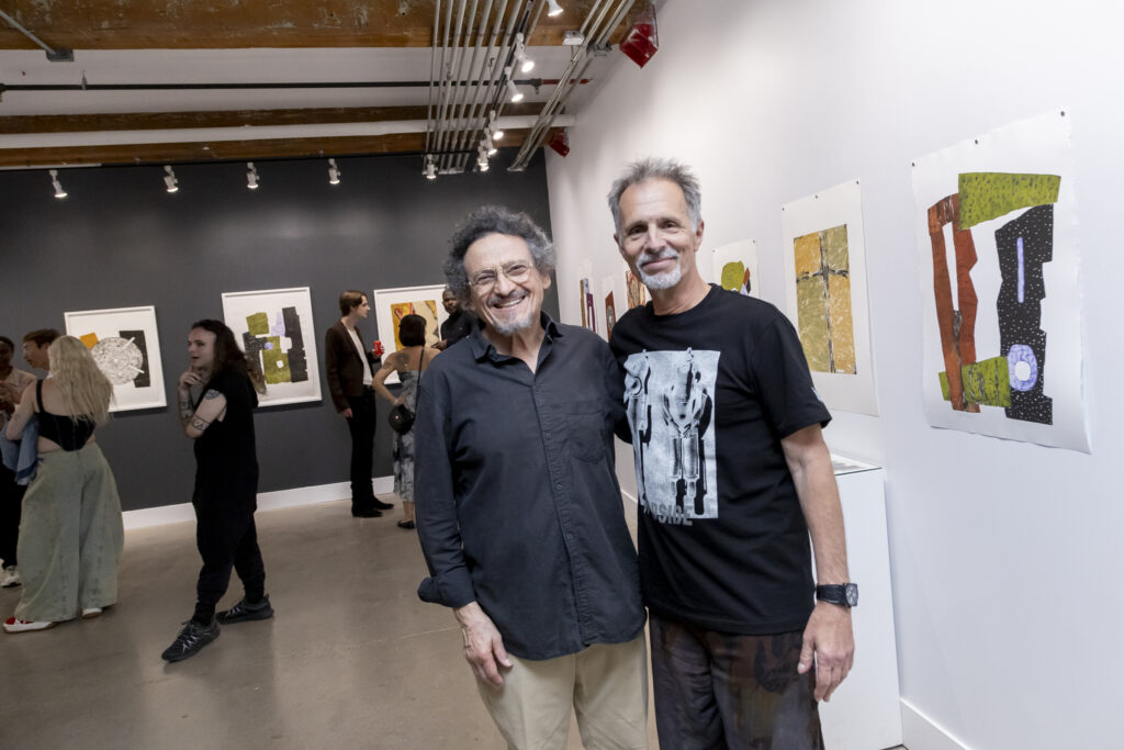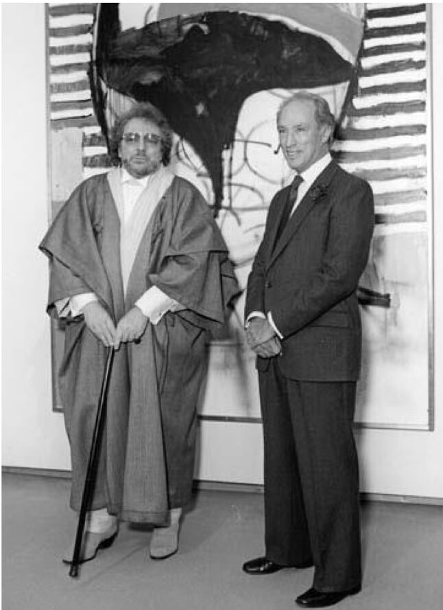
In the dArtles column of the Winter 1999 edition of dArt magazine, I wrote, “At the preview bash of Charles Ray’s mid-career retro at MOCA in Los Angeles, Charles himself stood on the patio roof looking down over the party. He didn’t cut through the party vortex and into the show until artist and teacher Roland Brenner arrived.” From that point in my article it became a list of “who’s who” of the LA art world. Some credit for Ray’s success has to go to the Los Angeles art dealer Burnett Miller, who passed away in 2001.
In her December 13, 2001 obituary for the LA Times, Suzanne Muchnic wrote, “An energetic and insightful entrepreneur who had an eye for quality and a finger on the pulse of contemporary art, Miller is credited with introducing the work of young artists who later achieved international renown. Sculptor Charles Ray – whose travelling retrospective exhibition appeared at Los Angeles’ Museum of Contemporary Art in 1998 – made a breakthrough at Miller’s gallery in 1987 with Ink Box, a giant black-lacquered metal cube filled with 200 gallons of black printer’s ink.”
Charles Ray installation view of his 1986 Ink Box at the Irvine Museum, Orange County
Muchnic quotes the Times art critic Christopher Knight, who wrote of its 1990 showing at Newport Harbor Art Museum, “The quivering meniscus of ink that is the top plane of this menacing black cube forms a threatening surface just begging to be touched, even in the face of disaster.”
In his 1995, performance at the Burnett Miller gallery, artist Skip Arnold delivers an obvious homage to Ray’s Ink Cube by replacing its “quivering meniscus of ink” with his own quivering flesh. The image featured here was used in an article by Craig Stephens in the Fall 2002 edition of dArt International titled Pollock to Punk: A Conversation with Skip Arnold.
Skip Arnold, On Display, 1995, performed at Burnett Miller Gallery in Santa MonicaSteve Rockwell, Gallery Space (Shoes), 1988, acrylic, wood floor, shoes, 14 x 14 x 15 inches
My own synthesis of Ray’s Ink Cube and Arnold’s 1995 On Display piece is the sculpture Shoes. It was made in 1988, a year after the Burnett Miller exhibition of Ray’s ground-breaking piece. With the Shoes, Ray’s ink and Arnold’s body evaporate, leaving the residual imprint of black shoes overlaid by black print on plexiglass. In 1997 Burnett Miller consented to have a part in my Storage exhibition. A unique feature of the gallery’s Bergamot Station building in Santa Monica was its spectacularly convenient second floor skylight, clearly visible in the top left-hand corner of the Skip Arnold photo, and neatly matched in the top right-hand of Steve Rockwell’s Storage photo.
Steve Rockwell, Storage Bernett Miller, Bergamot Station, Santa Monica, 1997, photo by Steve Rockwell
Completely unaware of the Charles Ray Ink Cube until a couple of decades ago, I had produced the progressive “inking” of a six-by-six-inch square in 1987, the year Ray displayed his “inky cube” at Burnett Miller. My square was subsequently cubed as the Shoes sculpture the following year in 1988. It took a hundred and thirty-nine people over a period of nine months to complete the “inky” square, the Pick a Number project eventually leading to the publication of dArt International magazine in 1998.
Steve Rockwell, Pick a Number between 1 and 99, 1987, ink on printed bond paper, 42.5 inches x 12 feet 10 inches
As part of the Meditations on Space project on December 1, 1995, my 36th gallery stop was Mary Boone, then in Soho. The account in the published book work read, “Someone must have been adjusting the lights or changing them. An enormous yellow step ladder rose toward the skylight in the center of the gallery. It made me think of the white ladder in Paris at Galerie Lucien Durand. Ron was busy at the desk by the door wielding a letter opener.” My black and white acrylic portrait staring up at the light suggested layered and cocooned gallery spaces from Paris, New York, and finally Los Angeles.
Steve Rockwell, Meditations on Space (Mary Boone Gallery, New York), 1996, acrylic on panel painting, 32 x 32 inches
Only much later, having reflected on the sources of my inspiration, did it land on a “dream vision” that I had in 1970. In it, an angel appeared with a shining solidity that shattered my flesh self to the extent that I presumed it to be the “Angel of Death,” were it not for its kind radiant beauty. Having not received spiritual grounding of any kind in my family, I was open to its interpretation. In form and perfection, it exceeded anything by Raphael. To a Catholic, it could clearly have been Mary. Then suitably combined with the definition of “boon,” it transformed into a timely benefit, blessing, or something that is incredibly helpful and advantageous.
The Graphic Arts Triennial in Hungary, takes place in a beautiful city in the mountains of the Bükk Nationale Park, Miskolc. The triennial started as a biennial 65 years ago, in 1961, then for several reasons, financial and organizational among them, turned into a triennial. For a North American reader 65 years sounds almost unbelievable. It is not an international show or art fair, but a Hungarian art event. In today’s rootless world glazed in international veneer, this is a major accomplishment, a triumph of Hungarian art and perseverance.
Installation view of Miskolc Graphic Arts Triennial at the Miskolc Galley. Photo: Benedek Baranczó
Reproduced graphic art was always a European genre—think of Dürer’s and Rembrandt’s work. It has been flourishing from the 19th century to the present day within Central Eastern Europe, in Hungary, Germany, Poland, Slovakia and the Czech Republic. The genre has endless potential as both the message and the technical implementation harmoniously capture the possibility of constant renewal.
Because of the 65th anniversary there are two large exhibitions. One, titled Sixty-Five, is at the Herman Ottó Museum, showcasing all the Grand Prize winners from the very first year till today. The Museum’s rich collection shows an emblematic picture of 20th century Hungarian graphic art. It is a very interesting and entertaining exhibition where visitors can follow the historical, thematic and technical developments of reproduced graphic arts.
Installation view of Sixty-Five at the Herman Otto Museum. Photo: Benedek Baranczó
The Miskolc Graphic Arts Triennial 2026 fills all the rooms of the large Miskolc Gallery. Visitors first see the exhibition of the previous triennial’s Grand Prize winner, Tamás Felshmann’s, titled Architectural Heritage. At first sight I thought that I was looking at historical pieces of architectural plans or illustrations. The works are very impressive, large-sized and captivating. When you start looking at the details you want to know everything about the whereabouts of the buildings, their locations, originality, the architect’s name, how they were built and why and how they are depicted in this way. It is a unique show of majestic buildings. We can identify some basilicas, like St. Peter’s in Roma or St. Mark’s in Venice, while others depict public places, all representing our historical heritage through architecture. Buildings depicted by dark lines, grey surfaces or white, empty areas are perfect replicas of the original buildings. Still there is something more to them. Felschmann seems to add a magic touch that turns the buildings into something dreamlike, so even while they are real and proportionate, they turn into something beyond it, a heavenly place. The Basilica series, greyish drawings of symmetrical facades, sometimes with a drop of color, are spiritually intense. Even when the pieces are dark, they still radiate beauty and harmony. You can see that these works have been done by a perfectionist. Everything is painstakingly correct, but still spiritual and nostalgic, showing a bygone era creatively transferred to another age.
Tamás Felshmann: Basilica Minor 49, Study, 2024, digital giclée print on paper, 150 x 100 cm (left) and detail (right)
On the second floor, the largest room of the gallery showcases the award-winning artworks. Grand Prix winner Miklós Kelemen’s (Municipality of Miskolc Grand Prize award) Unfinished sculpture is both a commemoration and a tribute to the art of his sculptor grandfather. The large-sized work, composed of 9 prints, is very powerful. It depicts the creation of a large sculpture of a horse, maybe intended to be in a public square, following the old technique when the artist built a wood frame at first. We can see that wood structure is tied together with ropes. The surface of the wood panels and the texture of the ropes are beautifully drawn with sensitive lines and deep shades.
Miklós Kelemen: Unfinished sculpture, 2025, intaglio collagraphy on paper, 297 x 207 cm (left) and detail (right)
Tamas G. Kovács’ (Hungarian Academy of Arts Special Prize) biblical triptych is challenging both thematically and visually. While recognizing the narrative (The annunciation, The moment of birth, Massacre of the innocents) I hesitate about how to interpret it. Is it satirical or AI focused? There are robots with other AI elements in each composition, as well as mythical monsters mixed with machinery parts. There are many layers. The top (heaven?), the middle with the actual action, and something is also happening underground where they are digging a mine with strange machinery. Is it a religious composition or a set of tarot cards? Hard to say, but either way it is interesting. You can’t overlook it.
Tamás G. Kovács (L-R): The annunciation, 2026, linocut on paper, 60 x 42 cm; The moment of birth, 2026, linocut on paper, 70 x 50 cm and Massacre of the innocents, 2026, linocut on paper, 60 x 42 cm
There are numerous young artists (more than 20% of the participants) in the triennial, Orsolya Cseh (Hajagos Imre award) among them. What is remarkable in her linocut, titled Wedged into my words is the way she depicts her motifs. On the left side of the composition is a large figure facing a ball-like thing with thorns, a bent tree, some vegetation on the ground and maybe animals. There is a crossroad in the foreground and a bicycle on the ground. What kind of world—imaginary or real—does the artist travel? The strength of this piece is the making of it, the linocut, that allows such a rich surface. The curving lines, the various patterns, the strong contrasts of black and white elements create a rich, expressive composition.
Orsolya Cseh: Wedged into my words, 2025, linocut on paper, 99 x 200 cm
Anikó Csonga Kovács (Hermann Ottó Museum – Miskolc Gallery award) depicts a woman warrior in a Japanese fighting position. Titled Individual, she is alone and faceless. It seems that she is in a chemical war, with a container on her back connected to a tube that will shoot out the liquid. This is a linocut on layered plastic sheets that gives it a 3D feeling.
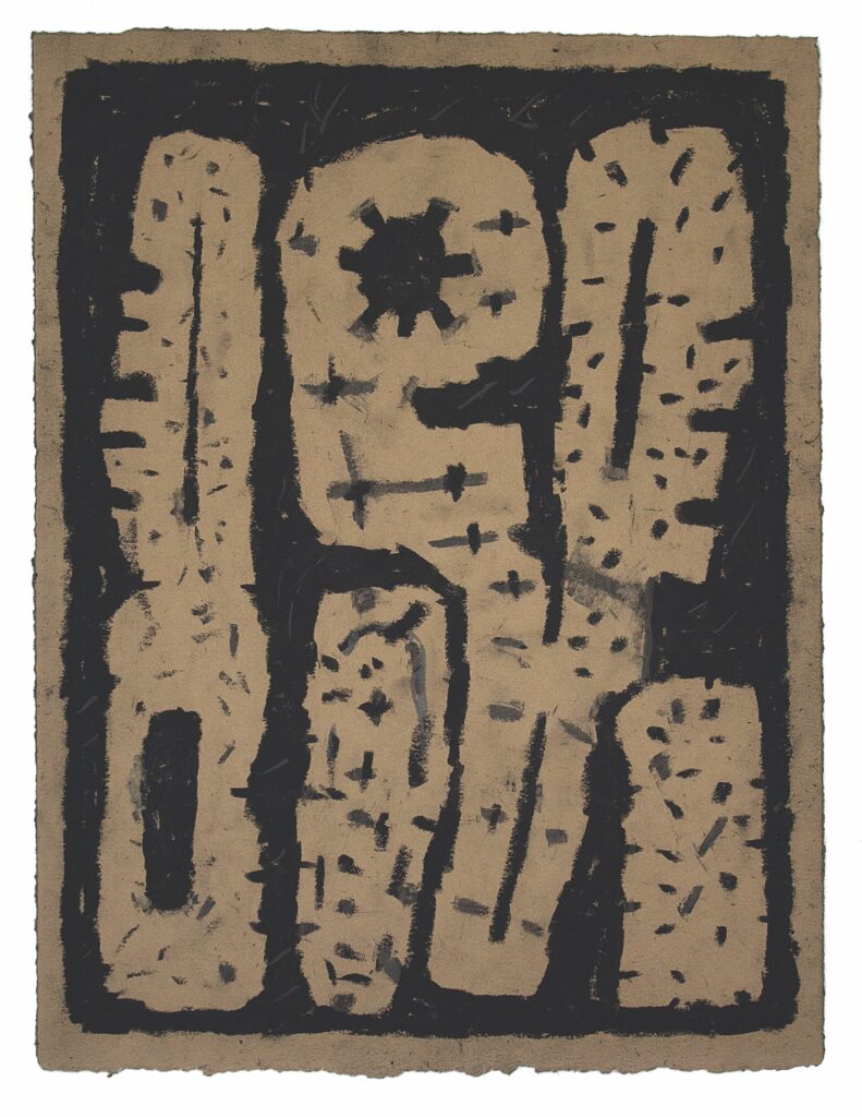
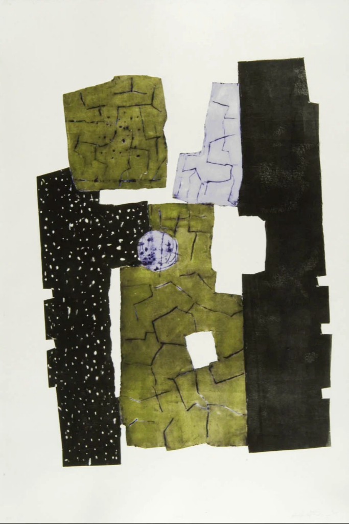
Mátyás Boros (Szabadkéz Gallery and Art Colony award) creates a composition in Totem 2, that mixes graphical and sculptural elements into a unique print installation.
Anikó Csonga Kovács: Individual, 2025, linocut on layered plastic sheets and paper, 100 x 80 cmMátyás Boros, Totem 2, 2026, linocut, unique print, paper installation, 90 x 90 cm
The triennial is a huge exhibition with 114 artworks by 69 artists. We live in an age of rapid technological advancements, and the field of reproduced graphic art is no exception. New design genres emerge at a record pace only to lose their dominant role just as swiftly. This is the case with electrography, which used to appear in significant quantities, but this year its presence is negligible. The call for the triennial allows for a wide range of techniques, whether it is traditional or new and experimental. During my conversation with curator Ábel Kónya, the potential involvement of artificial intelligence was discussed, which clearly showcases that the organizers are open to new methods of implementation.
I was somewhat surprised by the large number of artworks that follow traditional techniques requiring academic training. The Hungarian University of Fine Arts has an excellent Graphic Art Department that most of the exhibiting artists attended or attend as the triennial allows students to enter their works. A good example of this a third-year student, Veronika Fürstand’s piece, Only I can truly understand. It is a beautifully lyrical composition, where a tiger comforts a girl by licking her face. Love and empathy don’t have borders.
Veronika Fürstand: Only I can truly understand, 2025, colour linocut on paper, 41 x 59.6 cm
Prominent pieces within the traditional category include the sensitive, figurative, soft-ground etching compositions of János Barta (Hungarian Graphic Artists Association award). Réka Dobi’s series, From late Night to early morning are outstanding images with their sensitive depiction of the various stages of sleep, waiting for it come, dreams, even nightmares and total escape from reality. Mietta Kerper’s woodcut guides us into a rhythmic rainy night, where red figures covered with various patterns walk along the road. It has strong painterly qualities and creates a meditative atmosphere.
János Barta: Super 8 Unstable, 2025, soft-ground on paper, 19.7 x 29.7 cmRéka Dobi: From late Night to early morning I., 2025, linocut on paper 116 x 151 cmMietta Kerper, Rhythm exercise I., 2025, multi-block woodcut on paper, 29.5 x 42 cm
However, this does not mean that experimental works are neglected. Several works refer to their unique techniques and implementation methods, such as in the case of Zsolt Durucskó and Dániel Lebeda, which encourage the viewers to figure out the methods used. Electrography is still present; examples include the works of Péter Berentz and Zsuzsanna Enyedi.
Zsolt Durucskó: Escape attend II., 2023, own technique, intaglio on paper, 59.5 x 27.2 cmZsuzsanna Enyedi: Blind spot II., 2026, digital print on plastic board 80 x 132 cm
The exhibited works of the 2026 Miskolc Graphic Arts Triennale give a remarkable picture of the contemporary Hungarian graphic arts. It shows the thematic deepness and technical variety of the artists of our era. It also paints a true picture of social situations, political movements and changes, outlines everyday life and the psychological responses of people. Rich narratives and strong expressions always were and still are the main characteristics of graphic art. This positive outlook, both in terms of themes and techniques, I believe is one of the main reasons behind the genre’s survival. In Hungary graphic arts still flourish and will have a long and wonderful future.
Images are courtesy of Miskolc Gallery. Photo: János Ádám
Miskolc Graphic Arts Triennial, 2026, Miskolc Gallery, 2 Rákóczi Street, Miskolc and Sixty-five, 28 Görgey Artúr Street, Miskolc, Hungary, both May 9 – August 9, 2026
At Keunhee Park’s solo exhibition, MAZE, at the Riverside Gallery in Hackensack, NJ, sculptures that alternate between the modes of transparent glass and opaque wood manifest themselves in succinct metaphors about the nature of identity and being. While Park’s work appears purely abstract with only formal concerns on the surface, it is totally concerned with the real world and, in particular, the human world and the questions of identity.
These sculptures contain forms that turn in rectilinear fashion like a literal 3-dimensional maze or snake game that maps out the possible pathways of movement and/or communication link. They carry the vestiges of certain conceptual and instruction-based works by the likes of Sol Lewitt, whose work including Floor-Wall Grid (1966) would stand as an example of the grid that Rosalind Krauss would write about in her seminal 1979 essay describing the use of grid as a powerful motif to bring about a new vocabulary that did not exist prior and as a language of the abstract realm that distinguishes itself from the “real” world.
The rectilinear geometry would manifest itself throughout history, whether the perspectival space or the windows in modern painting like Matisse’s masterpieces, as Krauss would point out in her writing. The grid as a window acknowledges the “frame” that exists outside or within the inner dimensions of the artwork. In Park’s grid-like constructions, the spatial dynamics is highly organized and curated with a specific set of rules and conventions in which the spatial dynamics come together. These underlying codes of spatial turns and projections suggest a fundamental language or building block as we see in the form of pixels on a computer display or the bricks of a virtual world.
“Maze” Series by Keunhee Park
Why does a pathway suddenly change direction as if it were being stopped by something and were seeking an alternate path? Why does it continue to move uninterrupted in a straight line from certain positions?
Park’s sculptures represent the self and how we navigate the world or the environment in which the self exists, which is ultimately in relation to the other selves that occupy different positions in space time. Very interesting theories abound in physics that may inform our understanding of existence and the cosmos, including the fact that the electrons are virtually indistinguishable from one another. What if we were the electrons, but we were the same person, just spread out across various points in the space time continuum?
Particular portions of the sculptures alternate between the materials of wood and glass, as if to equate transparency with honesty and opacity with secrecy of the inner self. It is important to identify the difference between the surface and the core in relation to the question of identity, and Park’s sculptures in part reflect this binary relationship. Were the core of the self to become more visible, it must become more transparent and honest, yet the being or the object becomes less clearly defined, more susceptible to the influence of the surrounding elements (such as light and reflections), and more vulnerable. The opposite is true of opacity; with secrecy, the being or the object becomes less honest, yet it is also more protected and less vulnerable.
This is the contradictory and ironic condition of the universe and existence. Why do humans value honesty and integrity so much in a world where one must pay more to uphold such noble ideals?
In another reading of Park’s sculptures, the transparent glass portions may suggest the imaginary or the imagined decisions and outcomes, whereas the opaque wooden parts may suggest what is real in the status quo, prior to the event of imagination that spawns subsequent actions. Park’s works may also reflect on human existence as a mix of the imaginary and the real structures. The imaginary and the real differentiate into the realm of social and political structures, economic structures, and so on in the imaginary, and the physical structures in the real.
Human structures are not only made of tangible objects but also the symbolic and aesthetic objects, to which Park’s Maze series belongs in reality. Ultimately, it is important to consider the alternate histories of what could have happened had we taken the other path. This is because alternative history and imagination allow us to critique and to reform the sociopolitical and economic structures, as well as the individual being (in terms of one’s condition and circumstances), in the status quo. Park’s sculptures may have begun as the artist’s reflection of a life lived, in which he had to struggle numerous times throughout life, only to become an artist, which in and of itself is a path of multiple struggles. However, the Maze series also carries a universal value and meaning because it is a human nature and condition to struggle and to seek out a decision at the crossroads.
Keunhee Park: MAZE, June 19 – July 6, 2026, 1 Riverside Square, Suite 201, Hackensack, NJ 07601
Published in 1719, Daniel Defoe’s The Life and Strange Surprising Adventures of Robinson Crusoe of York, Mariner, is generally regarded as the first English novel. Its immediate success might be attributed to its documentary, confessional style of narration. The receptivity by the general public to tales of shipwreck already had the Alexander Selkirk account as a classic example. Lack of lighthouses and the accurate mapping of shoals made naval disasters inevitable in this age.
Scanned image by Philip V. Allingham. The illustrator presents a convincing panorama of the wrecked merchantman off the coast of a remote island off the South American coast (left), with several small figures (presumably, one of them Crusoe). London publisher: Cassell, Petter, and Galpin, 1863-64
To a young Jouko Salomaa living in Grangesberg, Sweden, Defoe’s classic left a deep impression. To him, when screened at Cassels, the local theater, Luis Bunuel’s 1954 Robinson Crusoe was a disappointment. What the film was unable to convey adequately in his mind, and which the book described in intricate detail, was Crusoe’s gradual conversion of his island wilderness into something of a solitary paradise.
Movie poster for Luis Bunel’s 1954 Adventures of Robinson Crusoe. It was screened a year or so before the 1957 Atlantic crossing by Jouko Salomaa at Cassels movie theater in Grangesberg, Sweden
Jouko used one of the illustrations from the book as a basis for his 1957 colored ink drawing of Crusoe and Friday, which he gave as gift to classmate Lennart Hansson. On Jouko’s departure to Canada from Sweden on October 1, 1957, Lennart photographed him at the railway station, the images of which were later emailed to Canada along with one of the Crusoe drawing.
Jouko reser till Canada (Jouko travels to Canada), October 1, 1957, Lennart Hansson scrap book page with two of his photos of Jouko Salomaa at the train station in Grangesberg, Sweden, taken the day before Jouko boarded the SAL ocean liner Stockholm in the Copenhagen to Halifax, Canada Atlantic crossingJouko Salomaa, Robinson Crusoe and Friday, 1957, colored inks on paper. Gifted by Jouko to classmate Lennart Hansson before Jouko’s ocean departure
On his departure, twelve-year-old Jouko and ocean liner passengers endured a storm that produced waves the height of the ship. Seasickness had trapped the lad to his cabin for all but the last day of the voyage. The joy at the release from his confinement came with a boundless excitement to explore the ship. Finding himself at the prow of the liner, on an ill-advised impulse he clasped the jack staff tightly with both hands, hoisting himself up with a quick jerk, legs dangling over the tip of the prow. Looking down, the keel cleaved the relative calm Atlantic waters producing little rainbows. A nervous twist of the head at the fear of discovery, however, brought a quick end to the prank.
The Swedish American Line ship The Stockholm photographed after its 1956 collision with the Andrea Doria in Nantucket Sound
Unknown to the young passenger at the time but common knowledge to crew and many of its passengers, was the ocean liner tragic history. Just a year before on July 25, 1956, in a collision with the SS Andrea Doria, the prow of the MS Stockholm had sunk to the bottom of the sea off the coast of Nantucket in heavy fog. The 75-foot section was repaired within four months at Bethlehem Steel Shipyard in Sunset Park Shipyard, Brooklyn. While the Andrea Doria sunk after eleven hours most of its passengers were rescued.
The ‘Andrea Doria’ in its last hours Harry Trask/Wikimedia Commons
At the moment of impact, 14-year-old Linda Morgan on the Andrea Doria had been asleep. It seems that her cabin, stateroom 52 on the upper deck of the luxury liner had been pierced by the prow of the Stockholm, it somehow sliding under her mattress and catapulting her onto the deck of the Stockholm. Swedish crew heard a girl asking in Spanish, “Where I am I?” Puzzled, they realized quickly that she was not part of the Stockholm passenger list.
It is at this point that a dot needs to be connected. Both Linda and Jouko became part of the art world as adults. Linda served as curator at the McNay Museum in San Antonio, Texas. She had married Phil Hardberger in 1968, who served as mayor from 2005 to 2009. Jouko created the art persona Steve Rockwell in 1987 in Toronto, eventually published dArt International magazine, which the city of San Antonio invited to cover their 2008 Luminaria arts festival. I took the photo of Mayor Hardberger, not realizing at the time that his wife and I were curiously connected to the Andrea Doria collision and tragedy. The “miracle girl” after recovery from a broken leg, and fractures, was reluctant in later life to talk about an event where she and her mother survived, while her sister and step-father perished.
The Luminaria in San Antonio edition of dArt International Magazine (2008), featuring the Bill Fitzgibbons light art illumination of the AlamoThen San Antonio Mayor Phil Hardberger photographed at a 2008 Luminaria event by Steve Rockwell. The Mayor married Linda Morgan in 1968. She had been the “miracle girl” survivor of the Andrea Doria
A necessary footnote to the sinking of the Italian luxury ocean liner SS Andrea Doria is the intentional burning and sinking of its American namesake, the USS Andrew Doria on November 21, 1777. The geographical distance between the two wrecks is approximately 277 miles, one about 50 miles south of Nantucket, Massachusetts, the other at the bottom of the Delaware River near Petty’s Island, near Philadelphia. During the American Revolutionary War, rather than surrendering the valuable asset to the advancing British fleet, Captain Isaiah Robinson had the ship packed with combustibles, and watched it burn to the waterline and sink beneath the waterbed. The USS Andrew Doria is historically famous as the first American warship to receive an official salute from a foreign power at Sint Eustatius in 1776. The painting by Phillips Melville depicts the Continental Navy Brig flying the Grand Union flag, the first national flag of the United States.
Phillips Melville (Colonel, USMC, Retired), a 1974 depiction of the Continental Brig Andrew Doria warship receiving its historic first official salute from the Dutch at St. Eustatius on November 16, 1776. Courtesy of the U.S. Navy Art Collection, Naval History and Heritage Command (NHHC), Washington,D.C. Gift of Colonel Phillips Melville, 1977. Public Domain (as a work of the U.S. federal government/U.S. Navy)
Christopher Rouleau, 2026, 12 Brilliant Colors, Latex, acrylic and enamel on canvas, 54″ × 72″
The message in Christopher Rouleau’s “12 Brilliant Colors” exhibition is direct. If you don’t get the picture, he spells it out in two languages, each ‘brilliant color’ numbered from one to twelve. The charm of the artist’s work at the Red Head Gallery in Toronto is the absence of ambiguity. Rouleau’s ego never gets in the way of his painted intent. By not wearing his angry, tormented artist tuque, the “Selling of Canada” paintings strike us directly where we live – a “double-double” caffeine-induced sugar rush from a Tim Hortons cup of coffee.
Christopher Rouleau, 2026, Tons, latex and acrylic on plywood, 24 x 18 x 1/2 inch; Ketchup Wars, latex and acrylic on canvas, bubble mailer filling, 36 x 18 x 2 inches; Loss, latex and enamel on canvas-wrapped box, 18 x 18 x 18 inches
To a Canadian, each meticulously-rendered image is a mental billboard along the highway of Canada’s history. As an immigrant kid on my first day at Golden Avenue Public School in South Porcupine, my own pack of “12 Brilliant Colors” landed on my desk on the first day of school. That’s how I remember it – cellophane-wrapped pencil crayons with a picture of a snow-covered log home below the word “Laurentian,” loosely-lettered in red.
The “Selling of Canada” has continued unabated since its confederation in 1867. In fact, even before there was a Canada there was Rupert’s Land. French fur traders Radison and Groseilliers learned that the best furs were found around the “frozen sea” of Hudson Bay. Since the French governor refused to back their plan to set up a trading post on the Bay, one thing led to another, until the fur trading duo got an audience with England’s Charles II through Prince Rupert, the king’s cousin. And the rest is history: the “Selling of Canada” began in earnest by the Hudson’s Bay Company with an act of government in 1689. “Made Beaver” became not just a brand but a commercial trading standard.
Christopher Rouleau’s “Selling Canada” installation view
Rouleau’s “12 Brilliant Colors” are rooted in the beauty of the land itself, here specifically the Quebec Laurentians, a crayon for every month of the year. A century ago, the Group of Seven placed a national stamp over the color and texture over Canada’s landscape. Influenced importantly by Tom Thomson, the Group expanded northward through Algoma beyond Lake Superior to the Rockies and the Arctic. To the east Quebec’s Charlevoix and Laurentian regions supplied the drama of shoreline and mountain. Branded into the consciousness these images in oil served as advertisement readymades for Canadian National and Pacific railways to sell travel across “Scenic Canada.” If going by car, vacationers might as well ride on “Canadian Tires.”
Christopher Rouleau, 2026, HBCanadian Tire, Latex and acrylic on canvas, 30″ × 60″
While Rouleau’s “Selling Canada” works are admittedly nostalgic, tapping into decades of collective memory, their insinuation casts a deeper, more complex shadow. As hieroglyphs of national identity, by virtue of their visual familiarity, the viewer is rendered essentially defenceless to their impact. Much like the work of Jeff Koons, Rouleau’s paintings here are “critic-proof.” To whatever might be said about his show, an apt response by the artist might simply be, “I intended it.”
Christopher Rouleau’s “Selling Canada” installation view
To some extent, Rouleau even seems not to be “wedded” to the paintings on display. “Selling Canada” may be read as a sample documentation of slices from our environment, mechanically reproduced. As the artist’s “Christopher” business card reads: “lettering, signs, graphic design,” implying that if the viewer were not impressed with the paintings display, he would be happy to provide ones more suitable to their taste.
Selling Canada: Guest Artist Christopher Rouleau, May 27 – June 20, 2026 at the Red Head Gallery, 401 Richmond Street West, Toronto, Ontario, Canada M5V 3A8