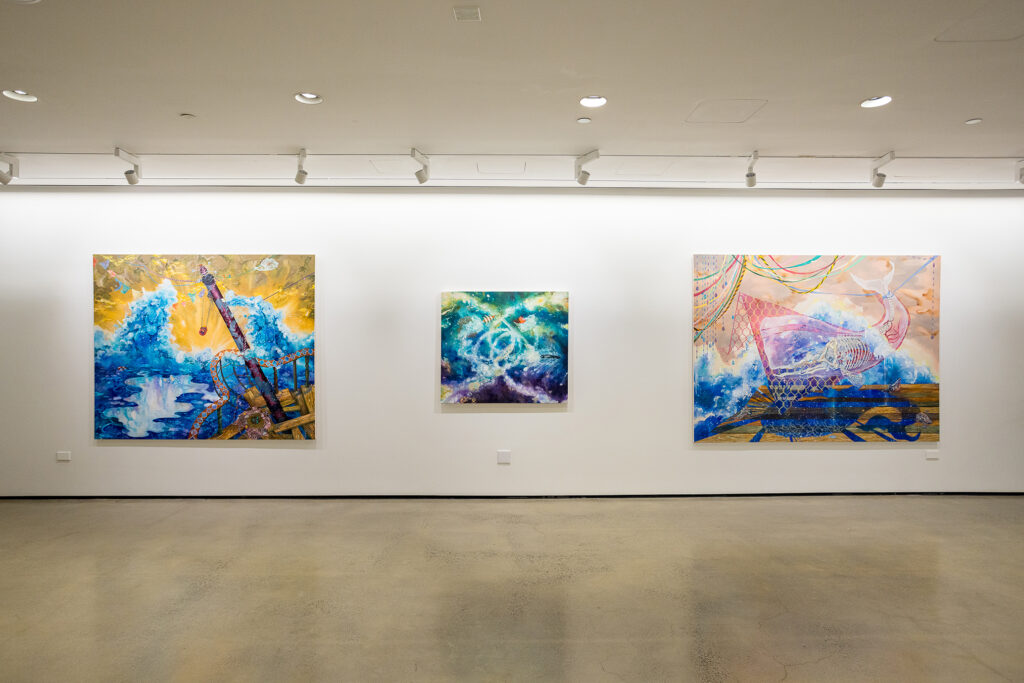
by D. Dominick Lombardi
The late paintings of John Meridith have a different sort of clarity than his earlier works, where black lines were used to clarify shapes, emphasize movement and forge a foreground. In the last decade of his life, when Meredith switched “…between cigarettes and bronchodilators, likely with a paintbrush in hand…”, he created paintings that are more distilled, direct and meditative. Already an introverted individual, in those last ten years of his life, he became even more reclusive knowing his days were numbered. This was especially true during the onset of his battle with emphysema. This dire reality appears to have pushed the artist toward a more transcendent vision, despite any anger he may have been feeling.
The earliest of his late paintings here are all from 1990, and they are the five most hopeful and brightest works. Only Tangiers No II has any reference of Meredith’s use of black to clarify his earlier visions. At or just after the beginning of most of the paintings here, Meredith placed strips of tape to mask the white or lightly painted ground of the canvas. At some point in the painting process the tape was removed, and in many instances painted over a bit – or totally if the artist found that relatively clean stripe to be too imposing or distracting to the overall composition. In Tangiers No II, the artist comes close to suggesting a portrait with strangely clownlike features. Any suggestion of humor that might enter one’s thoughts here is quickly dispelled by the large, jet black swathes of paint that obliterate any indication of a mouth, while the splashes of paint thinner, probably turpentine, create purple, black and red drips indicating some sort of distress.
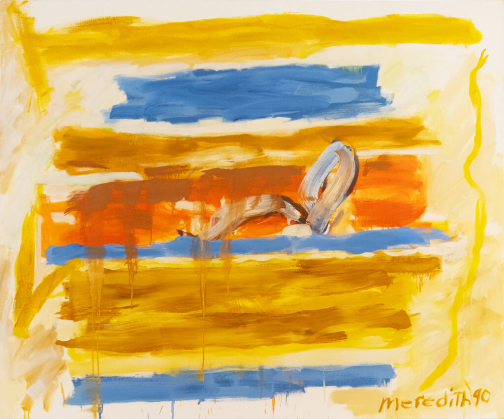
The most compelling work from the 1990’s is Reclining Figure. To the mostly primary colors of the red, yellow and blue backdrop, the artist adds wide sweeping strokes of heavily muddied white to suggest a lounging subject that is partially obscured by a wash of ochre over the figure’s legs. The brilliance here is the way Meredith utilizes such a heavily contrasted paint application of the figure, as opposed to the rest of the painted surface to work in the greatly abstracted and simplified human form. Placed just right of center, the figure looks backlit by brilliant sunlight – a visual tour de force much greater than the sum of its parts.
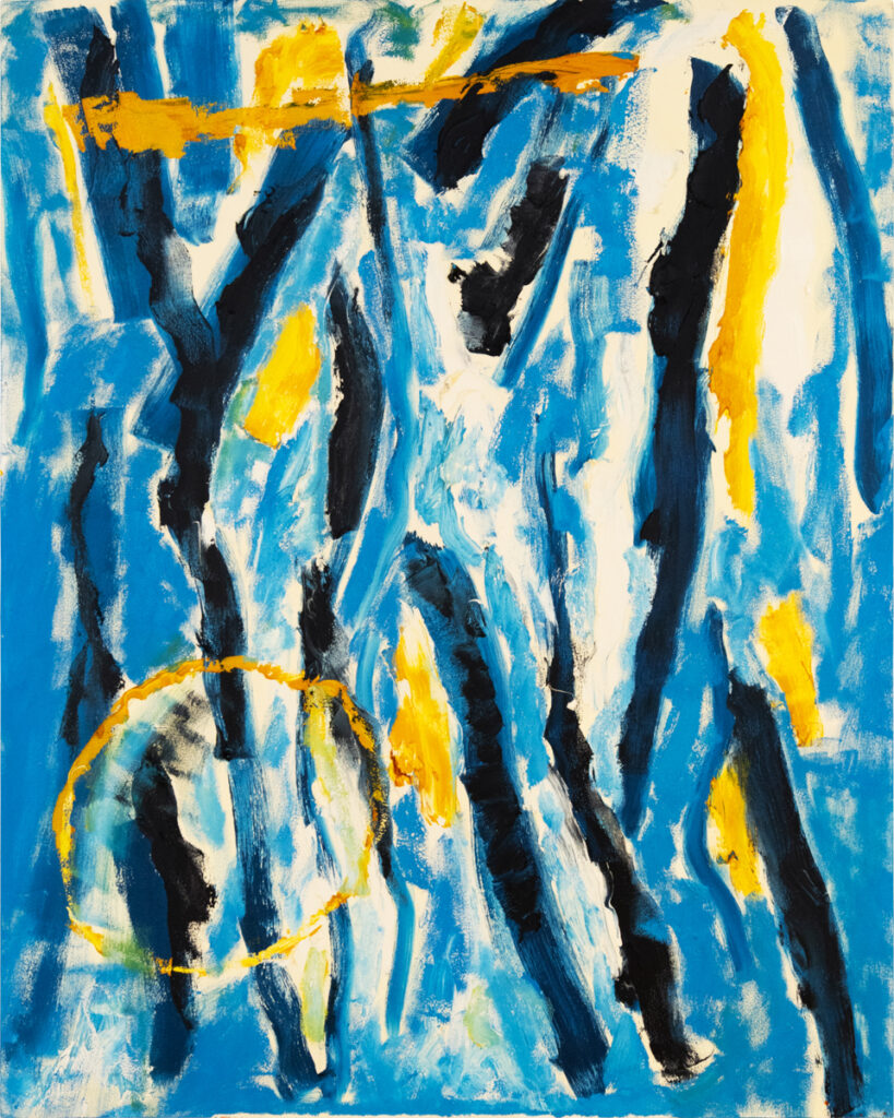
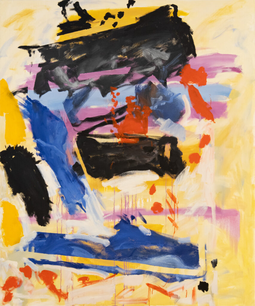
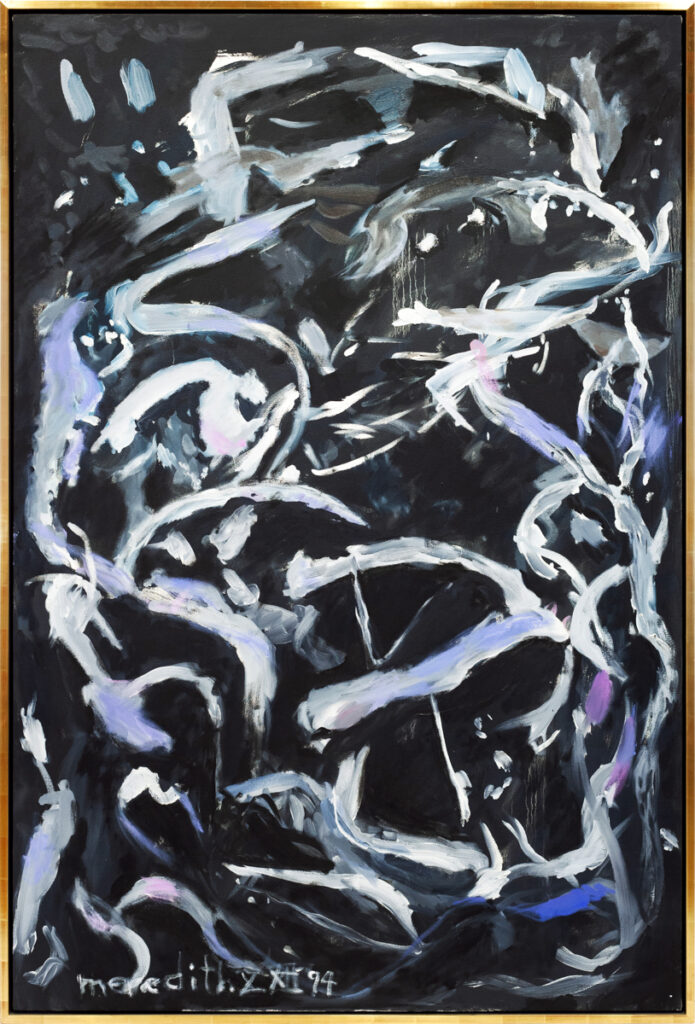
Then there are two paintings from 1993, which bring back the use of black lines – only this time it is more about creating rhythmic upward movement that is both alluring and impermeable in Emperor, or a tangled trap of contrasting thoughts in Key Largo. Then there are four paintings from 1994. The one named Untitled is the most hopeful in palette and approach and reminds me very much of the serene and seductive paintings Matisse made while living in Nice. Conversely, Eroica is the most disturbing work in the exhibition, and consists of two ghostly forms painted over a black ground that interact and look back at the viewer creating a chilling effect.
The two Untitled paintings from 1997 show most profoundly, the way Meredith worked with masking tape. In both works, the tape is used as a tool to create structure and composition. Working within a very shallow space, the artist manages to create compelling spiritual depth. In their clarity and simplicity, these two paintings remind me of De Kooning’s late works when his debilitating illness changed his approach and aesthetic. The one example from 1999, painted a year before his death, features four white haired feminine forms that intertwine like smoke from one of Meredith’s many cigarettes. A late statement on how life, living, lust and death are fleeting and beyond our control, like smoke from a fire and Meredith is the flame.
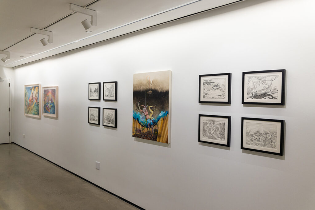
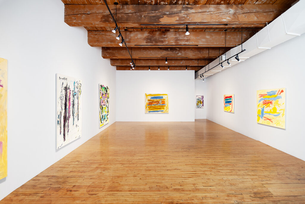
John Meredith: Last Breaths, June 6th – July 13th, 2024. Christopher Cutts Gallery, 21 Morrow Avenue, Toronto, Ontario, Canada M6R 2H9