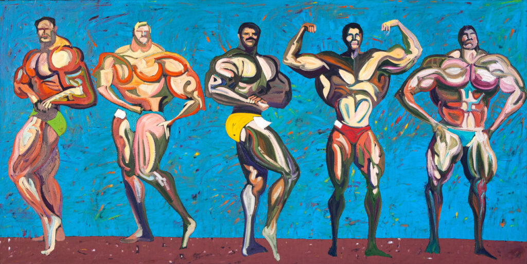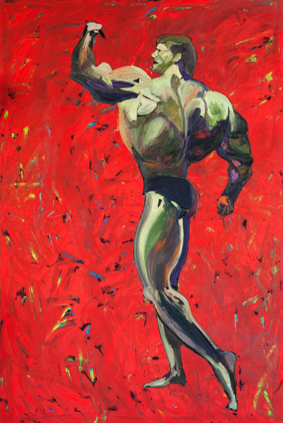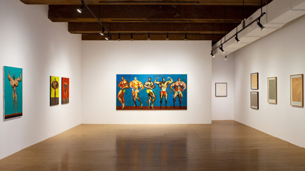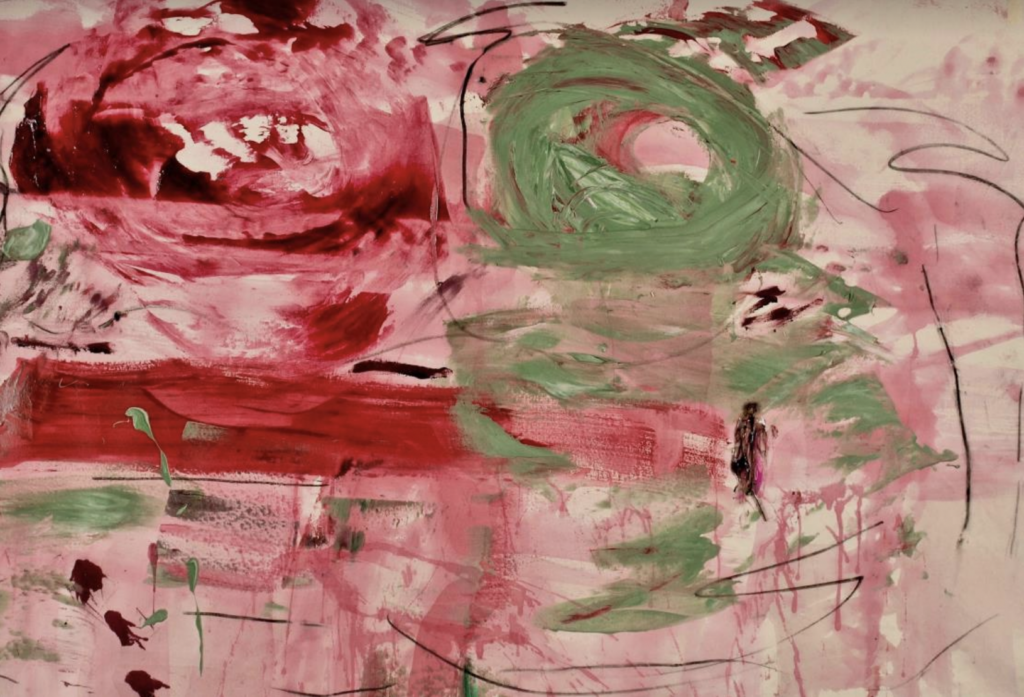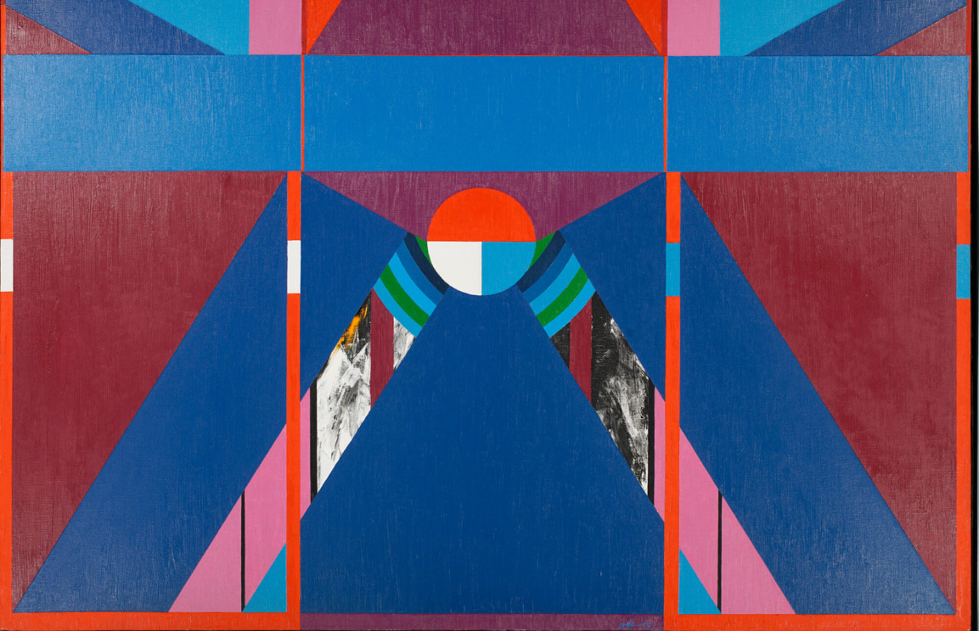
On the occasion of his exhibition, Dark Color Wheel Paintings at the David Richard Gallery in New York, John Mendelsohn asks and answers his own questions about his work. The twelve paintings in the series were made in 2022.
Why an interview in this form?
Autofiction, Autoeroticism, Auto Interview!
How did you do these paintings?
To misquote the sportswriter Red Smith, “There’s nothing to it. All I do is starting working and open a vein.”
I mean your technique – do you use mechanical devices for making the circles and projecting rays?
No mechanical devices, no taping, everything by hand. Just the radical act of painting on canvas.
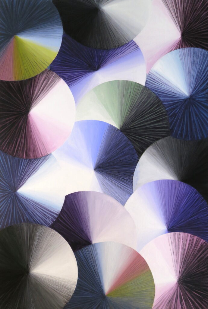
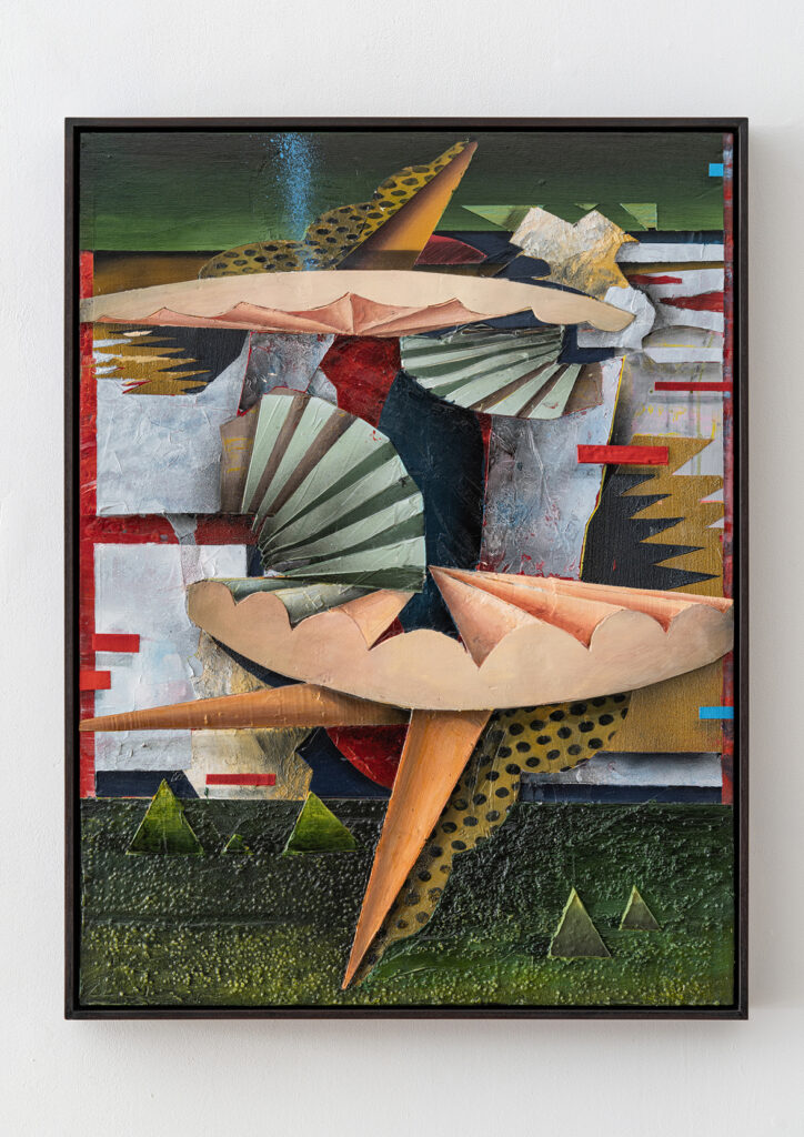
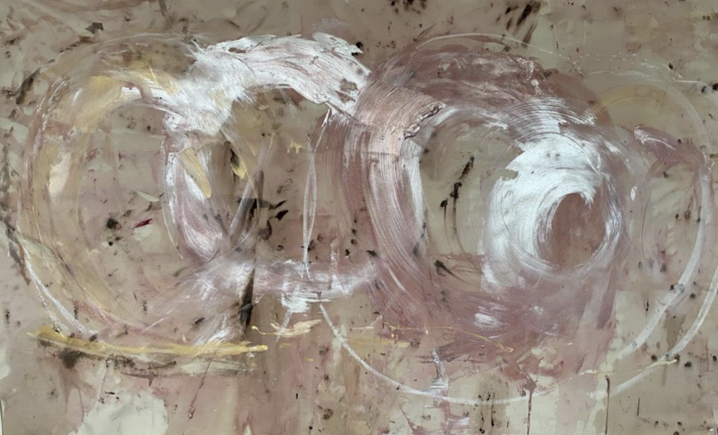
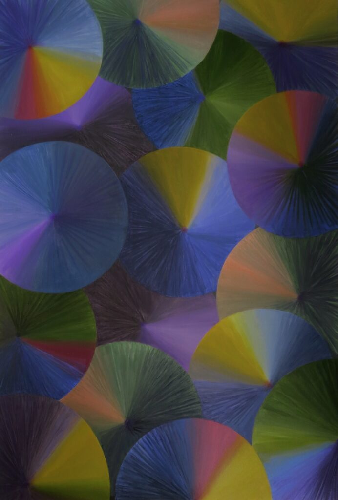
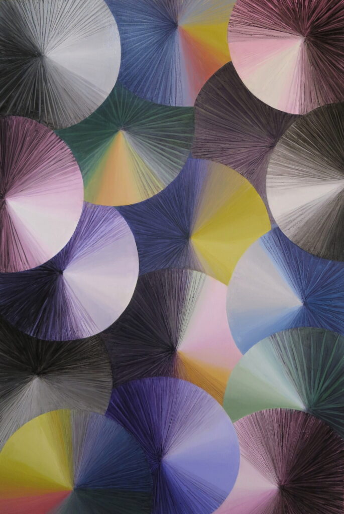
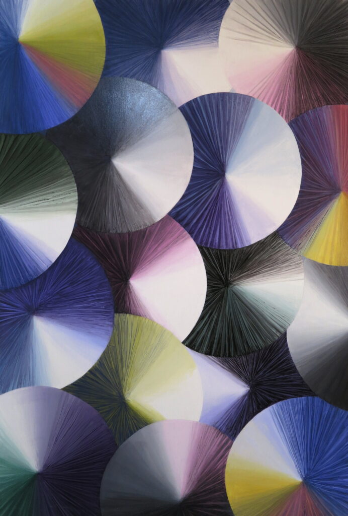
Why the title Dark Color Wheel paintings?
They follow my Color Wheel series that were exhibited at the David Richard Gallery in 2021. Like the earlier series, they have discs with color projecting from their centers. The form suggests a color wheel, a device that shows color relationships.
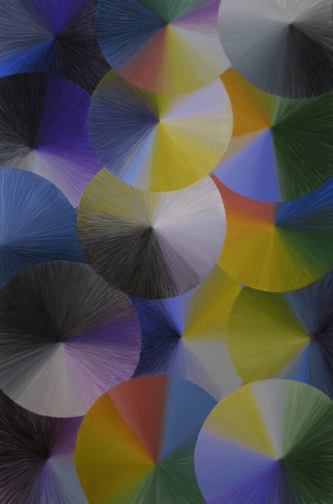
In contrast to the earlier series, the new paintings have a wider range of colors, deeper tonalities, and lower saturation hues that play off against exuberant, purer hues. Sequences of primary colors contrast with unexpected juxtapositions, that devolve into tinted grays and blacks. For me, color in these paintings is lyrical, astringent, and ultimately mysterious.
What was the origin of these paintings?
Success has many mothers. To quote myself, speaking about the impetus for these paintings, “The first was a dream I has as a child, a wonderful dream, in which I entered a golden chamber with turning golden wheels, like a clockwork’s interior. Second, there was a visit to the hospital to visit a friend who was at the end of his life. He said to us that he saw spinning discs, but that only he could see them, not us. Third, while conducting an art workshop at a senior center, I was teaching a participant how to paint flowers with dark centers.”
How about your feelings at the start of this series of paintings?
A poetic motive for the paintings was the phrase “a song of flowering and fading”, conjured up by the paintings’ radiating forms, that suggested a way to consider the splendor and shadow pervading everything.
Can you say something about how these paintings developed within the series?
The paintings began with richly colored works that are quite dark in tonality. The chromatics start to change, with some really surprising and at times disturbing sequences of hues. There are then a number of softly atmospheric paintings. They give way to the final group of works, with strong contrasts of tinted blacks and a cold, blazing light.
These paintings have a particular mood. Do you agree?
I would say a spectrum of moods. The persistence of light against encroaching darkness constitutes one of the central motifs in these works. It helps to evoke these paintings’ moods: an unstable mixture of melancholy and brightness – a sense of inevitable waning consorting with beauty that is a fugitive, saving grace.
The discs and rays suggest many associations beyond color wheels: flower forms, the movement of time, the wheel of life, the piercing appearance of the miraculous in the everyday.
What about the style of these paintings – how would you describe it.
I wouldn’t. I would say that in the context of these abstract works, illusionistic possibilities had arisen, unbidden. These include a painterly, representational quality, a sense of space, and the impression of emanating and reflective light. As is my practice, I allow rather than censor.
Do you recognize precedents for this work?
Of course. I’ll let the art historians have a crack at this, but … “No Caravaggio, no Delaunays, no Stella – no Dark Color Wheel paintings.”
I notice that from series to series your paintings really change – why?
At one point in the past, I would say that I was restless. At another point, I would say, there is no need to choose one approach. Now I am inclined to say that I’m guided to the next thing, which can be more closely or more distantly related. After doing this for quite a while now, some patterns of thought emerge, but so do more mysteries.
What do you think that these paintings can give a viewer?
Their je ne sais quoi – literally, “I do not know what”, says it all. That is, paintings can have an ineffable quality; it enables distinctive experiences – entrancing, unsettling, moving.
What do you think about what people have written about your work?
Let them knock themselves out. Among the comments: formalist, whimsical, strategic, romantic, failed minimalist — the last I especially appreciated. Since I occasionally write about art, I know that it is fairly impossible.