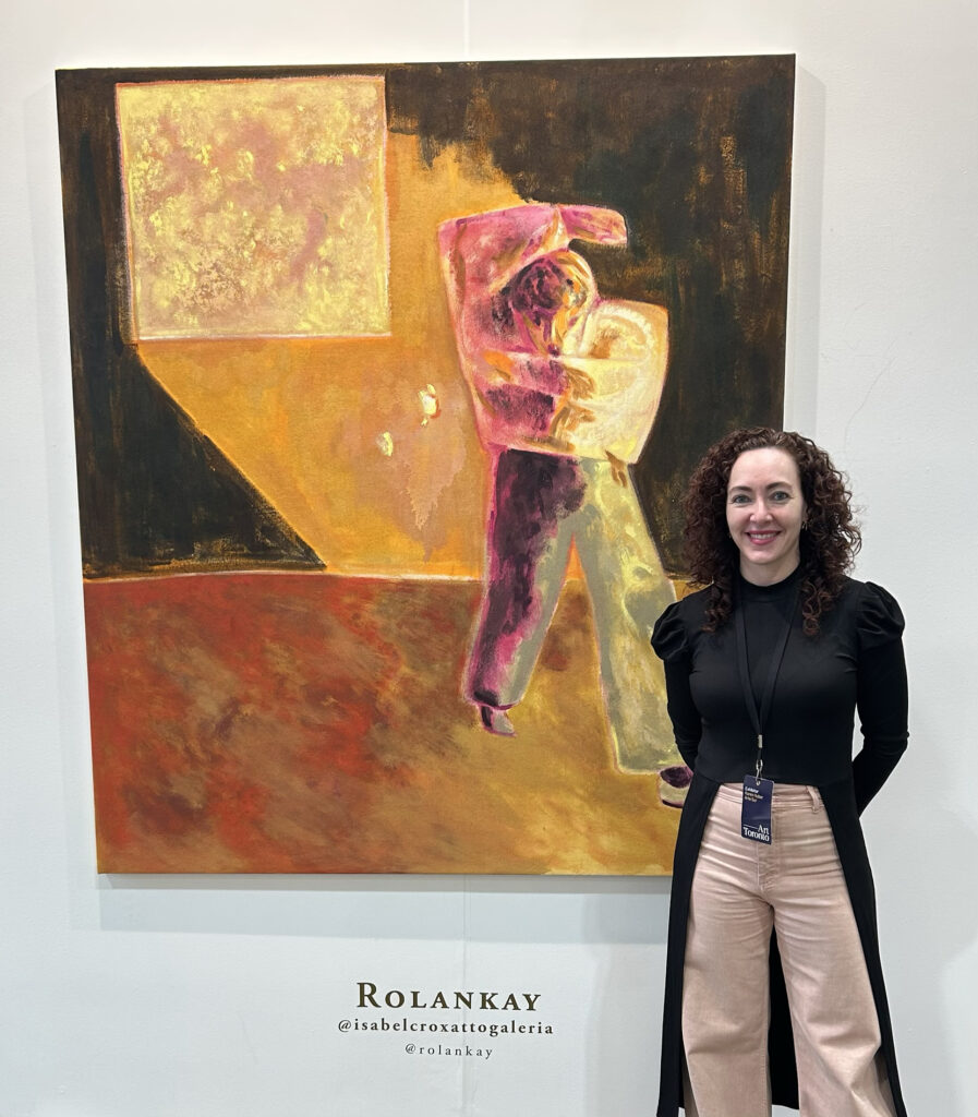
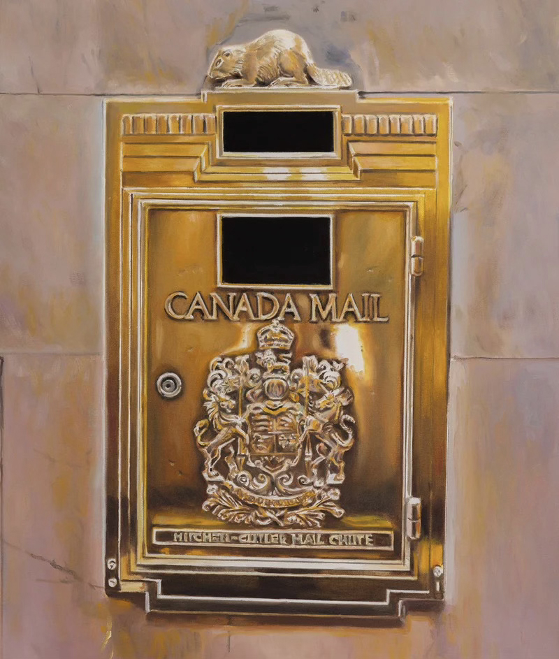
Mexican curator Karen Huber in front of art work by Chilean artist Rolankay (1989-) titled Illumination, 2025, oil on canvas 67-3/4 x 59-7/8 inches courtesy of Isabel Croxatto Galeria from Santiago, Chile
Art Toronto is Canada’s leading art fair, held annually at the Metro Convention Centre located on Front Street in the vibrant downtown area of Toronto. It is the largest art fair in the country, showcasing works from both emerging young artists and established masters. Under the leadership of Mia Nielsen, the Director of Art Toronto, the fair has consistently thrived, with a new central theme introduced each year. This year, the focus is on Latin American art (Arte Sur), curated by Karen Huber, a Mexican curator and gallerist based in Mexico City. Huber is recognized for her innovative approach to presenting contemporary Latin American art from Central and South America. She has assembled 11 esteemed galleries for Art Toronto, which are featured in a dedicated section of the fair’s exhibition space. The participating galleries include Alejandra Topete Gallery from Mexico City, Mexico; Aninat Galería from Vitacura, Chile; BLOC Art from Lima, Peru; Crisis Gallery from Lima, Peru; deCERCA from San José, Costa Rica; Judas Galería from Valparaíso, Chile; Isabel Croxatto Galería from Santiago, Chile; PROXYCO Gallery from New York, USA (featuring Latin artists); Subsuelo from Rosario, Argentina; Swivel Gallery from New York, USA (featuring Latin artists); and The White Lodge from Buenos Aires, Argentina.
The Latin American focus is a must see. According to Huber, every art fair in the world needs a section for Latin American art. This huge continent brims with creativity encompassing all mediums resulting in fresh works touching upon all aspects of humanity stemming from young voices, indigenous peoples, well seasoned artists and those artists no longer alive. In talks with fellow colleagues, curators and friends, Huber feels Latin America is no longer seen as a minority. In her opinion, it has become very active in every country and in every city in the world and it is an important part of the economy. Huber feels it is essential to give visibility to Latin American artists in spaces like art fairs, galleries, museums and institutions. Many feel there has been a void in the art market for contemporary Latin American art. More galleries are now expanding to exhibit Latin American art opening the world to more conversations about art, to more story telling from different backgrounds and linking various cultures together. There is a growing curiosity among individuals regarding Latin American art. Individuals are increasingly seeking to travel to fairs in Latin America to witness and discover the wealth of offerings that this continent presents.
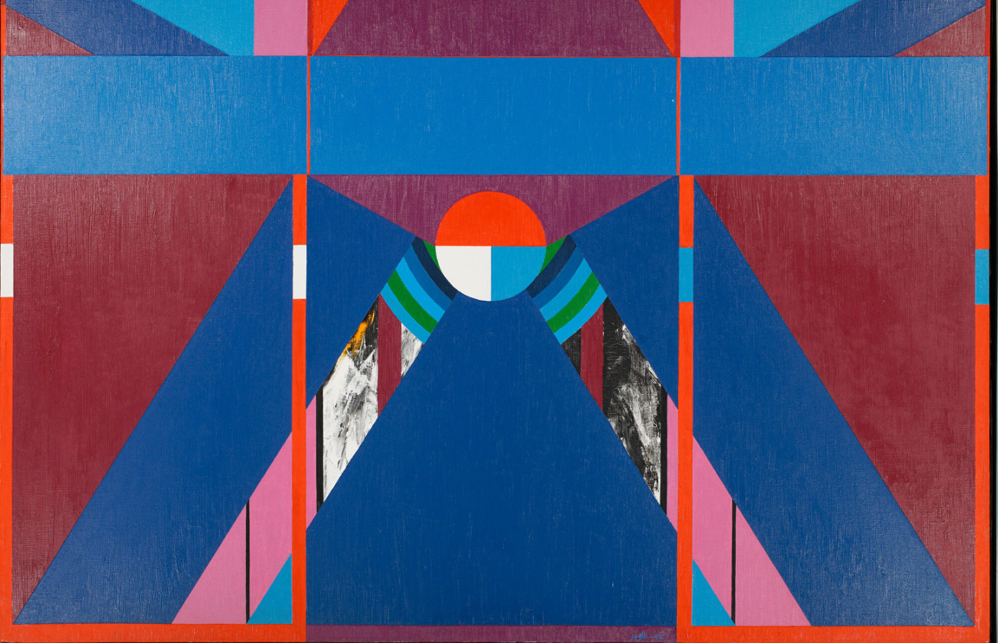
Canadian artist Harold Town (1924-1990), Tyranny of the Corner Puzzle Set,1962, oil and lucite on canvas, 82 x 75 inches, courtesy of Christopher Cutts Gallery
Although most galleries within the Art Fair showcase emerging contemporary artists, there are exceptions like Christopher Cutts Gallery booth A71, who highlights emerging talents such as Alexander Rasmussen alongside the renowned Canadian master Harold Town. Director Christopher Cutts made a noteworthy observation: “They positioned me in a corner this year, so I thought there was no more fitting artwork to display in that corner than Harold Town’s piece titled Tyranny of the Corner Puzzle Set from 1962”.
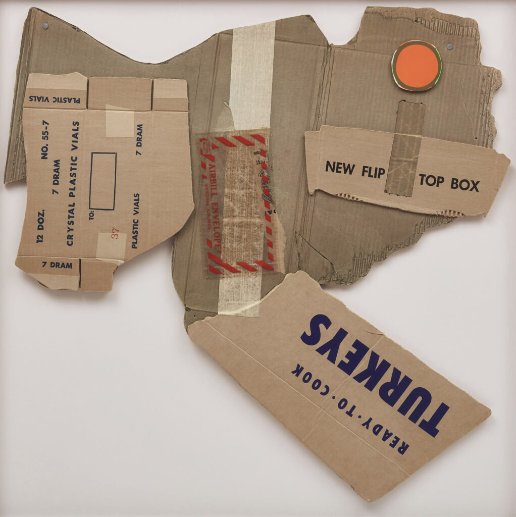
American artist Robert Rauschenberg (1925-2008) Cardbird lll, from Cardbird Series (Gemini 305), 1971, offset lithograph and collage with tape on corrugated cardboard, 35 x 35-1/2 inches courtesy Cowley Abbott Art AuctioneersCanadian artist Group of Seven Member Franklin Carmichael (1890-1945) Coal Chute, 1942, oil on board, 38 x 48 inches courtesy Cowley Abbott Art Auctioneers
This year signifies a milestone for innovators Rob Cowley and Lydia Abbott, who are continually expanding the limits of art sales. Together, they operate Cowley Abbott, Canada’s Art Auctioneers, which specializes in showcasing and selling secondary market artworks both regionally and internationally. Their Private Sales section, featured within the auction house and exhibited at the Art Toronto art fair booth A51, highlights Canadian masters such as David Blackwood, A.J. Casson, and Franklin Carmichael, alongside international icons like Andy Warhol, Robert Rauschenberg, and Larry Poons.
Rebecca Hossak Art Gallery at Art Toronto booth C54 featuring works by artist Nikoleta Sekulovic (1974-) (left) Alice, 2025, acrylic and oil stick on linen, 78-7/10 x 68-9/10 inches. Nikoleta Sekulovic (1974-) (right) Vanessa Bell,2025, acrylic and oil stick on linen, 84-3/5 x 72-4/5 inches
The Rebecca Hossak Art Gallery, booth C54, located in London, UK, showcases two remarkable artworks by the artist Nikoleta Sekulovic, who was born in 1974 in Rome, Italy, and has German/Serbian heritage. Sekulovic is among the most sought-after artists represented by the gallery. Last year, she presented two pieces at Art Toronto, successfully selling both, and subsequently featured her work at Miami Basel, where several pieces sold out. Sekulovic is a contemporary figurative painter renowned for her vividly conceived portraits that pay tribute to iconic women throughout history. She employs a unique style that she has cultivated, characterized by a contemporary craftsmanship reminiscent of Pre-Raphaelite design.
The art fair offers a wonderful experience for those seeking inspiration and knowledge from the numerous art dealers and artworks displayed.
Joanne Tod (b. 1953) is a renowned Canadian artist whose painting invites a deeper contemplation of the complex interplay between subject and form. Her meticulous technique and choice of color evoke a serious examination of the themes she explores. Each piece serves not merely as an aesthetic object but as a commentary on contemporary issues, urging the viewer to engage thoughtfully with the visual narrative presented. The strength of her work lies in its ability to resonate on multiple levels, blending personal expression with broader societal reflections. As Tod continues to push the boundaries of her artistic practice, her contributions to the art world remain significant and profound.
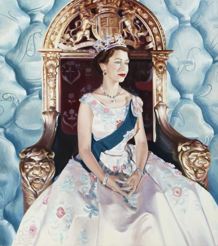
Joanne Tod, Queens, 1996, oil on canvas, 36 x 30 inches
Tod has become recognized and acclaimed in the contemporary art scene for her figurative artworks derived from photographs, employing irony to confront stereotypes, reveal vulnerabilities, and disturb preconceived notions regarding women, race, and social status. Few artists depict the complexities of the female experience as skillfully as Canadian artist Joanne Tod. She employs her expertise to amaze audiences by juxtaposing female subjects with meticulously crafted representational images. Tod was one of the trailblazing female artists to tackle women’s issues long before society recognized their significance in the 1970s. Her work is remarkably powerful, and her talent is undeniable. What she does is choose the images that are staples of visual culture and then, by a very subtle twist, manipulates the context of the image. In Tod’s practice, the use of irony serves as a means to reframe what we see, and to draw attention to the things people do and the society in which they exist.
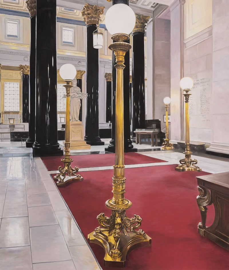
Joanne Tod, La Banque, 2025, oil on canvas, 72 x 54 inches
Her work currently on view at Caviar 20, located at 647 Dupont Street, Toronto, will run until November 29, 2025. This must-see show serves as a mini retrospective, highlighting works from various stages of her career. It includes an early piece titled “In the Kitchen” from 1975, created with acrylic on canvas, as well as a portrait of Queen Elizabeth II titled “Queens” from 1996, rendered in oil on canvas. Other notable works featured are “Morning at the MET” from 2007, also an oil on canvas, alongside more recent pieces such as “Beaver Snail” and “La Banque,” both from 2025 and executed in oil on canvas. Additionally, several smaller works like “5 O’Clock EST” from 2025, created with watercolour on paper, are included in the exhibition.
Joanne Tod, Beaver Snail, 2025, oil on canvas, 36 x 27 inches
Tod is regarded as one of Canada’s leading portrait artists, a master of figurative painting, capturing the prominent figures of the nation. Her style, characterized by vibrant brush strokes and a soft palette, is immediately identifiable. Few artists have the capability to showcase the finest attributes of their subjects as proficiently as Tod does.
Joanne Tod, Morning at the MET, 2007, oil on canvas, 64 x 48 inches
Tod, has enjoyed a career that few artists could ever aspire to. Her creations are cherished in every major museum across Canada, including the National Gallery of Canada in Ottawa, the Art Gallery of Ontario in Toronto, and the Musée des beaux-arts de Montréal to name a few.
Joanne Tod, In the Kitchen, 1975, acrylic on canvas, 54 x 36 inches
Joanne Tod is the only living artist remaining with us whose works are included in the book “Masterpieces of Canadian Art From The National Gallery Of Canada”; David Burnett, Published by Hurtig Publishers, Edmonton, Alberta, 1990.
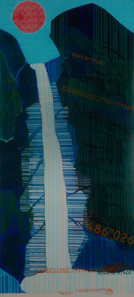
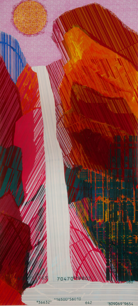
In Hyun-Young Oh’s Barcode Landscape: Landscapes of a Coded World 2025, the notion of identity undergoes a radical reconfiguration through the reductive logic of quantification. Drawing from Byung-Chul Han’s critique of the “datafication” of existence — where the self, culture and even nature is rendered as transparent, calculable and performative — Oh’s digitalised East Asian landscapes of multitudinous barcodes, QR codes and Bitcoin motifs function as contemporary vistas of a quantified cosmos. The formative identity of subjects within today’s electronically-mediated society — what Han calls the digital totality — which is no longer constituted through an imaginal proliferation of mythical metaphors, but through digitized codes, results into a homogenizing datafication of reality, in which the mythical opacity that forms identity is erased. Every mythical image is reduced into an algorithmic code; and every poetic idea collapses into an abstract equation.
Hyun-Young Oh, Barcode Landscape 202522, mixed media on canvas, 135 x 61 cm
Hyun-Young Oh vividly renders these cataclysmic shifts of electronic devouring through the intricate use of traditional Korean iconography. For instance, the cosmogonic mountain ridges of The Painting of the Sun, Moon and Five Peaks or the Irworobongdo — a dynastic symbol of the Joseon royal court — are reframed here as a digital womb of decontextualized codes, while the winding rivers, towering peaks and spectral moons of the sansuhwa painting style are translated into infinitesimal grids of information. These digitalised landscapes of randomised inventory codes and infinite-spawning quick response codes no longer anchor any type of cultural belonging; they become anonymous data, circulating freely across endless, circulating networks.
From within these hyper-networked mountains and the glow of electronic moonlight, compact masses of anonymous metropolises ascend like shattered fragments of a global motherboard all the way up to the fragmented sky; an architectural foreshadowing of digital chaos, before it is compressed into the lucid flatness of the screen held in the palm of the hand. In this digital fever-dream any regional identity deteriorates into global anonymity.
Hyun-Young Oh, Barcode Landscape 202526, mixed media on canvas, 135 x 61 cm
In this way, Hyun-Young Oh reveals that identity, that ceases to be national, territorial or genealogical and becomes something automatically generated, decoded and recoded through an endless digital circulation like an ouroboric feedback loop. For Marshall McLuhan, each medium reshapes the human sensorium and creates collective identity; the typewriter and print culture of the Renaissance undergirded the formation of national consciousness through linear and sequential thought. In contrast, digital media engender an international simultaneity. An engulfing “global village” that dissolves borders and hierarchies, replacing narrative continuity with networked multiplicity. But Oh’s iridescent landscapes of digital identifiers and ever-generating bitcoins neither lament nor celebrate this unparalleled transformation, but instead they delve into its paradox. The analogue gestures of gentle brushwork dreamily merge with the convoluted geometry of digital computation.
Hyun-Young Oh, Barcode Landscape 202527, mixed media on canvas, 135 x 61 cm
Traditional Korean iconography is not here to be read as a nostalgic ruin or a reactionary remnant of the past; rather, it functions as a recurring leitmotif of a newly emerged digital cosmology. The system-generated cipher codes and reprogrammed QR patterns do not hopelessly liquidate these enchanted panoramas of mystical mountaintops —such as the primordial Mount T’aebaek of Korean mythology — but they re-translate them into new contemporary idiom of today’s hyper-technological culture; tradition, once confined to charred horizontal boundaries on a two-dimensional plane, is now refracted through these mainframe codes of digital cryptocurrencies and scanning e-images into a mobile and vertical circuit that traverses the entire inhabited world with inexhaustible bandwidth. In Oh’s fluorescent canvases, identity is no longer a static essence but a continuously updating system; a cultural algorithm that retains traces of history even as it generates new mythical topographies. In encoding traditional Korean painting into the circuitry of the digital, Hyun-Young Oh profoundly succeeds in reforming a hybrid interface, merging thus the abysmal gulf of tradition and digitality.
In the contemporary art scene, few artists encapsulate the complexities of human experience as effectively as Canadian artist Katie Pretti. Born in 1980, she graduated with honours from the Ontario College of Art and Design in 2004 and obtained her Masters in Contemporary Art History in 2023. She is currently based in downtown Toronto, Ontario. Her creations may be regarded as entirely non-objective abstraction infused with conceivable figurative elements. Her artwork challenges viewers to engage in a dialogue between the recognizable and the abstract.
Katie Pretti sitting in her studio with a powerful work currently still in production behind herKatie Pretti sitting in her studio with a powerful work currently still in production behind her
Pretti’s art often creates a nuanced interplay where the figure is obscured or rendered in such a way that it becomes part of the surrounding abstraction. In some works, the forms are distinctly recognizable, while in others, they dissolve into a tapestry of colour and texture, demanding the observer to ponder the relationship between representation and abstraction. This duality not only showcases her versatility as an artist but also reflects the complexity of human perception.
Katie Pretti; The 4th Pathway No 4, 2012, 47” x 47”, acrylic, oil stick, oil pastel, and graphite on canvas. Private Collection
Through her art, Pretti invites us to explore the boundaries of abstraction and figurative representation. Each stroke and hue is deliberate, inviting the viewer to engage with the emotional resonance behind the images. Her unique approach encourages a deeper understanding of not only the figures portrayed but also the layers of meaning that lie beneath the surface. As her style evolves, the boundaries of abstraction are challenged.
Katie Pretti remains a pivotal figure in the art community, inspiring both admiration and contemplation among art lovers and critics alike. Her work is a testament to the power of art to evoke thought and reflection, transcending the simple act of viewing to become an immersive experience. Pretti’s contributions to the art world are not merely aesthetic; they are profound explorations of the human condition presented through a lens of abstract interpretation. As her career unfolds, followers of her work can anticipate the limitless potential of her creative journey.
Katie Pretti; Vanitas No. 10, 2010, 88″ x 75” oil stick, watercolour, pastel, graphite on canvas. Collection of Darren Saumur
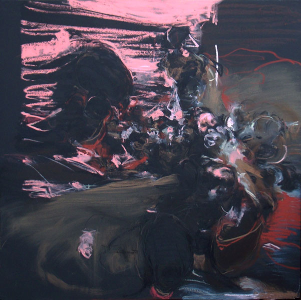
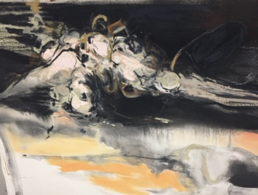
Pretti’s new works are a series of 12 pieces loosely based on the Vanitas trope, which is a theme from northern European paintings of the Baroque period. This theme is a reminder of life’s fragility, the transient nature of youth, and the inevitability of death. Also, most specifically, it’s a condemnation of vain pursuits. (The addition of which distinguishes this theme from the closely related memento mori paintings of the same era.) Traditionally conveyed through the depiction of a realistic still life, a Vanitas painting features an arrangement of objects which each illustrate an aspect of the moral. For instance, a skull is used to symbolize death; a burning candle, bubble, or hourglass signifies transience; decaying fruit or flowers represent decay; mirrors reference vanity.
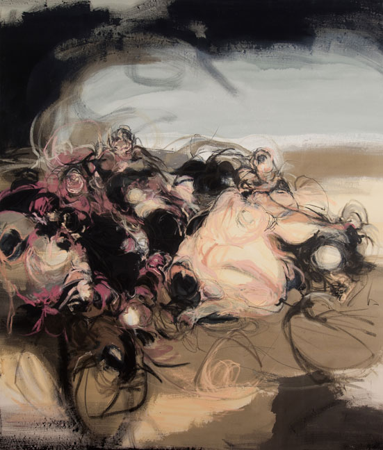
This theme holds additional importance for Pretti. It represents a return to a collection of Vanitas themed paintings she created in 2010, which was a crucial series in her career. It was designed as a series of 10 pieces to work together similarly to Claude Monet’s Waterlilies, allowing viewers to observe the transition of light from day to night in the backgrounds of the compositions, which essentially featured figures set within landscapes. Vanitas No. 10 features “imagined figures contorting within a foreboding landscape during the transition from day to night… these imagined abstracted figures are attempting, in vain, to resist the arrival of darkness. The onset of darkness is inevitable”. This piece, from Pretti’s initial Vanitas series, serves as inspiration for the current work.
When Pretti first approached the Vanitas theme in 2010, the entire notion of death’s inevitability was merely an abstract idea to her; she could only intellectualize it. However, after experiencing her own encounter with death, her perception of the theme of Vanities transformed. This led her to truly grasp the sensation of fragility. That experience profoundly motivated Pretti to apply to the Ontario Arts Council to explore the Vanities theme once more. Now, 15 years later, equipped with a genuine understanding of the fear of death, she is reassessing her interpretation of Vanitas, but this time with a darker and bolder perspective. She is not particularly inclined to include a “beautiful” landscape element in her work this time. In her own words, “I am really leaning into colour and playing with composition and, of course, abstracted figures to create imagery that will express slight discomfort, maybe some anxiety, and certainly moments of fear. That’s not to say that this is gonna be a completely unpalatable, dark, unapproachable body of work. Some panels are going to present as bright and some as dark, but all will be dynamic compositions using bold colour. And the pallet does shift incrementally over the panels creating a cyclic sense to the series.” Pretti is trying to translate a narrative into abstract elements that ask the viewer to use their intuition to interpret. This would define her general method of abstraction, indeed. You imagine that you are observing a figure, yet you understand it is not a representation of a figure.
Katie Pretti; Daemons No. 3, 2016, 54″ x 68” Acrylic, oil stick, oil pastel and graphite, on canvas. Collection of Jeanette Preis
Some of her work could be considered non-objective abstraction while some could be considered figurative abstraction. According to Pretti, Daemons No. 3 could be interpreted as one’s inner demons being so persistent that they’ve materialized into reality, like the daemon figure is emerging from a dark realm, pushing forward in space, toward the viewer, toward reality … it’s a scary painting lol.
Katie Pretti; Corpus Hypercubus, 2017, 52” x 42”, acrylic, oil stick, oil pastel, and graphite on canvas. Collection of Jenni BernardiKatie Pretti; Mudang, 2016, 54” x 65”, acrylic, oil stick, oil pastel, and graphite on canvas. Private Collection
Corpus Hypercubus and Mudang paintings were obtained directly from the artist’s studio during a private visit. They exemplify what Pretti describes as “in-between” works that “are hugely informative of future work.” Corpus Hypercubus distinctly displays elements of both landscape and figure, and, most significantly, it showcases media and colour experimentation that appear in later works. The term mudang, a female shaman who communicates with the supernatural through dance rituals, resulted in the creation of the Mudang painting. The stripes of colour in the black ground foreshadow key pieces Pretti has exhibited since.
Katie Pretti; Beside Myself 1, 2024, 58” x 54”, acrylic, oil stick, oil pastel, and graphite on canvas. Collection of the artist
Beside Myself 1 is a current abstract expressionist painting. The expression ‘beside myself’ can be understood as a complex, multi-faceted, and evolving imagery, literally merging into one another. Additionally, it may convey feelings of intense frustration and exasperation, or evoke a sense of gut-wrenching dread or regret.
Pretti’s artistic endeavours are most aptly likened to those of British artist Cecily Brown (1969-), as both artists deconstruct the form of the human image, merging it into abstraction. However, the artists from whom Pretti draws inspiration include Edvard Munch (1863-1944) (especially his woodcuts), classical old masters such as Giovanni Battista Tiepolo (1696-1770) and Henry Fuseli (1741-1825), as well as the Abstract Expressionists Mark Rothko (1903-1970), Robert Motherwell (1915-1991), and Willem de Kooning (1904-1997)…
Pretti currently has work on view at The Modern, Toronto – Niagara Inaugural group exhibition (230 Niagara Street, Toronto) on view now through to January 2026 alongside works by Ben Woolfitt, Francoise Sullivan, Mark Roth, Andre Fauteux, Cora Cluett, Judy Singer, William Griffiths and Sandy Van Iderstine.
Pretti has held studios in Los Angeles, Buenos Aires, and Brooklyn, and has been artist in residence at COME (Buenos Aires), Ctrllab (Montreal), The White House (Toronto), and Spark Box Studios (Picton, Ontario). Her book of drawings, Sonority of Words, was launched in Toronto by Art Metropole. It was featured at the 2007 NYC Art Book Fair, and added to the Artists Books Library at the National Gallery of Canada. Pretti has also been profiled in Carte Blanche Volume 2: Painting, ArtSync, ArtSlant, Magenta Magazine Online, Elle Canada, Fashion Magazine, Canadian House and Home, and Inside Entertainment, among others.
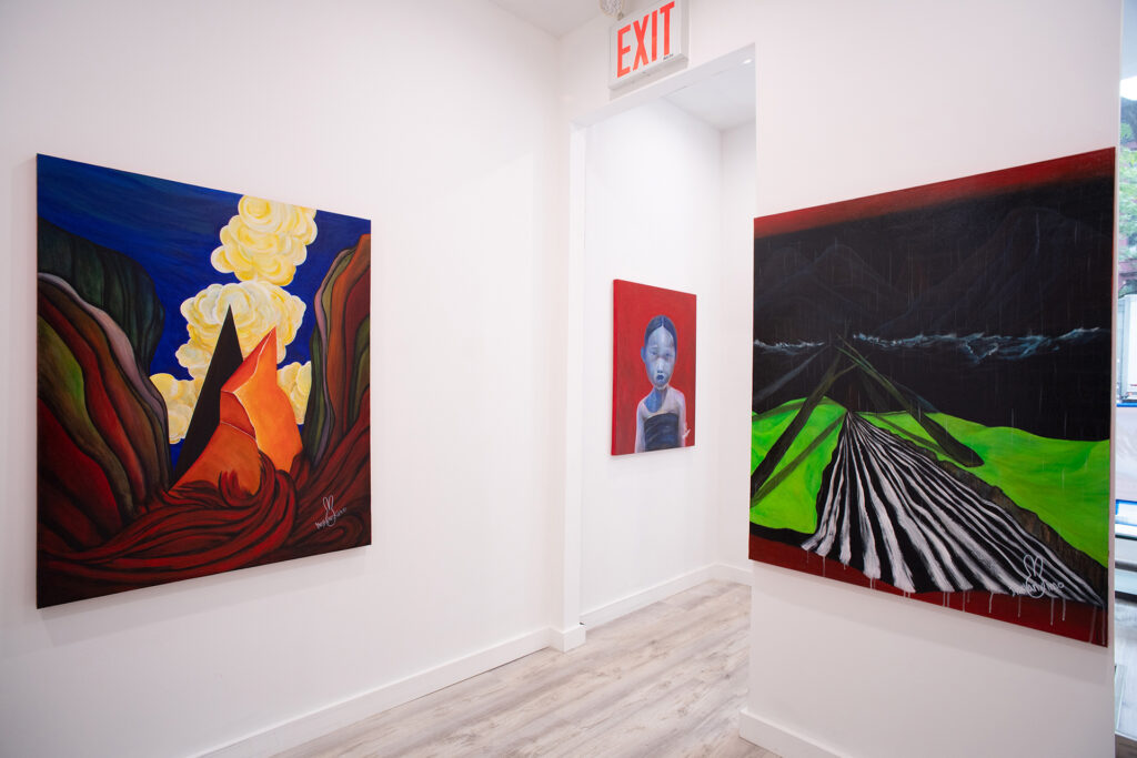
Installation View of Dressvanximo’s “The Stranger” Solo Exhibition
Dressvanximo’s solo exhibition titled, “The Stranger,” at Gallery Wave in NYC is a psychological thriller and surrealistic experience. The Korean artist takes the violence of our encounter with the strangers in the streets and re-packages it as the dream-like landscapes and portraits, which speak of the journeys and encounters from life itself, universally-speaking. Featuring 7 paintings of striking colors and mentality that deal with the uncanny and the relationship between the known and the unknown, the exhibition is a mini survey of the artist’s prolific output.
Born in 1992 in South Korea, Dressvanximo has studied and pursued art for all his life. However, commercial success has been slow for the artist, whose incompatibility with the South Korean market owes to the fact that the artist paints with honesty and style that is aggressively formulated or violently suggestive at times. The collectors in South Korea usually gravitate towards pretty pictures of flowers and calm, meditative landscapes more than Dressvanximo’s straightforward images of skulls, for example, which would imply the rather depressing subject matter of human weakness and mortality.
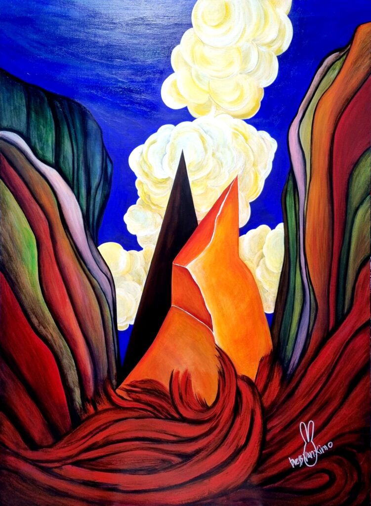
Dressvanximo, Deus Ex Machina, 2025, various materials, 45.9 × 35.8 inches
The most striking painting at the exhibition is “Deus Ex Machina” (2025), which is a psychological landscape? The image depicts a simultaneously crystal or lava-like formation juxtaposed to a black, triangular abstract shape and surrounded by a flowing topology with hairlike grooving and a sky with floral cloud patterns. A bit Giorgio De Chirico-esque (in terms of visual style) and a little bit like Salvador Dali (in terms of the content), the painting is the encounter between the familiar and the unknown, between the deja vu and the uncanny, and between the known self and the other (or the stranger). Who is at the core, and who lies outside at the periphery? It is hard to say.
The contradiction of visual language is laid out there for everyone to question and experience: the very act of defining the features of the orange formation (which is either geological or psychological in nature) limits it to just that, preventing us from associating it with anything else; however, the black triangular form is ambiguously formed and abstracted to the extreme (like a question mark) so that we can place ourselves in the black shape’s perspective or position. While, at first, the black shape appears as the unknown other, we slowly find out that the black shape is in fact ourselves and our subjecthood… The external world is already pre-defined, but our subjecthood is ongoing as an undefined operation and open to all possibilities enacted by our free will. Furthermore, it is the object that reflects the most light that is darkest inside, and the black shape is filled with light internally. If light is the symbolic or metaphorical device for the knowable and the self, then the black triangle is the self while appearing as the stranger, and the orange shape is the other, even as it tries to masquerade as the familiar self.
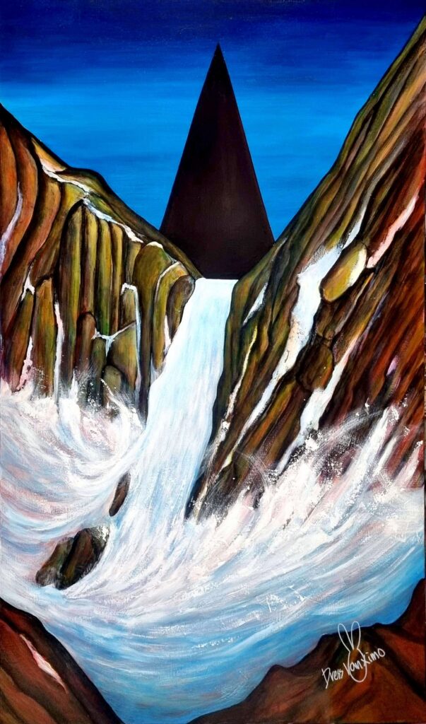
Dressvanximo, Silence, 2025, various materials, 46.0 × 28.6 inches
On the other hand, Dressvanximo’s painting with the highest level of depth and finish is “Silence” (2025), which again features the black triangular shape at the horizon, which is beneath the silhouette of the cliffs and the waterfall falling below. What is the artist trying to say with this landscape painting? If the landscape could be understood as a metaphor for identity formation, it appears to speak of the relationship between the self and the other. The encounter between the self and the other could be marked by psychological scars, but what is even more violent is the encounter between the self and the self. Self in relation to self is the most dangerous and risky because it requires greater honesty, strength, and integrity, to not sugarcoat one’s shortcomings as strengths or to mistake one’s honesty as a weakness. Brushing off one’s own failures in the form of self-praising propaganda invites more blunders, failures, and hurt in the future, so the healthy formation of a strong identity requires a high degree of honesty, rationality, and good intent.
It could be argued that the black color of the abstract geometric shape, which serves as a marker for the self in relation to the external world, assumes a secondary metaphorical purpose. It would be to illustrate the artist’s own frustrations and qualms with the South Korean society and art world, which has been messed up inside and out by money and power (like all capitalistic societies, including the US). Has the market hijacked the virtuous language of art to generate value with value, allowing for a cyclical feedback loop with influencers promoting their mediocre children for a great sum of money, and blind critics praising “art” corrupted with money and notoriety like automatons? The artist believes so.
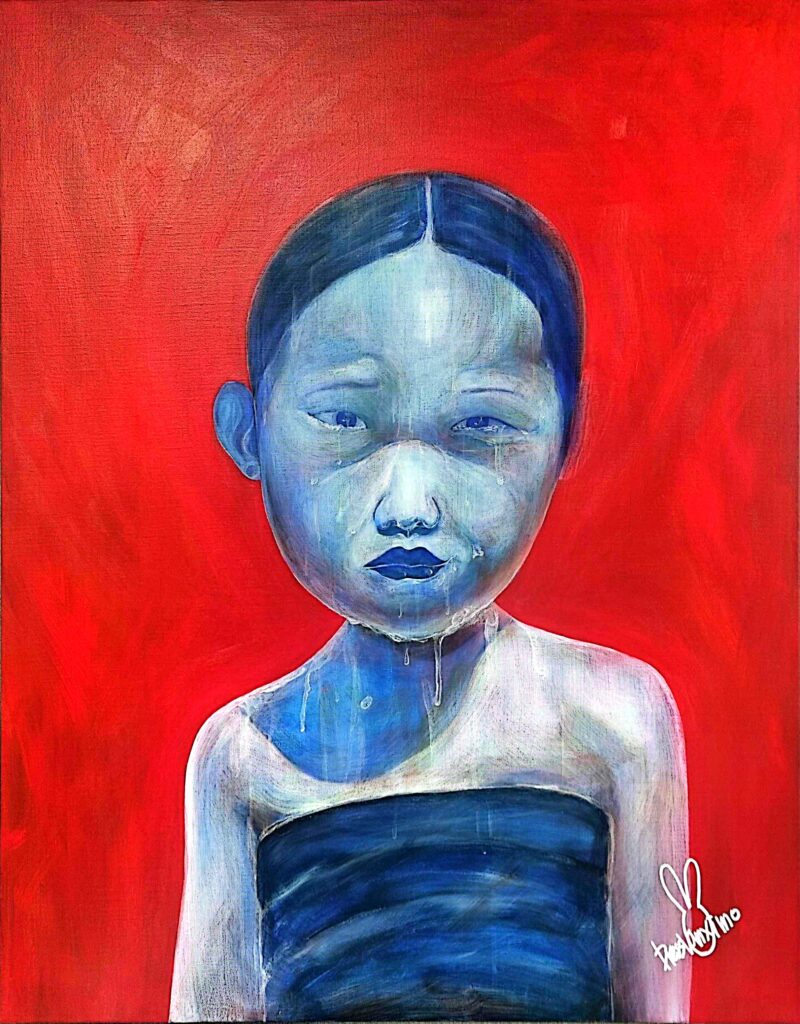
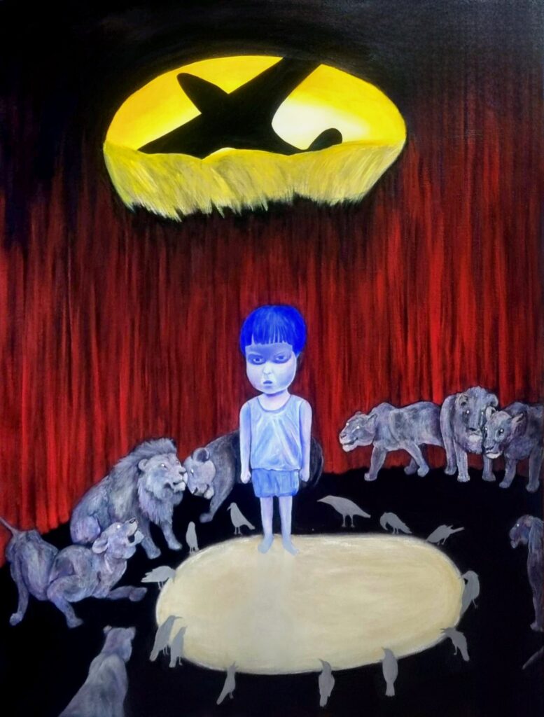
The figures are equally compelling works, which include a portrait of a Korean boy surrounded by lions (“A Black Bird Covered the World” (2024)) and a painting of a girl based on a a historical photograph from the Korean War (“Innate Goodness, Innate Evil” (2024).
In the case of the boy, we observe the great anger and hatred for both the other and the self, which stem from the great violence of chasm of difference in power. The boy is completely helpless against the lions, so the situation requires greater strength from the boy to acknowledge the weakness of the self… greater than the combined sum of the powers of all the lions in the scene. Indeed, yin and the yang are intertwined, and the sheep assumes the role of the lion, while the tiger is in fact the rabbit, underneath the mask of the predators’ faces. The boy, in the moment of acknowledging the defeat of the self, perishes with great pain and psychological damage as he is eaten by the lions as food and a piece of meat. Yet, in the same instance, the boy garners enough power to not only survive the destruction of the ego but also protect it with an unbreakable shield (of wisdom and love).
In the case of the girl from the Korean War, she is somehow reminiscent of the comfort women who were taken into sexual slavery during the Japanese occupation of Korea. This is just as “The Scream” (1893) by Munch somehow magically foretold the self-destruction and the subsequent nihilism of Europe (and the world) during the greater wars that followed in the 20th century.
As the artist points out, her left eye and her right eye are slanted in different angles, which is suggestive of good and evil in the same face. This is a great, earnest study of the self that acknowledges both the capacity for good and evil, and the light and the darkness of the self. The self’s future is not predetermined, due to the unpredictable nature of free will and quantum physics, but the image of the self can be summed up as an archetype of a fox or a lion (or a wolf or a tiger). The core of the self is quintessentially a tendency or a force (like acceleration) that generates a particular trajectory over a series of events or circumstances.
The discussion between the self and the other and the self and the self provides a new way of understanding the difference between and the nature of good and evil. What is good? What is evil? What is the self and the other in relation to these concepts or values?
How do we try to use propaganda and linguistic tricks to repackage our own mistakes as good and others’ trials as failures? What is the true nature of the self that wants to be a tiger and a king, even if this requires the expense of others, who are relegated to a lesser role?
Buddha prior to his divine state of enlightenment was Siddhartha Gautama, and he escaped the palace although he was a prince because he wanted to solve the suffering of all of mankind. Jesus Christ also asked his disciples to give up material wealth and to follow only him and his spiritual word. This is exactly the opposite of most people who are materially concerned and worship money and power. The difference between good and evil, between tiger and fox, and between the king and the subject… lies in the nature or the character of the core of being and existence.
What we learn from Dressvanximo’s works and self investigation is that the king is not king, power is not power, truth is not true, and the self is not the self that we think we know. Furthermore, the distinction between the self and the other is much less than the difference of understanding and repackaging the self as self… between the self and the self.
What we finally understand is the virtuous must master the art of the lie, while the conmen must understand the principles of truth. Power is the art of letting go of power, and the yin and the yang of the cosmos brings us to a full circle from a position of weakness to strength and back to weakness in ever-fluctuating changes of paradigms. The Nazis of the European theater and the Japanese soldiers in the Asia-Pacific during World War II are not so “evil” or different from the less evil others who may fantasize violent pornography or follow the orders of a fascist dictator-wannabe on a morning in January. Evil is not necessarily purely evil, and good is not entirely good. Purity of thought is not healthy or feasible. Justice is not a pure concept. It is not so straight-forward.
Dressvanximo, A Black Bird Covered the World, 2024, various materials, 35.8 × 28.6 inches
Yet, the arrow of justice is there. It points to a direction of what is good based on the sum of all events and situations. It is a human concept and intuition.
Within the complexity of the world, which is exacerbated with the rise of AI, fake news, and fascism, artists like Dressvanximo demand greater honesty, sincerity, and engagement with the world. Who are we? Where do we come from? What are we capable of? Are we the good guys or the bad? What is human nature?
It is a human who could hurt another human and then contemplate the nature of this wrongdoing in relation to the self. The human speaks from the heart a tormented scream, just like Munch’s iconic painting… a life lived and decisions made demands transparency, strength, and integrity because we are human, and it is human nature to seek the arrow of justice and love, wherever it might be headed.