Alex Cameron: Swashbuckler

by Gary Michael Dault

All the good things that can be said about a painter have been said about Alex Cameron. Which is not to say that they ought not be said again and again and again. Especially now, after his grievous and entirely unexpected death from a serious fall not far from his Toronto studio last June 17. He was seventy-eight years old.

Much will rightly be said, now and in the future, about Cameron’s pauseless exuberance, about his adventurousness: about his working as a studio assistant to the legendary Jack Bush, about his serving for over a decade as a mechanic for champion Formula 1 and 2 motorcycle racer, Miles Baldwin, about his intrepid voyaging into the wildernesses of Northern Canada and Western Canada, of India and Nepal. Fearless and dashing stuff. 

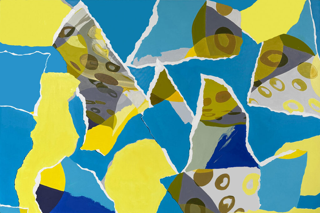
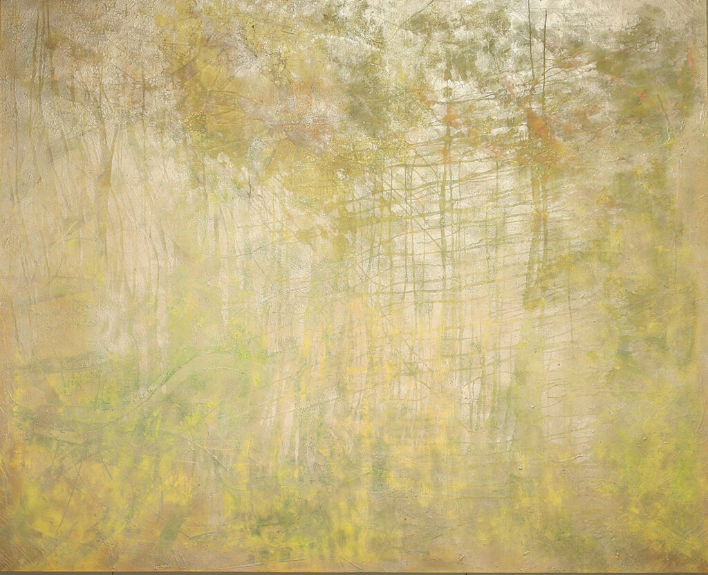
Alex Cameron, Yellow, oil on canvas, 40 x 50 inches. Courtesy the Bau-Xi Gallery, Toronto
Alex Cameron, Yellow, 2019, oil on canvas, 40 x 50 inches. Courtesy the Bau-Xi Gallery, Toronto

But while there is a lot to recount about Alex Cameron’s searching, expansive life—as an explorer in a tireless pursuit of colour and vista, form and transcendence—I just can’t bring myself to rehearse much of that bio-stuff here and now.  Others will supply all that.  For me, all I can think of right now is Alex Cameron and paint, Alex and the utter rapturousness of pigment. The Alex Cameron in my heart right now is the Alex Cameron who once explained to some interviewer that he saw his skies as “colour fields,” noting that he liked having skies in his paintings so that he could “stick stuff in them.” “Stuff” being paint.

I once began a catalogue essay for a Cameron exhibition at Toronto’s Moore Galley called (unhappily, I thought), “2001—A Paint Odyssey” (the Kubrick film had just come out), with a paragraph that I hoped simultaneously introduced and also summarized the kind of painter I felt Cameron was (and was still becoming): “Alex Cameron’s paintings,” I wrote, “are immensely, winningly genial. There is a painterly robustness about them that is remarkably infectious. And while this by no means denies them aesthetic ambition, it does mean that their seriousness lies behind and within the artist’s love of painting for its own sake. To look at a Cameron, to open yourself to one, means there is a good deal of joy to be got through before you come to the core of it—an onerous enough task in the generally repressed hedonism-wary times in which we live” (clearly nothing much has changed over the past quarter century).

Alex Cameron, Purple, 2022, oil on canvas, 30 x 30 inches. Courtesy of Bau-Xi Gallery, Toronto

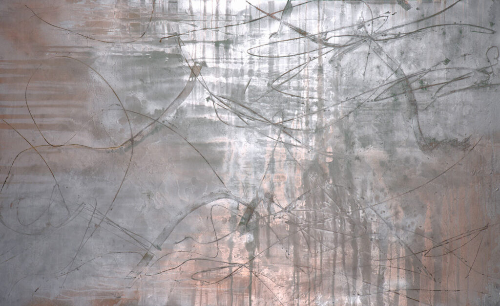
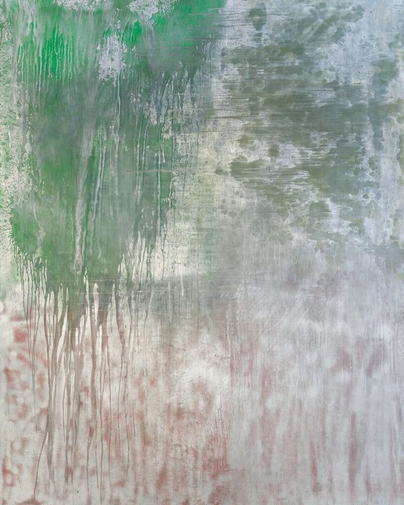
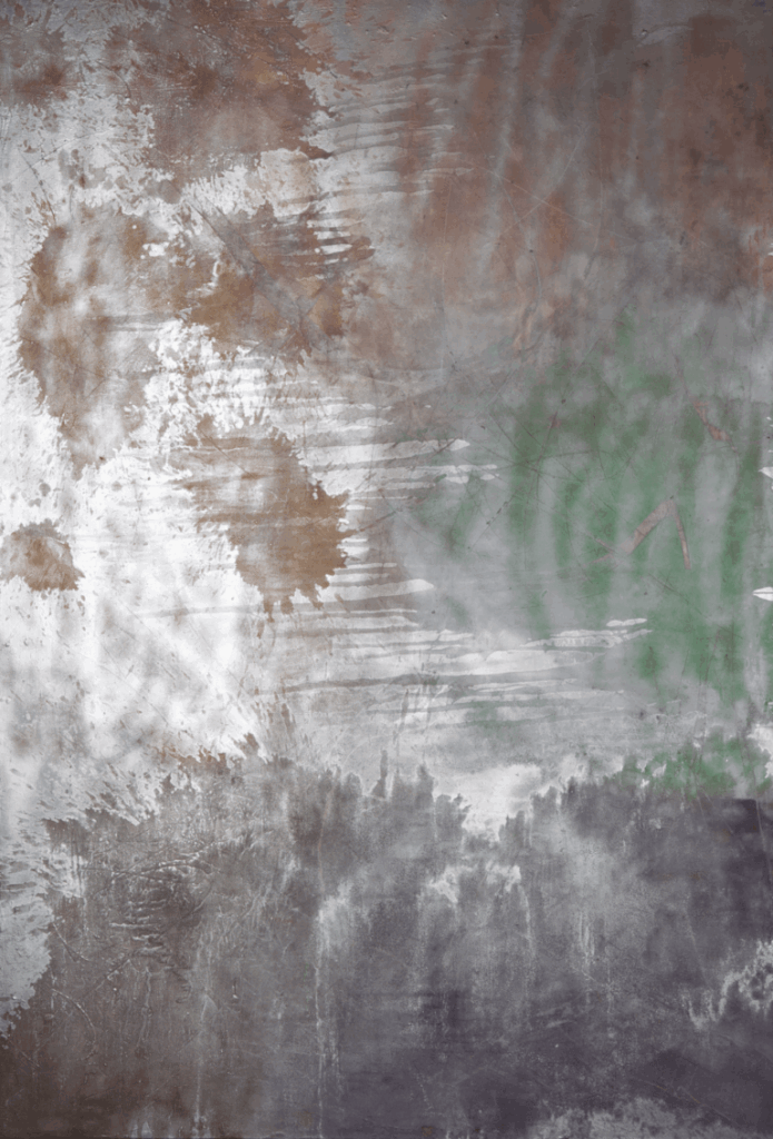
The Cameron paintings I was writing about around this time (2000-2007) were usually large, airy, non-representational works which tended to be made up of painterly dots and swipes, flanges and rinds of colour, feathery sweeps of the brush over his gala surfaces, and a recourse to very hot, strident hues (plummy violets were big with Alex, I remember, and oxidized yellows and roasted tomato reds). Sometimes parts of the canvases were sprayed.  I remember being a bit discomfited, though, when The Globe & Mail titled one of my full-tilt articles about Alex (April 21, 2007) “Fauvist Fandango” (newspaper writers do not get to title their own pieces).

Alex Cameron, My Pinery, oil on canvas, 60 x 60 inches
Alex Cameron, My Pinery, 2007, oil on canvas, 60 x 60 inches

In a discussion of a big oil painting called “Gabriell’s Wings” from 2001 that I wrote about for the Moore Gallery, I noted that Alex was “A skilled landscape painter when he chose to be (his idea of a good tine is to be helicoptered into the wilderness and set down amongst the bears and beavers to paint the solitude).  Cameron,” I continued, “builds his abstractions on a firm footing of landscape-derived shapes—a bright swatch of lake-like horizontality across the bottom of a painting, above which a cheeky, serpentine wobble of pigment, an echo of a far shore, softens you up for entry into the aerial ballet taking place up in the rest of the picture.” I spoke of the “electric agitation” of his pictures. And I made admiring mention of the way Alex would smear paint onto his surfaces with his fingers or “let fly with it so that the deep space of the paintings is galvanized by infinitely small threads and hot wires of pigment—tiny, shrill utterances of hue.”

Eventually, inevitably, the Landscape-Idea shouldered its way decisively forward, informing the stream of vigorous, muscular landscape paintings that would now preoccupy him for the rest of his career.

And remarkable landscapes they always were. Alex gloried in the untouched forest and, in painting after painting, became its scribe, anthologist and, to some degree, its archivist.  This latter tendency actually used to give me pause sometimes. The fact is, Alex painted trees so vividly and convincingly they were themselves—or so I thought—beginning to encroach, as an almost documentary subject, upon the progress of his painting qua painting.   

Alex seemed to sense this himself.  And he gradually began throttling up the paintings so that the contretemps between his beloved subject (trees) and his handling of them (in daring acts of pigment) turned increasingly into a virtuoso tussle than a dutiful homage.

Which is to say that just when the paintings were on the edge of becoming too nakedly arboreal, Alex began using the trees—the forest skyline—as his armature upon which to drape and generally festoon his increasingly writhing and tumultuous attacks of pigment.  The artist’s forest increasingly became trees, not as they could be taxonomically described, but as they were felt—as purely visual objects in a scintillating visual field, as gloriously life-enhancing vectors thrusting up into the painterly light.

Alex Cameron, The Crashing Plane, 2020-2022, oil on canvas. Courtesy of the Bau-Xi Gallery

It strikes me that these descriptions of Alex’s excitingly lush and scrappy production of big sinewy wilderness paintings might position him, in the minds of people who didn’t know him, as a big, brawny, rather Paul Bunyan-esque figure, bestriding the waiting landscape like a colossus.  The truth is, Alex was a slight, tensile, quick and rather elfin man—with a boyish grin so infectious it was almost impossible not to see something leprechaunish in him.

While this enjoyable, mercurial joie-de-vivre was a sort of admirable constant in Alex’s life, he endured a number of distressing medical events which might well have stilled and silenced a less perpetually resilient man. I remember an afternoon in which painter David Bolduc—Alex’s best friend and mine too—and I were chatting at a Toronto coffee shop we liked called Il Gatto Nero (it was maybe 2007 or 2008) when Alex came to join us. I remember how, during one gregarious moment, he causally mentioned that he had just suffered a slight stroke which had left him with a strange floating rectangle of pure white blocking his eye—I think it was his right eye.  David and I were distressed, but Alex gave us the impression that he would simply soldier cheerfully on, seeing the world around this intrusive white spot. I can’t recall his ever mentioning it again. Then, in 2012, he suffered a much more serious stroke which left him entirely unable to use his right arm. Anyone else might have given up painting in despair. Alex being Alex, however, he simply set about learning how to paint with his left arm alone.

Not only did this would-be deprivation not appear to alter or diminish Alex’s progress as a painter, the paintings he would make from 2012 until his death this year would be the most brawny, restless, opulent and downright ecstatic of his career. His trees and lakes commingled exuberantly with his clouds and skies until each of his canvases shuddered and heaved with convulsive, painterly life. These later canvases grabbed you by the lapel and shook you until your sensibility rattled.

Look at a painting like My Dad’s Forest (2015) or the exquisite Colours (also from 2015).  Pictures like these offer—just as a technical feat—the best, most virtuoso paint-handling I’ve seen in Canadian painting for decades. Look hard at them and your eyes will never be the same.

The late Camerons are not so much landscapes as paintscapes. If the wilderness is in peril (and when is it not?), then Alex Cameron would try to brush it back to life.

 He loved to paint. And now his paintings will live for him.

You Think That’s Funny?

by D. Dominick Lombardi, curator and participating artist

September 6 to November 16, 2025
Hammond Museum & Japanese Stroll Garden

Cary Leibowitz, Painting is Not Dead? Painting is Dead? (1998), marker on found photographs, 10 x 16 inches, 11 x 17 x 1 inches framed

Humor in Contemporary Art is a funny thing. Seriously. An exhibition with humor as its specific theme is not something you often see in galleries or museums. There have been exceptions over the years, where artists like Saul Steinberg, who straddled the two worlds of fine and commercial art with his many brilliant The New Yorker Magazine covers; and the outlandish works of Marisol Escobar and H. C. Westermann who have their own unique brand of humor, can be seen in museums throughout the world – artists that would not have been as successful without the recognition of their wit and humor. Today, some form of humor, albeit on the darker side, can be experienced in the contemporary works of numerous well known artists such as Carroll Dunham, Sarah Lucas, Barbara Kruger, Peter Saul, Erwin Wurm and last, but definitely not least, Maurizio Cattelan, who all have varying levels of dark humor in their creations.

Maurizio Cattelan, A Perfect Day (1999)

The title of this exhibition, “You Think That’s Funny?,” comes from an email conversation I had with Mike Cockrill, one of the artists in the exhibition, who has been toying with the limits of humor in art since forever. He sees humor and the extent of what can be publicly tolerated as a satisfying challenge. He, like many of the artists in the exhibition, presents us with something to make us laugh privately, but maybe feels a bit uncomfortable when expressed in the public realm.

The artists selected for this exhibition have accepted the fact that there is humor in their art. Using a variety of media, styles, references and messaging, they all have created narrative art that should make visitors at the very least smile, or at times laugh out loud. What is also important to note is the substance beyond the initial humor. Humor only goes so far, so while these artists have your attention you can appreciate the abilities and techniques used in the fabrication of their very intriguing work.

(left) Todd Colby, To the Future (2024), acrylic and mixed media on canvas, 24 x 24 inches; (right) Peregrine Honig, Wonkey Donkey (2006), pen and ink, Gum Arabic, pigment on Strathmore, 10 ½ x 10 ½ x 1 ½ inches, all images courtesy of the artists
(left) Todd Colby, To the Future (2024), acrylic and mixed media on canvas, 24 x 24 inches; (right) Peregrine Honig, Wonky Donkey (2006), pen and ink, Gum Arabic, pigment on Strathmore, 10 ½ x 10 ½ x 1 ½ inches, all images courtesy of the artists

Todd Colby uses words and images to create weirdly symbolic, diaristic mixed media collages, paintings and sticker commentary that all have substantive impact. As a poet, writer and visual artist, Colby blends an endless series of investigative thoughts and images ignited by keen observations that, when added to a common surface, shed a humorous light on the often brazen and hard to bear new realities in our current sociocultural and political landscape. Peregrine Honig also utilizes words and images to create humorous vignettes, however in this instance, Honig’s art is more specific and far more intimate. Working with pen and ink, Gum Arabic and pigment on paper, Honig presents previously innocent stuffed animals in far more mature social situations that many adults can easily relate to. In doing so, humor is maintained, but in a very different light, whereby the source of one’s distinct personality traits, positive and negative, can be traced back to one’s early days at play.

(left) Rita Valley, WTF (2019), mixed materials: silk brocade, vinyl, satin, paracord. 48 x 47 inches; (right) Norm Magnusson, Horse (2025), archival computer print, 24 x 18 inches

Rita Valley is fed up with the state of our union. Utilizing her skills with fabric and fringes, Valley gets right to the point as she confronts the viewer with familiar terms of dissent. Using fancy patterns, shiny surfaces and heavily textured accents, Valley projects a passionate belief system that is being attacked on all sides. However, at first glance, the feeling one may get from her art is one of a universal, reactionary-type of humor, pulling the viewer in, as they think more deeply about what is hounding their own worlds. The art of Norm Magnusson reveals a multi-pronged approach to humor that varies between county fair controversy and lowbrow art bombs to more serious issues regarding our collective state of mind. Magnusson is a master at pairing words and images, contrasting references and recognising timely subliminal links that creep up on you unexpectedly. Magnusson constantly reminds us to stay engaged and to look at the world with both delight and suspicion.
(left) Judy Haberl, Sausages (2020-25), jewelry, pearls, sausage casings, acrylic medium, sizes variable; (right) Bret DePalma, Art Ham (2024), acrylic,collage on canvas, 48 x 48 inches

Judy Haberl grew up in a home where food was often extremely experimental, as her father advised NASA on their “food in space program…”. Her family ate “…dehydrated foods to test for edibility,” which were usually godawful, as these early experiences with laboratory food still influences her art to this day. Included in this exhibition are her humorous sausage casings filled with faux jewelry, and witty Baby Cakes made of colored Hydrostone as she reminds us that it’s all getting too far afield from wholesome whole foods. Bret DePalma pushes his narratives well past reason. Nothing fits, yet it all works once his paintings are completed. No color, perspective, symbol or representation is off the table, as he weaves through uncharted spaces that sweep across his mind. The humor, which is very complex and layered, begins slowly and tentatively as the viewer comes to terms with what is in front of them as they wonder where all this wizardry comes from.

(left) Susan Meyer, Maggie, 2025, wood, foam, acrylic, Apoxie Sculpt, paint, 2 x 3 inches; (right) Jeff Starr, Landolakes (2024), acrylic, marker on paper, 15 x 13 inches

Susan Meyer’s sculptures have a B-movie type futuristic look to them that feels timid in one way and grandiose in another. A bold mix of emotions that gives her work a unique sort of humor that is subtle but effective. This is not to say that there is no depth here, there is, and much of it as exemplified by elements of High Modernism as a distinct placeholder, especially with respect to the aesthetic, while the presentation of materials in their curious shapes and colors adds contrasting notes of frivolity and seriousness. Jeff Starr creates mixed media paintings that feature multiplanar realities. These planes, which could not be more different, shift back and forth between an idealized ‘real world’ and an imagined astral plane that transcends what is considered normal processing of space and time. This overlapping of universes forms a visually halting transition, perhaps the way alien space travelers may perceive our world on their terms, focusing more on unknown elements we can not see, while turning the whole thing into an absurd visual conversation.

(left) Jim Kempner, The $6 Million Dollar Banana Split, video, running time 5:33; (right) Cary Leibowitz, Cubism? (1998), marker on found photograph, 8 x 10 inches, 11 ¼ x 9 ¼ x 1 ¼ inches framed

Jim Kempner, a well known, decades long art dealer on the corner of 23rd Street and 10th Avenue in New York City’s Chelsea District, is one of the more colorful individuals on the scene. A passionate purveyor of prints, sculptures, drawings and paintings, Kempner sees the humor in his daily reality and does something about it. His seven season video series, The Madness of Art, is a much needed breath of fresh air, a break from the austere atmosphere NYC galleries too often project when coming face to face with the general public. Cary Leibowitz uses words masterfully, and we never know if he is being cheeky or in the middle of a crippling crisis. Or is it both? Either way, Leibowitz’s art will forever stir things up by disrupting the viewer’s typical train of thought. Whether it’s cute stuffed animals, symbolic ceramics, intricately cut placards, pennants, paintings, shopping bags or an all out outdoor installation, Leibowitz leaves us with an indelibly blazing, bold and unexpected mark on many things searingly sociopolitical to the brilliantly benign.

(left) Mike Cockrill, The Door (2013), acrylic on canvas, 46 x 36 inches; (right) Mary Bailey, Pox - Let’s Go Viral (2025), wood, acrylic paint, 5 x 2 ½ x ⅞ inches
(left) Mike Cockrill, The Door (2013), acrylic on canvas, 46 x 36 inches; (right) Mary Bailey, Pox – Let’s Go Viral (2025), wood, acrylic paint, 5 x 2 ½ x ⅞ inches

Mike Cockrill’s art portrays feelings of hopelessness, futility, ecstasy or enlightenment. Using easily recognizable figures like clowns and the typical office worker stuck on a never ending wheel to nowhere, Cockrill strikes at the heart of the circumstances he presents in ways that will make the viewer smile or laugh at first, until the weight of the situation breaks through. After that, it’s back to the humor in a continuous cycle of responses that would never be as potent if not for the clever, straightforward, high quality of Cockrill’s art. Mary Bailey’s primary medium is painted or scribed wood that, when messages or symbols are added, has anywhere from unique tinges of Surrealism to a persuasive form of Pop. In her most recent series of symbolic cigarette packages, Bailey sends powerful socio-political statements utilizing her own brand of dark humor to make her point, concerns that are growing more and more troubling every new day. In the end, Bailey dives deep into realities that are best served with a little humor or all is lost.

(left) Cathay Wysocki, Expeller of Erroneous Thought (2022) acrylic, collage, sand, glitter, beads on canvas 20 x 16 inches; (right) D. Dominick Lombardi, CC 113 UC (The Impossibility of a Skinned Knee) (2021), sand, papier-mâché, gesso, acrylic medium and objects, 11 1/2 x 12 x 9 inches

Cathy Wysocki makes art that swings back and forth between fear and fantasy. Wild colors and crazy narratives somehow make everything oddly copacetic. The limits of which are stretched to the breaking point in every imaginable way. Hideous/Beauteous comes to mind here as Wysocki weaves her way through highly textured surfaces where emotions run raw and rampant propelled by a limitless and lively aesthetic. Very often in my paintings and sculptures, humor is presented as a prompt or a reward for looking at the art. With the sculpture CC 113 UC (The Impossibility of a Skinned Knee) (2021), I take a shot at the art world in general, and Damian Hirst specifically by making reference to his most famous early work The Physical Impossibility of Death in the Mind of Someone Living (1991) where a tiger shark is suspended in a clear glass and steel tank filled with a 5% solution of formaldehyde.

Adam Niklewicz, ERWIN (2024), cardboard box, rubber boot, 30 x 12 x 14 inches

Adam Niklewicz joins the fun with ERWIN (2024), an homage to the outrageous sculptures and photographs of Erwin Wurm. Like Wurm, Niklewicz often pairs absurdly unlike objects in penetrating ways to twist, confuse and delight – it’s physical comedy in 3D, yet there is something deeper and darker looming in the unconscious here. It’s called unencumbered imagining, free association, the ability to literally think outside the box and get excited about some of the most banal objects of the day-to-day.

Gary Michael Dault: A Self Interview

“…but it is extremely difficult to watch oneself working….”

                       –Xavier deMaistre, Voyage Around My Room, 1794.

Q: When did you first paint?

A: In 1952, when I was twelve. My friend, Robert Nunn and I walked to the edge of the St. Lawrence river (we lived in Kingston) and despoiled a canvas board each. His despoiling was better than mine; his painting was bolder, louder and more decisive than mine.  He was a barely pubescent Vlaminck or Derain. My painting was timid, abashed.  It was a timidity, a diffidence, I then set about to outgrow.

Q: When did you first exhibit?

A: In lots of momentary, glancing-blow places, but my first SERIOUS exhibition was in 1983, at the Jane Corkin Gallery in Toronto.  It was a big show of works on Paper. I was forty-three and in the throes of teaching and writing about art—other peoples’ art. 

Writer turned painter: Gary Michael Dault; the former art critic for The Star; shown here with his painting Burnished Day or Conch Of The Voice (mixed media; 1983) opened his one-man show at the Jane Corkin Gallery yesterday. The show runs until April 23.

Q: Let’s jump ahead about 40 years. How did your summer-long exhibition at the Periphery come about?

A: Entirely through the kindness and courtliness—the agency—of architect, artist and musician Dimitri Papatheodorou, for whom the Periphery is both a country home and a six-acre estate-wide workshop near the pastoral, pixilated village of Warkworth, Ontario.  Papatheodorou describes the Periphery as a landscape containing visual art, music, performance and architecture, seeing it as a “time-based project” where he pursues his painting (in the exquisite new studio he has recently designed and had built) and, in a spacious gallery next to it, mounts summer-long exhibitions of some artist whose work he likes (last summer’s exhibition was of paintings by Toronto-based artist Greg Angus).

Q: What makes up your Periphery exhibition?

A: It’s in two parts. The first is a small retrospective, a mounting of a dozen works on paper from 2005 to 2015. The second part, titled Passatempi, Painting in the Meantime, is a wall-sized array of about 75 recent small paintings (acrylic with collage) on rough hunks of raw cardboard, some of them (my favourites) only a few inches wide.

Q: What are they like?

A: They’re muscular and messy, wildly gestural, impatient, ecstatic, frenetic and as far as I’m concerned, almost unbearably beautiful. They make my chest tight.

Q: They are, as you say, awfully small.  Why?

A: Because they are painted on very small pieces of throwaway cardboard—distaff, disreputable, ignoble shardsof cardboard, a lot of which come to me as the wrappings around books I’ve ordered or the boxes some foodstuffs like pasta come in.  I save them all for painting.  I love cardboard.  I like its used look. It has a history.

Q: When do you paint?

A: Between writing poems.  Which is to say, all the time.

Q: How long do you spend on a painting?

A: About 2-3 minutes.  5 minutes tops.

Q: What’s the rush?

A: I’m getting old.  I’m eighty-five now.

Q: That’s the reason?

A: Nah.  In fact, I’ve always worked that way.  Back in 2010, when I was exhibiting my 1 Minute Cereal Box Landscapes everywhere, each one of them took me only a minute apiece.  I’d make a whole exhibition in an hour.  Labouring over a painting is okay, I guess, if you’re Magritte or somebody.

Q: What do you like about these rapid-fire cardboards?

A: Their hecticity, the rush of them, the meaning (sometimes august, symbolic and even mythic) that always—always—emerges from them.  Not one of them is ever non-representational.  And yet not one of them knows where it’s going when it starts out.

Q: What if you make a mistake?

A: I can’t.  If a painting begins not to work—to bore me, for example—I subject it to some cleansing, cataclysmic event, like a sluicing of white paint—and then I start in to fix it.  I haven’t lost one yet.   

Q:  How did you decide on their installation?

A: Dimitri did that. He’s an architect. He has a perfect sense of form.

Gary Michael Dault

July 16, 2025

Titans of Sculpture: Henry Moore and Marino Marini

by Roy Bernardi

Henry Moore (30 July 1898 – 31 August 1986) was an English artist. He is best known for his semi-abstract monumental bronze sculptures which are located around the world as public works of art. His sculpture style was significantly influenced by his experience as a soldier in World War I. Moore also produced many drawings, including a series depicting the Second World War, along with other graphic works and studies on paper. 

Marino Marini (27 February 1901 – 6 August 1980) was an Italian sculpture and educator. He initially trained as a painter in Florence before transitioning to sculpture. While he continued to engage in drawing and painting, Marini focused mainly on sculpture starting around 1922. Known for his figurative sculptures, particularly the “horse and rider” theme, which he explored throughout his career. In 1929, he took over from Arturo Martini as a professor at the Scuola d’Arte di Villa Reale in Monza, close to Milan, Italy, a role he held until 1940.

Henry Moore and Marino Marini, 1970, (detail) Gelatin silver print by Yousuf Karsh

Henry Moore and Marino Marini were introduced in 1951 by the New York art dealer Curt Valentin, leading to a significant friendship that endured throughout their careers. They often met along the Tuscan coast in Italy during the 1960s and 1970s, where Marini lived and Moore had a vacation residence. Both artists sought to revisit and modernize the European sculptural tradition, which Tuscany offered many exceptional examples. They shared numerous creative interests and held deep admiration for one another. Together, they cultivated a network of friendships and professional relationships with notable artists and intellectuals, including Jean Arp, Max Beckmann, Salvador Dali, Alexander Calder, Yves Tanguy, Lyonel Feininger, Alberto Giacometti, and Jacques Lipchitz.

Marino Marini, Due Figure, 1941, oil, tempera, pen, india ink, brown ink and pastel on paper (13.5 x 10.25 inches)

It is intriguing to note that both artists subconsciously exhibited remarkably similar artistic styles in their drawings, particularly in their early drawings from the 1940s. Their drawings predominantly focused on potential sculptural figures, as demonstrated in the drawings presented here. The figures in Marini’s Due Figure from 1941, created with oil, tempera, pen, India ink, brown ink, and pastel on paper, and Moore’s Draped Standing Figures in Red from 1944, executed in pencil, ink, wax crayon, and watercolour, reveal a striking resemblance when placed side by side. Both artists are utilizing mixed media materials on paper of comparable dimensions. It is clear that these illustrations depict figures arranged as non-objective prospective subjects in a sculptural context. The Vatican Museum contains a small drawing by Moore and features a collection specifically focused on Marini’s early works on paper.

Henry Moore, Draped Standing Figures in Red, 1944, pencil, ink, wax crayon and watercolour (15.75 x 12.25 inches)

Two talented artists who unknowingly shared a strikingly similar artistic journey in their early works. Both artists hailed from different backgrounds (Marini from Italy, Moore from England) but found their calling in the realm of art, showcasing unique perspectives and creative flair in their works on paper. From a young age, these artists displayed a natural inclination towards art, doodling on any surface they could find and immersing themselves in colours and shapes that ignited their imagination. Haunted by the war and the suffering of civilians he observed during the bombings, Moore’s artistic themes were significantly shaped by these experiences. Meanwhile, Marini’s artistic style underwent a transformation due to the war, moving away from the smoother, classical forms of his earlier works towards a more jagged, Expressionist style that reflected his anxieties and disillusionment with humanity in the aftermath of the war.

Combining the enigmatic allure of artistic expression with the intricacies of the subconscious mind, the intriguing parallels between two renowned artists’ early works have captivated art enthusiasts and scholars alike. It’s a fascinating intersection of creativity, influence, and individual style as these artists, perhaps unknowingly, manifested remarkably similar artistic techniques in their works during the formative stages of their careers. Through a journey of discovery and analysis, we can unravel the threads that connect these artists’ early artistic endeavours, shedding light on the subconscious forces at play in shaping their distinctive visual languages. 

Marino Marini, Pomona, 1943, oil, pastel and black crayon on paper (15.12 x 11.12 inches) (left) - Henry Moore, Two Women and a child, 1940, pencil, wax crayon, coloured crayon, watercolour wash and ink (15.75 x 11.75 inches) (right)
Left: Marino Marini, Pomona, 1943, oil, pastel and black crayon on paper (15.12 x 11.12 inches). Right: Henry Moore, Two Women and a child, 1940, pencil, wax crayon, coloured crayon, watercolour wash and ink (15.75 x 11.75 inches)

Despite their unique perspectives, these artists often incorporated similar elements in their compositions, from the arrangement of subjects to the harmonious blend of colours that evoked a sense of unity and cohesion in their artworks. It is intriguing to explore how unconscious influences, such as personal experiences, emotions, and cultural backgrounds, may have shaped the artists’ early artistic expressions. Delving into the depths of the subconscious unveils a rich tapestry of inspiration within their works. They collectively transformed classical sculpture into a more figurative semi-abstract style that aligned with contemporary trends.

They shared a profound admiration for Michelangelo’s sculptures, particularly David (1501-1504) and Pietà (1498-1499), the latter illustrating Mary holding the lifeless body of Jesus after the Crucifixion. Both masterpieces were crafted from marble extracted from the nearby Carrara quarries. Notably, the Pietà is distinguished as the only artwork that Michelangelo ever signed. On 21 May 1972, this sculpture, located in St. Peter’s Basilica in Vatican City, suffered damage when a mentally unstable geologist, originally from Hungary and residing in Australia, entered the chapel and assaulted the statue with a geologist’s hammer, proclaiming, ‘I am Jesus Christ; I have risen from the dead!’.

Henry Moore, Reclining Figure, 1969-1970, Bronze with brown patina

On the 15 December, 2005, a bronze statue by Moore, entitled Reclining Figure (1969-1970), depicting an abstract female figure, lying on her back with her legs raised and feet grounded, supported on one arm and resting on her hip. Valued at £3 million, was stolen from the courtyard of the Henry Moore Foundation located in Perry Green, Hertfordshire, England. The sculpture which weighed 2.1 tons and measured 3.6 metres in length was lifted using a crane and transported away on a flatbed truck. It is believed that the statue was melted down and sold for £5,000 as scrap metal. Six casts of the reclining figure were created in total.

Marino Marini, The Angel of the City, 1948, Bronze with brown patina

Marini’s sculpture titled The Angel of the City (1948) a seminal work by the Italian artist depicts a nude man sitting with outstretched arms on a horse. There are castings on display at the Peggy Guggenheim Collection in Venice, as well as the J. Paul Getty Museum in Los Angeles. This piece was one of Fallingwater, Pennsylvania, USA’s most prominent pieces of art lost during a flood at Bear Run Nature Reserve in August 1956. The sculpture was part of the Kaufmann family collection and was lost for years until found in fragments in August 2009.

Both artists achieved global recognition during their careers, showcasing their art work at prominent museum exhibitions and receiving numerous accolades worldwide for their work. Both are in collections with works in hundreds of galleries, museums and public spaces throughout the world.

Marino Marini, Ballerino, 1954, Bronze with dark brown patina (left) Henry Moore, Mother and child, 1980, Bronze with dark brown patina (right) 

The Art Gallery of Ontario (AGO) located in Toronto, Ontario, Canada, is home to the world’s most extensive public collection of Henry Moore’s art, encompassing sculptures, maquettes, and works on paper, largely donated by the artist himself during the years 1971 to 1974. The Henry Moore Sculpture Centre was inaugurated at the AGO in 1974 to showcase Moore’s original donation and has since become a landmark in Toronto.

The Marino Marini Museum, located in Florence, Italy, is dedicated to the artist’s legacy and creations. Occupying the former San Pancrazio Church, the museum displays a rich collection of Marini’s sculptures, paintings, and drawings, offering valuable insights into his artistic progression and journey.

Are Incredible Art Finds Still Possible? Part Two

by Roy Bernardi

The art world is a realm where new discoveries occur on a daily basis. While some may argue that finding a life-changing bargain is improbable, the reality is that such opportunities do exist, often emerging unexpectedly. Artworks are unearthed regularly in the most surprising locations. One must simply open their eyes and comprehend what they are observing. 

N. C. Wyeth, Ramona, Frontispiece illustration, 1939, oil on panel
N. C. Wyeth, Ramona, Frontispiece illustration, 1939, oil on panel

N. C. Wyeth (1882-1945). A woman bought a painting measuring 25-1/8 x 16-7/8 inches in a frame 28 x 19-1/2 inches for $4 at a thrift store, primarily for its frame. This was the aspiration of a woman as she rummaged through a collection of old frames during her visit to Savers, a thrift store located in New Hampshire. This situation highlights the notion that a frame can sometimes be more valuable than the artwork it holds. Only to later learn that the painting within the frame was an N.C. Wyeth original artwork valued at around $150,000 to $250,000 USD. The identification of the painting as the work of the esteemed American painter and illustrator N.C. Wyeth was facilitated by an art conservator based in Maine.   

The American painter, whose life spanned from 1882 to 1945, had an extensive career that included creating illustrations for magazines and authors over several decades. The painting found in a thrift store has been identified as one of four potential cover designs for the 1939 edition of Helen Hunt Jackson’s novel, Ramona. This story follows the life of a fictional girl of mixed Scottish and Native American heritage, who is left orphaned shortly after the Mexican-American War concluded in 1848. In this piece, Wyeth illustrates a critical moment in the story, where Ramona adopts a defiant posture in front of her adoptive mother, Señora Moreno, whose chilly disposition is effectively represented by her stark black dress. 

The details regarding how this artwork came to be in a New Hampshire thrift shop are still unknown. The painting was eventually sold 19 September 2023 for $191,000 USD at Bonhams Skinner Auctions in Marlborough, Massachusetts, USA. 

Rembrandt Harmensz van Rijn, The Adoration of the Kings, circa 1628, oil on oak panel
Rembrandt Harmensz van Rijn, The Adoration of the Kings, circa 1628, oil on oak panel

Rembrandt Harmensz van Rijn (1606-1669). The painting titled The Adoration of The Kings, an oil on oak panel measuring 24.5 x 18.5 cm (9-5/8 x 7-1/4 inches), created circa 1628 which possesses a distinctive provenance that traces back to Amsterdam. It was first recorded in an estate inventory sale on 17 May 1715, listed as lot 1. Subsequently, it was sold in London at Phillips on 2 June 1814, listed as lot 40, where it fetched 215 Guineas. The artwork was later presented for sale again in London at Phillips on 29 June 1822, identified as “by” Rembrandt van Rijn, under the title The Adoration of the Magi. On 27 March 1963, it was auctioned at Sotheby’s in London listed as lot 13, as “by” Rembrandt van Rijn, but went unsold at £3,800. The piece was eventually sold in Amsterdam at Christie’s on 3 December 1985, cataloged as “Circle of” Rembrandt van Rijn. It reappeared at an online auction at Christie’s in Amsterdam on 6 October 2021, listed as lot 7, also attributed to “Circle of” Rembrandt van Rijn, with an estimated value of 10,000-15,000 EUR, ultimately achieving a sale price of 860,000 EUR. The auction house catalogued it as a work from the “circle of” Rembrandt however the interest shown in the bidding indicated that several bidders suspected it might truly be a creation of the Old Master. 

Following a thorough analysis that incorporated infrared and x-ray imaging, along with evaluations by prominent Rembrandt scholars, experts have reattributed the small Biblical painting, which had been absent from historical records for many years, to Rembrandt van Rijn. The characteristics typical of his late 1620s style are apparent in both the visible painted surface and the underlying layers uncovered through scientific methods, revealing numerous alterations made during its creation and providing new insights into his artistic process. 

Sotheby’s has confirmed that the artwork is indeed an authentic Rembrandt. It was featured in the auction house’s evening sale of Old Masters and 19th Century Paintings listed as lot 11, held in London on 6 December 2023, with an estimated value ranging from 10,000,000 to 15,000,000 GBP. Ultimately, the piece was sold for a final bid price of 10,965,300 GBP.

Giorgio da Castelfranco (Giorgione), Portrait of Giovanni Borgherini and Trifone Gabriele, 1509/1510, oil on canvas

Giorgio da Castelfranco (Giorgione) (1473/74–1510). A remarkable discovery has been made by an interdisciplinary team of scholars and scientists at the Alte Pinakothek and the Doerner Institute in Munich, Germany. Comprehensive art-historical and art-technological studies, undertaken as part of a research initiative focused on the Venetian Renaissance paintings within the Bayerische Staatsgemäldesammlungen (Bavarian State Painting Collections), have validated the insights that began to surface during the exhibition ‘Venezia 500 The Gentle Revolution of Venetian Painting’ from October 2023 to February 2024.

The enigmatic double portrait, titled Portrait of Giovanni Borgherini and Trifone Gabriele, oil on canvas, 91.5 x 67 cm (36 x 26-1/4 inches) painted in 1509/10 previously showcased at the Grüne Galerie in the Munich Residenz since 2011 and currently housed in the Alte Pinakothek, has been ascribed to Giorgio da Castelfranco, commonly referred to as Giorgione. 

Giorgione, an influential Italian painter of the Venetian school during the High Renaissance, died in 1510 at a young age in his thirties. Originating from the quaint town of Castelfranco Veneto, which is also the birthplace of my father, Peter Bernardi, who was born in 1935. The town is situated 40 kilometers inland from Venice. An important milestone in Giorgione’s life was his encounter with Leonardo da Vinci in the year 1500. Giorgione is celebrated for the elusive and poetic nature of his artwork. However, only a limited number of paintings can be definitively attributed to him. The ambiguity surrounding the identity and interpretation of his pieces has rendered Giorgione one of the most enigmatic figures in European art history. He is widely regarded as the first Italian to incorporate landscapes as a background for figures in his paintings. In addition to altarpieces and portraits, he created works that lacked a narrative, whether biblical or classical, focusing instead on conveying moods of lyrical or romantic sentiment through form and colour. 

This attribution positions it among the rare known works of this remarkably gifted artist, whose brief career significantly transformed Renaissance painting. The research results, represent a remarkable breakthrough in the study of Italian Renaissance art.

Artemisia Gentileschi, Penitent Mary Magdalene, circa 1625/1626, oil on canvas
Artemisia Gentileschi, Penitent Mary Magdalene, circa 1625/1626, oil on canvas

Artemisia Gentileschi (1593-1653). The Kimbell Art Museum, located in Fort Worth, Texas, USA, has acquired a significant work by Artemisia Gentileschi. This painting is believed to be the original of a composition that has been replicated in several copies, a masterpiece once thought to be lost. Numerous reproductions of this artwork exist, including one that was auctioned in Genoa at Cambi Auction House on 30 June 2020. This particular copy, Lot 121 listed as “After” Artemisia Gentileschi, had an estimated value of 5,000-6,000 EUR but ultimately sold for 47,500 EUR.

For years, scholars have been in pursuit of this artwork, which had been thought to be lost. The painting titled Penitent Mary Magdalene circa 1625-1626, oil on canvas, 109.22 x 93.98 cm (43 x 37 inches) was first acquired, by Fernando Enríquez Afán de Ribera, the third duke of Alcalá and viceroy of Naples, during his role as the Spanish ambassador to Rome from 1625 to 1626. It was believed in the 18th century that the duke might have commissioned Artemisia, as indicated by the references to the painting in the inventories of his collection. The painting was later displayed in his Seville home, the Casa de Pilatos, where it became renowned and was widely reproduced.

Following the passing of the Duke of Alcalá, the painting was retained by his heirs in Seville until it vanished completely. It resurfaced at Tajan Auction House Old Master Paintings sale in France 19 December 2001, Lot 7, where it was attributed to the “studio/workshop” of Artemisia Gentileschi. Bidders, under the impression that it was an original creation, ultimately purchased it for $206,441, a figure that greatly exceeded the high estimate of $11,000. Artemisia’s artwork has achieved sales figures reaching as high as $5,259,897 USD. Subsequently, it was acquired by a private collection and remained there until Adam Williams Fine Art Ltd. of New York purchased it on behalf of the Kimbell Art Museum in 2024. The artwork is displayed in the section of the museum dedicated to showcasing other masterpieces of early 17th-century Italian painting, alongside renowned works such as Caravaggio’s The Bari (circa 1595) and Guercino’s Christ and the Samaritan Woman (circa 1619-1620).

Giovanni Francesco Barbieri (Il Guercino), Moses, 1618–1619, oil on canvas

Giovanni Francesco Barbieri (Il Guercino) (1591-1666). An oil on canvas painting depicting Moses, and measuring 72 x 63 cm (28-1/4 x 24-3/4 inches), was consigned to a sale held at Hôtel Drouot in Paris 25 November 2022, which was organized by the Paris auction house Chayette & Cheval. At that time, the artwork was attributed to an unidentified “follower’ of Guido Reni from the 17th-century Bolognese school, with an estimated value ranging from €5,000 to €6,000.The catalogue of Chayette & Cheval indicated that the auction house had contemplated attributing the work to Guercino, citing the fact that a replica of the same composition by his student Benedetto Zalone was presented by the Franco Semenzato auction house in Venice in 2001. However, the catalogue did not disclose the reasons for dismissing this evidence.

The artwork evidently attracted the discerning attention of at least two bidders, who engaged in a competitive auction. Ultimately, an Italian Old Master expert emerged victorious, securing the piece for an impressive €590,000. However, this amount pales in comparison to the painting’s true worth, which is estimated to be around €2 million. 

Over the following year, the astute dealer commenced the process of restoring the painting and verifying its provenance. After months of careful examination, experts announced that the newly discovered painting was actually completed bythe Italian Baroque master Giovanni Francesco Barbieri, better known as Il Guercino. A measured risk was undertaken, as acquiring a painting in a dirty condition inherently carries a degree of uncertainty. 

Recent studies indicate that this artwork was created circa 1618 or 1619, during Guercino’s late twenties while he resided in Cento, near Bologna. This timeframe positions it as a quintessential representation of the artist’s esteemed prima maniera, a term that refers to the pieces he crafted prior to his relocation to Rome in 1621.

The painting of Moses was initially part of the esteemed collection belonging to Cardinal Alessandro d’Este in Rome. Following his passing in 1624, it remained within his family. It is believed that during the years 1796-97, the painting was likely seized by Napoleon’s troops in Modena and transported to France. 

Guercino’s depiction of Moses has been purchased by the charitable foundation of Jacob Rothschild. The painting is set to be permanently showcased at Waddesdon Manor in Buckinghamshire, managed by the Rothschild Foundation on behalf of the National Trust.

Anthony van Dyck, A Study for Saint Jerome, circa 1615-1618, oil on canvas

 Anthony van Dyck (1599-1641). An Anthony van Dyck painting, titled A Study for Saint Jerome, has been rediscovered. This oil on canvas piece measures 95 by 58.5 cm (37½ by 23 inches) and was previously left in a dilapidated state in a farm shed located in Kinderhook, New York. It was acquired for a mere $600 USD. It was not until after the collector’s death in 2021 that his family opted to auction the piece, at which point it was identified as a Van Dyck.

The portrait depicts a nude man sitting on a stool and was likely painted between 1615 and 1618 when Van Dyck was working with Peter Paul Rubens in Antwerp. This piece serves as a study for a subsequent work by the Flemish master titled St. Jerome. The completed painting is currently housed in the Museum Boijmans van Beuningen in Rotterdam. 

The artwork was offered for sale at Sotheby’s Old Master Painting auction in New York on 26 January 2023, listed as Lot 110, with an estimated value of $2,000,000 to $3,000,000 USD, ultimately selling for $3,075,000 USD.