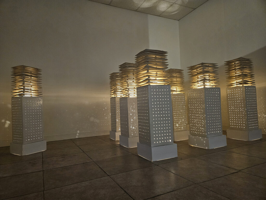
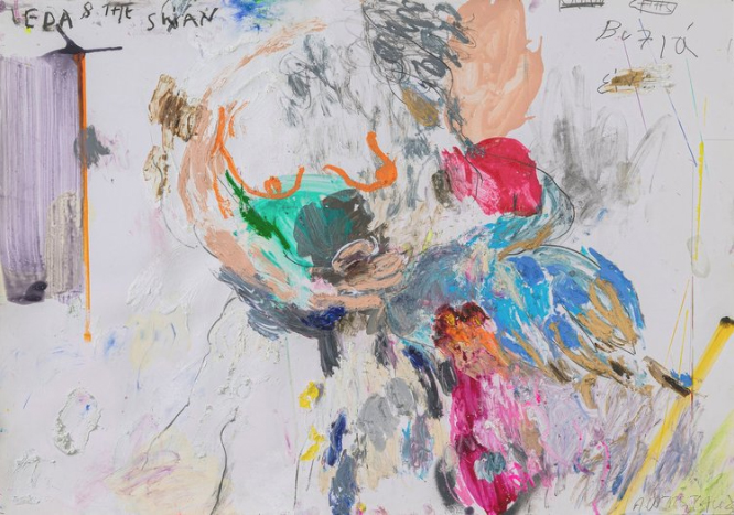
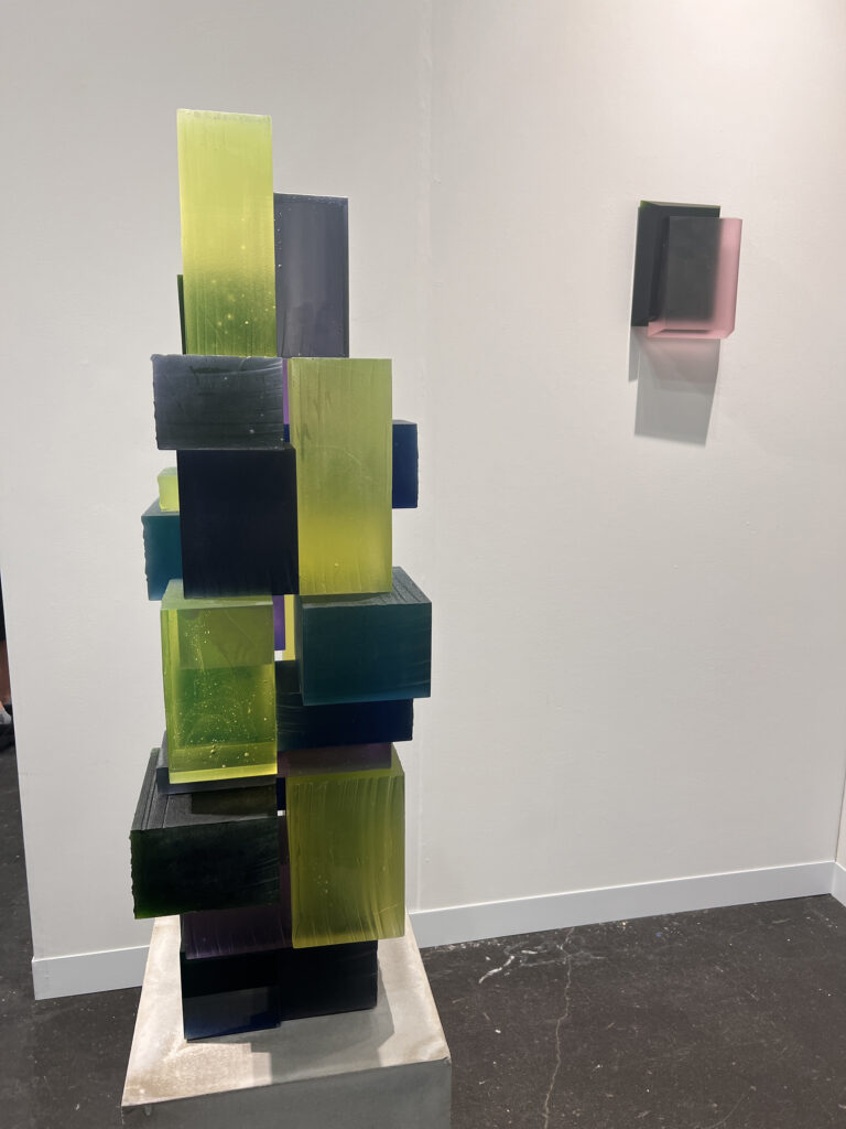
Jongsook Kang, Emptiness and Dreaming, 2023, installation view
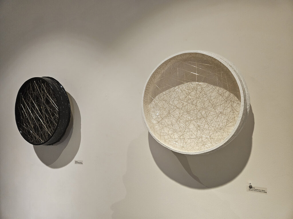
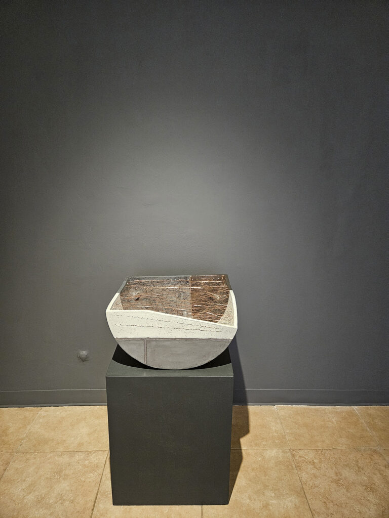
Jongsook Kang’s two-part series Emptiness and Dreaming Desire, presented together at this solo exhibition, manifest the artist’s innermost spiritual and mundane experience undoubtedly manifesting the secret nucleus of her ceramic sculpture in the last twenty years; namely New York/Seoul cities and Eastern Philosophy. Deeply inspired by the mystical teachings of Śūnyatā of Japanese Zen Buddhism, Kang imports a reflective quality that conveys silent introspection by interweaving a nexus of gold, silver, black and copper wires throughout her pieces that faintly recall the Japanese aesthetic of wabi-sabi but also the Korean philosophy of emptiness as fulness called bium. By so doing, she ritually metamorphosizes her objects into memory vestiges of human social networks or relationships in her beloved cities New York or Seoul. These ceramic edifices can be read in terms of the isolation felt during the Covid-19 pandemic, or in general as the loneliness of city life. Simultaneously, they can be seen as reconstructions associated with objects and mnemonic taboos – a transcended net of intertwined potentialities withdrawn from our a-priori forms of time and space – for the deceased victims of the Corona virus crisis.
Jongsook Kang, Emptiness and Dreaming, 2023, installation view
Furthermore, Kang’s delicate layers of clay, which vaguely recall Seoul’s or New York’s towering skylines casually observed from across the banks of Hudson or Han Rivers, deliberately function as metaphors and concrete incorporations of Confucian ontological principles. This philosophy is combined with Daoist aesthetics in Korea to formulate ideas of the yin and yang which represents the opposing yet similar principles of dark/light, feminine/masculine, action/inaction, dark and light in cosmic harmony.
Jongsook Kang, Emptiness and Dreaming, 2023, installation view
Kang skillfully handles physical and architectural space through the precise use of artificial lighting as a metaphysical duality of substantial positivity or negativity (as in in yin-yang Taegeuk philosophy). Moreover, the artist consciously transfigures her skyscraper-like constructions of square plates into imaginative comments about the ever-growing solitude of everyday life, principally experienced in global metropoles like New York or Seoul. Through her sculptures Kang also comments upon the eternal continuation of incessant change in a hectic world of constant becoming. As she laconically wrote in her artist’s statement: “in other words, my sculptures embrace the possibility of countless changes, and infinite possibilities that lead to eternity. The realization of the true colors of yin and yang, in which the eternity of light is condensed, can be said to be my own Dream-Desire”.
Many German philosophers or psychologists of 19th and 20th century Sigmund Freud for example, firmly believed that desire is the inner drive that substantially formulates every human being, while always being dynamic and tenuously alternating between objects and needs. While concurrently eternal and torturously unceasing like a strong current, desire undeniably (re)defines the unique individuality of each and every life form on the planet. Kang’s Dreaming Desire powerfully constitutes the polymorph matrix of opposing desires, in which frenetic life and spiritual emptiness or receptive yin and active yang harmoniously co-exist together despite their existential dissimilarities and internal struggles.
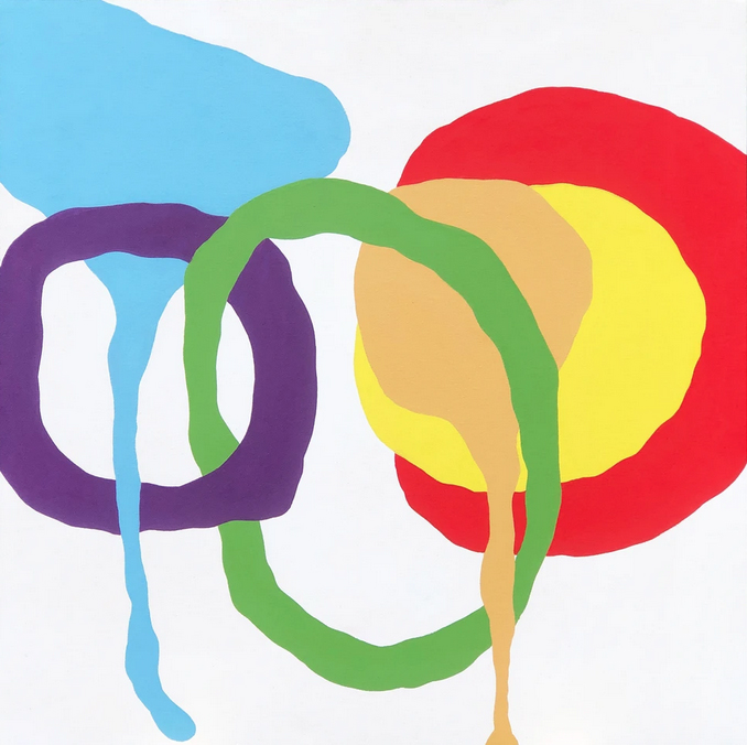
In the current solo exhibition at Mazlish Gallery in New York City, the soulful paintings of Loy Luo evoke timeless songs with unknown origins and infinite possibilities. The abstract artworks have the depth and strength of stone combined with the lightness of air and space. Luo not only encourages her audience to look but also to listen and move in place as they view her art. The musicality comes from Luo’s background as a musician and her notations that are painted on the canvas recount ancient songs of friendship and love. To fully experience the evershifting color, depth and space, the viewer is compelled to move from left to right and from up to down in order to grasp the dimensions described by the powerful presence of each artwork.
Loy Luo, Abstract Theater A8, 2021, acrylic, oil & mixed media on canvas. Photo: John Mazlish
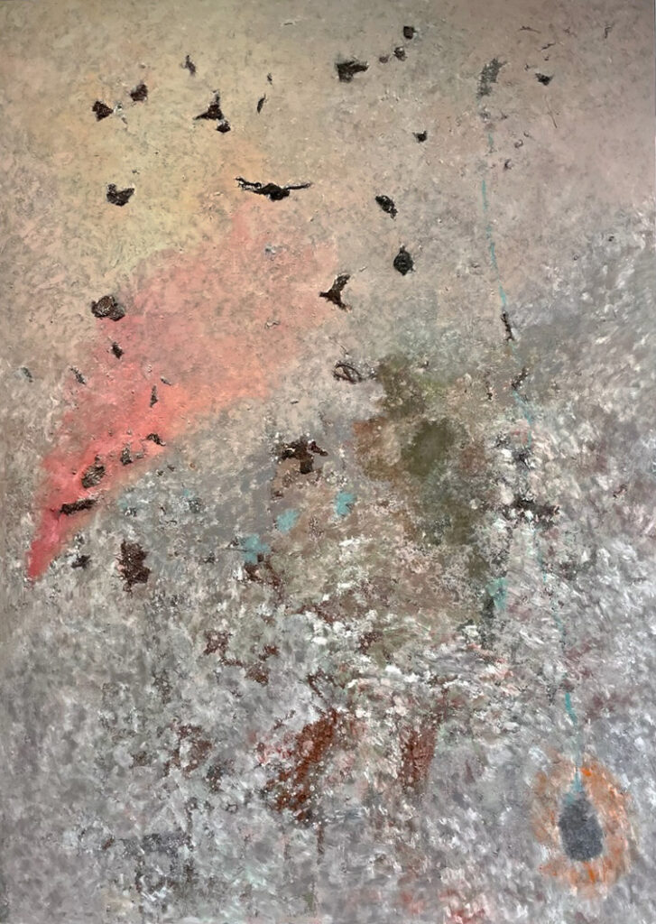
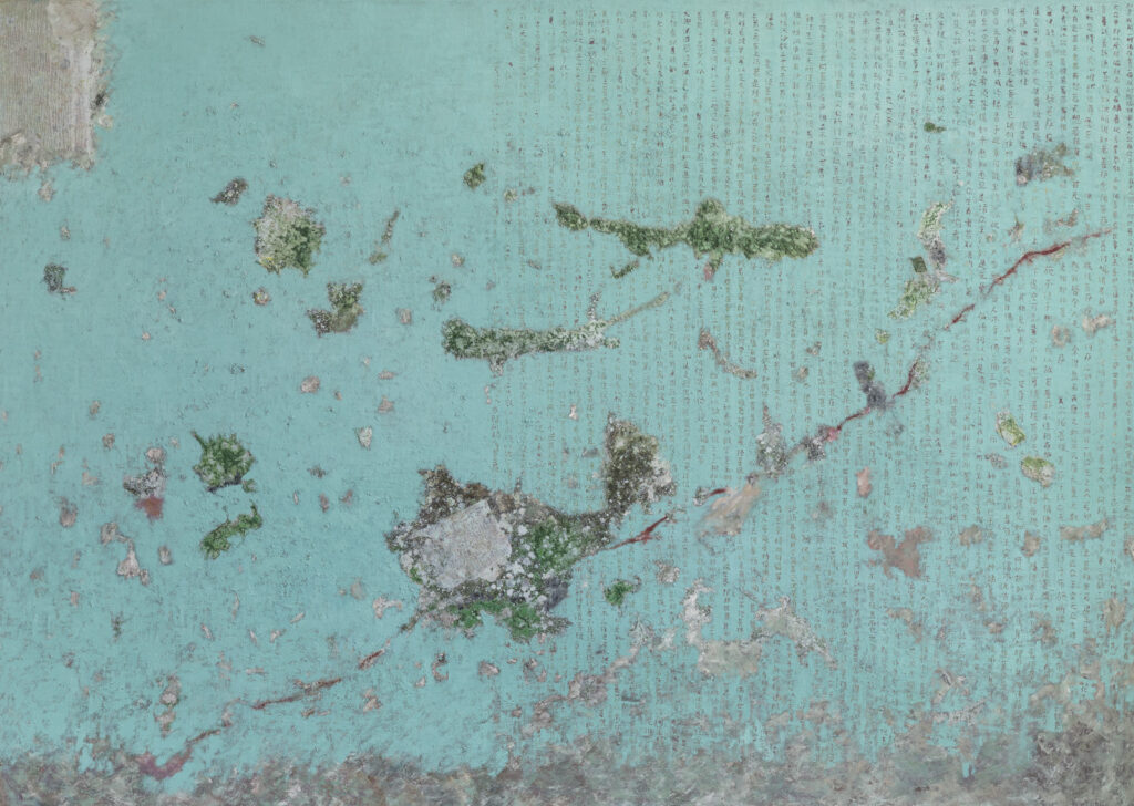
All of Luo’s artworks present a vast, borderless space. In this floating, gravity-free world, Luo paints intangibles with such conviction that these abstractions are made manifest. With precise, deliberate brush marks, Luo creates an alchemic surface that changes according to the ambient light. In Half Diamond Sutra, the mineral green of the ground unites the suspended marks and objects as well as the calligraphic notations scratched into the patina. In Abstract Theater A8, the sense of the self suspended in the experience of gazing towards a rosy light peppered with floating forms that are at once bird-like yet solid. The vertigo created by this tilting space is caused by a depth of field that seems to accelerate with the passage of time. In the Rune series, the sensation of different spaces is more direct: in Rune 2, the painting evokes the sunlight through trees as one gazes upwards and in the painting Rune 3, the atmospheric blue places the viewer adrift in a celestial orb.
Loy Luo, Half-Diamond-Sutra, 2023, mixed media. Photo: John Mazlish
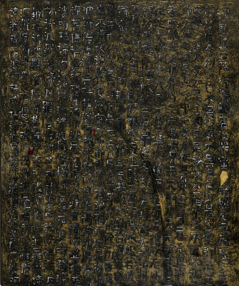
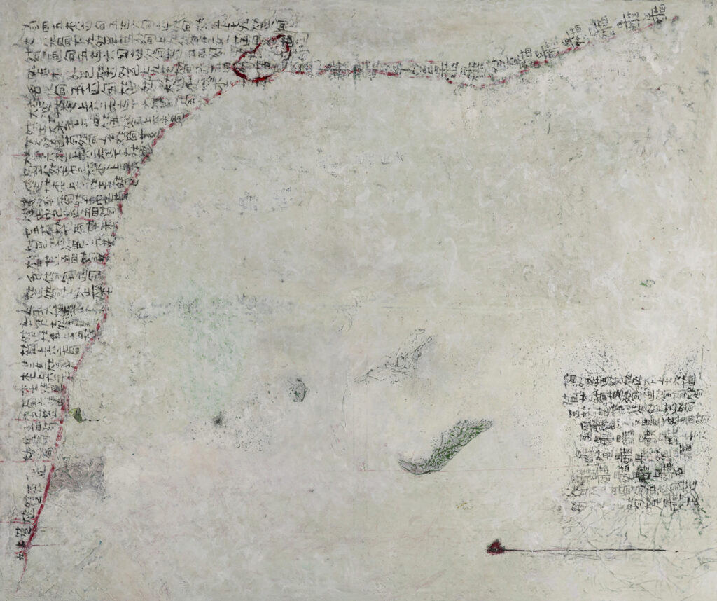
This cartographic quality continues through to the Heart Sutra series. In these paintings, there are luminous pigments lurking beneath a calming overlay of earth colors. It is in the incising of the paint through this glowing patina that Loy Luo reveals the depth of the painting’s journey. Calligraphic symbols rain down the canvases in a constant torrent of memories evoking stories, songs and poems. Some artworks, such as Heart Sutra I, go so far as to play with the light. As the viewer moves in front of the painting, the colors shift magically from black to gold and back to black. This optical illusion reveals and obscures its own meaning, cajoling the viewer to come close and then to step away in a continual “back and forth” sensation. It is only by remaining engaged with the artworks over time does the understanding of the inscribed words, the space and the shifting colors become clear.
Loy Luo, Heart Sutra 1, 2023, mixed media on canvas, 72″ x 60″. Photo: John MazlishLoy Luo, Guqin 2, 2023, mixed media, 60″ x 72″. Photo: John Mazlish
The most recent series of artworks, Guqin, refer to the horizontal slide guitar native to China with which Loy Luo performs her music. In Guqin I and II, Luo writes the notes of a traditional folk song on a white field. Sometimes the notes are cut off abruptly by a jagged sanguine border like an ancient wound that refuses to heal. In both paintings, the texts seem to have been incised into white marble that is at once solid yet poised to vaporize like a cloud- just as the memory of music disappears just after it is performed.
The uniting force behind all of Loy Luo’s artworks is the immense strength and space she describes with her large abstract paintings and smaller works on canvas. The alternating erasure and endurance of her mark making, the piercing luminosity of her colors and the power of implied telluric currents are all infused by Luo with a lightness of being. The inscriptions are manifested thoughts that rain down in the mind of the viewer like a half-forgotten melody as the artist presents an ancient tale, patinated with age and its accompanying palimpsests, conveying timeless instructions on how to love and live.
Loy Luo at Mazlish Gallery, 98 Mott Street, #600A, NYC N.Y. 10013 • 917-373-4550 • www.mazlishgallery.com
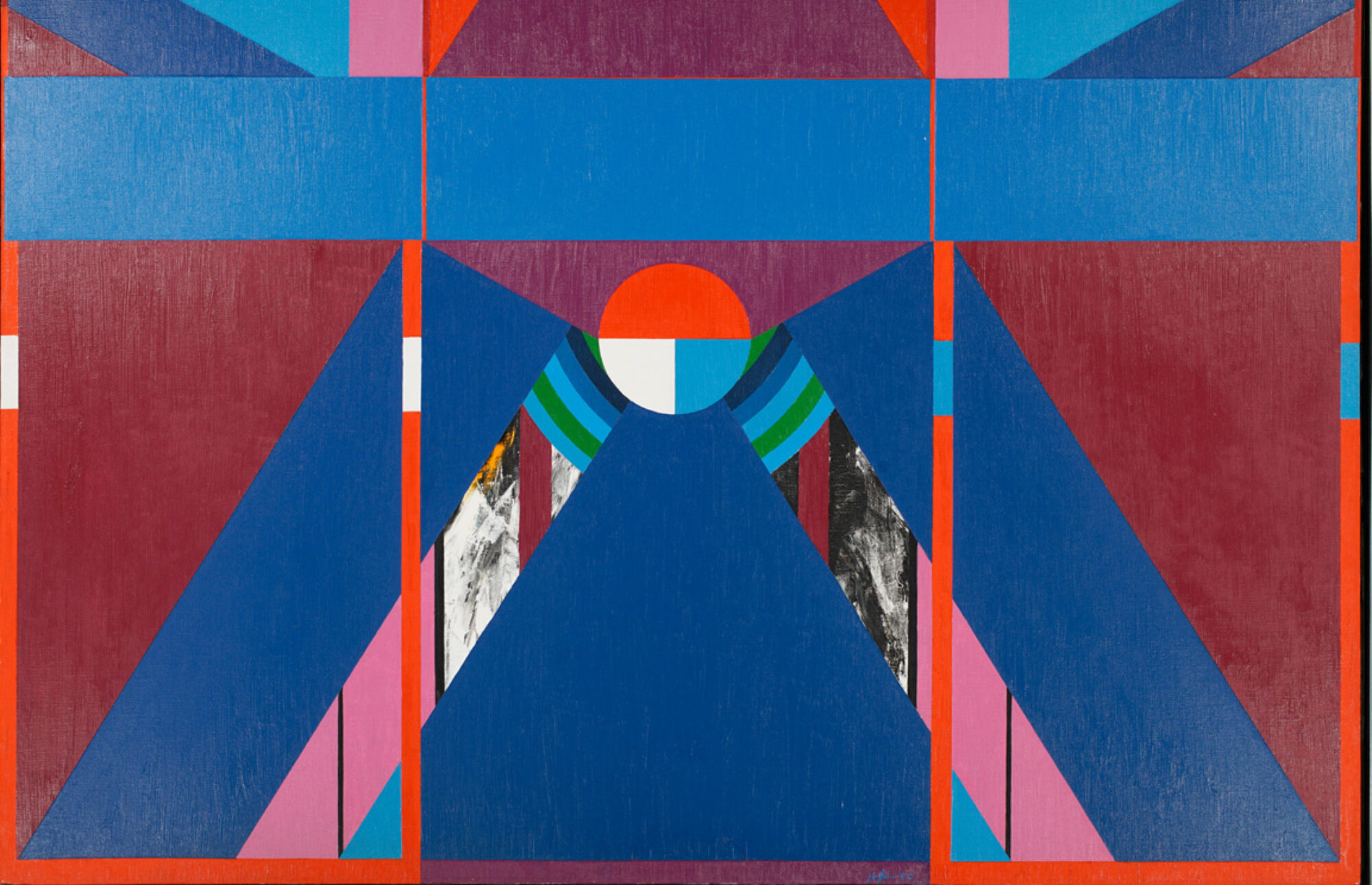
With colorful, gestural abstract forms, exuberantly captured through diverse emotions, conceptual word-games and expressive brushstrokes, Ariadne Vitastali’s paintings are a unique evolution of the visual tradition of the Northwest School Abstraction. Full of spontaneous markings of color tones with melodic lines as seen in Abstraction Lyrique, or automatist subconscious gestures, similar to Action Painting and finally gentle calligraphic movements reminiscent of the techniques of the American painter Mark Tobey, her neo-expressionist images can be formally compared to the radical experiments of the Dutch-American painter Willem de Kooning.
Ariadni Vitastali, Untitled 096, 2023, mixed media on paper, 39 x 28″
Willem de Kooning believed about his abstract painting that «It’s really absurd to make an image, like a human image, with paint, today, when you think about it…. But then all of a sudden it was even more absurd not to do it. … It [painting Woman, Ι] did one thing for me: it eliminated composition, arrangement, relationships, light – I put it in the center of the canvas because there was no reason to put it a bit on the side. So, I thought I might as well stick to the idea that it’s got two eyes, a nose and mouth and neck.». Artist statements can sometimes be misleading in that, out of a desire to control their public image artists sometimes overstate or exaggerate their statements.
Thus, one can safely assume that de Kooning’s work and by extension Vitastali’s were very meticulously planned, whilst both artists precisely considered the formal aspects of their compositions before their artistic execution in order to create a paradoxical sort of accidental perfection. Morphologically this can be confirmed by a careful examination of their artworks. De Kooning saved and cut-out various images of women from popular presses, something that demonstrates forethought and planning, while their placement also illustrates pre-planning and strategy as also Vitastali’s carefully chosen compositional designs. In fact, Vitastali’s compositions are often diagonally situated causing the eye to be active according to Expressionist principles.
Ariadni Vitastali, Untitled 111, 2023, mixed media on paper, 39 x 28″
Although Vitastali’s recent works are abstract, her oeuvre straddles the categories between abstract and abstracted, in that her non-relational images maintain some recognizable motifs. As seen in several 2022-2023 Untitled paintings, the artist uses abstracted modes in order to treat subjects with a feminist bent while depicting mythological heroines. One such painting is Untitled III, 2023 -wherein a figure is seen tumbling backwards into a chasm-that can be read in terms of the Demeter legend. When Persephone, her daughter was abducted by Hades the God of the underworld, Demeter went to Hades to seek her out, and her absence caused a famine on earth. To Vitastali’s predecessors -the American Abstract Expressionists- myth was also important informing the work of William Baziotes, Jackson Pollock, Willem de Kooning and Mark Rothko. These artists including Vitastali, used a semi-representational or abstracted style in their early careers later becoming increasingly abstract.
The term “abstract” and its varying degrees, carries a whole range of associations and descriptions. German-born American artist and museum founder, Hilla von Rebay, used the term gegenstandlos(to describe her abstract painting), which American artists later mistranslated as “object less painting.” Rebay who associated her visual production with “pure” music, like Kandinsky, believed that art should be externalized from the inner cosmos of the artist and not from a simple abstraction of external nature. This particular idea paradoxically already existed in the Christian aesthetics of the Middle Ages and Scholasticism and was quite widespread until the Renaissance and Mannerism. The artist-craftsman was not supposed to simply copy, or mimic the material world, but instead to reflect within his inner psyche, the divine “ideas” that constitute a higher dimension than world of phenomena or changing space-time.
Erwin Panofsky in his book Idea: A Concept in Art Theory, specifically wrote that the work of art “far from being merely derived from the creations of nature and transferred to the work of art by a simple act of copying, lives in the mind of the artist himself and is directly translated by him into matter.”Similarly, modern abstract painting rejected the Platonic concept of art as “mimesis” and attempted to return to a more primal state of art, i.e. to a non-representational art, where the artist expresses an inner and intuitive world-picture (Weltbild) of the external reality -or as Rebay meant the word gegenstandlos as“subjective”. The art theorist Wilhelm Worringer also believed that primitive art is par excellence a “pure, geometric and abstract” art, where the subject unconsciously tried to escape the eternal flux of the varying phenomena of the outer world.
Ariadni Vitastali, Untitled 9075, 2023, mixed media on paper
As Kant believed, despite all the avant-garde’s radical convictions about an abstract art of the future, abstract art essentially managed to return to a primordial side of pictorial art, where the inner world of the human psyche with all its violent permutations is no longer separated from an inaccessible rift in the external world. But instead, through abstract art (as well as music), the numinous phantasmagorias of the soul are translated externally without the need to appropriate a material form, or an external image. They should instead be expressed through a kind of formal “formlessness”, in which they visually diffuse without the metaphorical clothing of a phenomenal world. Thus, the Kantian separation of the thing-in-itself (i.e. the noumenon) and ephemeral phenomena no longer exists and the abstract artist as a new kind of shaman, or magician directly externalizes his immaterial and aniconic thoughts-feelings into objective reality, restoring thus a long-gone universal communication for humanity, despite linguistic, ethnic and cultural differences among civilizations. The imaginal (and also formless) medium of the abstract artist here manifests itself as a universal language of specific moods (Stimmungen) or even archetypical experiences, which every human, as Carl Jung strongly affirmed, everywhere in the globe subliminally shares.
Likewise, Vitastali’s complex, yet simultaneously time-minimal works externalize the boundary between abstraction and figurative painting. Between the dreamlike masses of pure color, anthropomorphic figures and illusory forms can be discerned, which blend together within the streams of discrete colorfulness. Thus, different fragments of lost forms are revived in an elaborate, but simple mosaic of lively hues, where the unconscious tendencies of an inner world are imprinted like living spots on the white paper, while morphic modulations and color-form sketches recreate the subliminal tones of a lyrical locus of abstract images. Her present paintings are abstracted, representing as such an engagement with her earlier mode of working, which rigorously marks her maturity as an artist.
As Ariadni Vitastali writes in her statement about her new works “the painting elements of form, color, gesture, line, as also fragments of phrases, or simply words, define the worked surface as abstract elements, insinuating a glimpse view of a momentary and subjective reality”.
1. Bice Lazzari: Stacatto in a Blue Musical Forest.“Untitled” Richard Saltoun Gallery at Independent Art Fair 2023
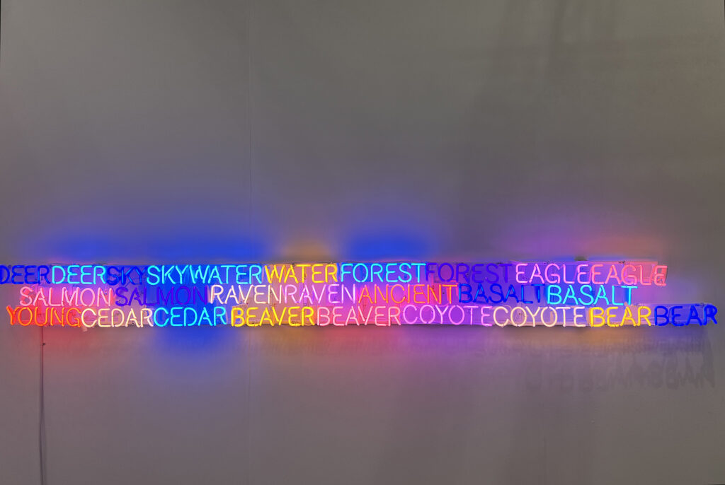
2. Mary Watt: Sky-water dives into a deep river and walks into the forest, searching for light. “Shared Horizon ( Keepers of the Western Door), Marc Strauss Gallery at Armory 2023
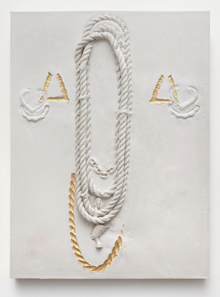
3. Lakela Brown: Ancient gold piercing our history and our heritage. “ Composition #2 with Doorknocker Earrings, 56 Henry at Armory 2023
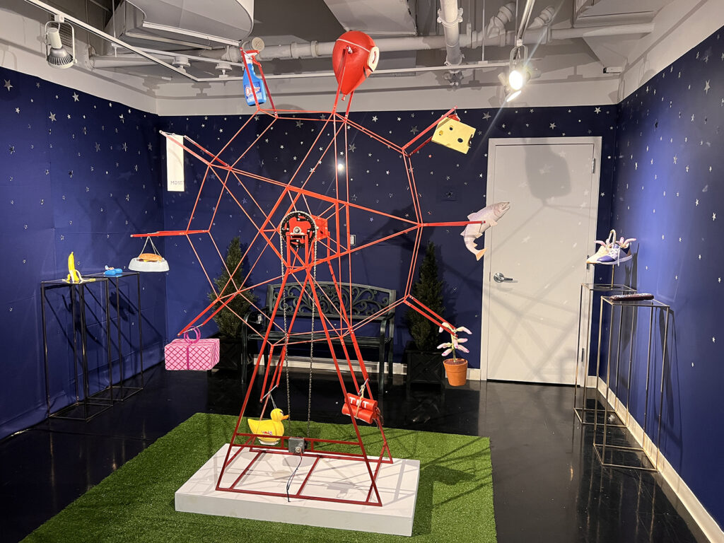
4. Stuart Lantry:Ferris wheel riding with gifts facing a dangerous reality. “Asleep at the reinvented wheel”, Spring Break 2023
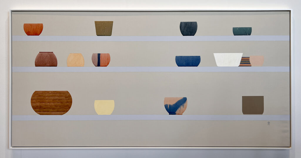
5. Ed Baynard with a lineup of our daily treasures – “Bowl painting” , James Fuentes at Independent Art Fair 2023
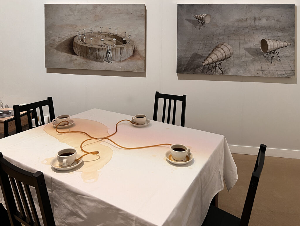
6. Allan Wexler:Coffee seeks its own level. Jane Lombard Gallery at Independent Art Fair 2023
7. Pepe Mar:Face Off (Philodendron), 2023, mixed media and acrylic on museum board, 24 x 20 inches, David Castillo at Armory 2023
8. Gregg Woolard:Ancient call for energy and synergy in orange metaphors. “Valley of Kings”, Max Fish at Spring Break 2023
Mike Hansen, Off Minor, Big Band (Jazz Series), 2021, acrylic on canvas, 36 x 36 inches
Classical music and contemporary jazz is wound tightly into every thread of the weave of Mike Hansen’s “Spot-o-fi” installation of watercolours, canvases, and plaster sculptures at Lonsdale Gallery in Toronto. Scan the QR code on the exhibition labels, and hear the music that gave life to the artist’s visual output. Yet, there is no necessary chain here that binds one to the other. Hansen admits that his painterly output amounts to a critique on abstract expressionism and its latter day emotional hangover, a purely visual art conversation between modernism and its post-painterly derivations. Consequently, the “Spot-o-fi” visual wall art stands alone against the welter of Hansen’s “wall of sound” references.
Mike Hansen Spot-o-fi installtion view
If Hansen has a go at abstract expressionism’s watered down derivatives, he also manages to save some powder for the music streaming platforms of our day. His exhibition title, “Spot-o-fi” is a dig at the prevalent algorithms, encouraging a type of lazy listening that tend ultimately to denigrate the sonic masterpieces he references to background noise.
Mike Hansen, A Love Supreme (Jazz Series), 2021, acrylic on canvas, 74 x 74 inches (four canvases)
No better example of a modernist painter steeped in music, who succeeded in as tight a threading of sound and image as anyone, was of course, Paul Klee. The 2008 “Melody and Rhythm” exhibition at Museum der Moderne in Salzburg, Austria was a tribute to the Swiss artist’s uncanny ability to evoke “sound composition” from colour, line, and texture.
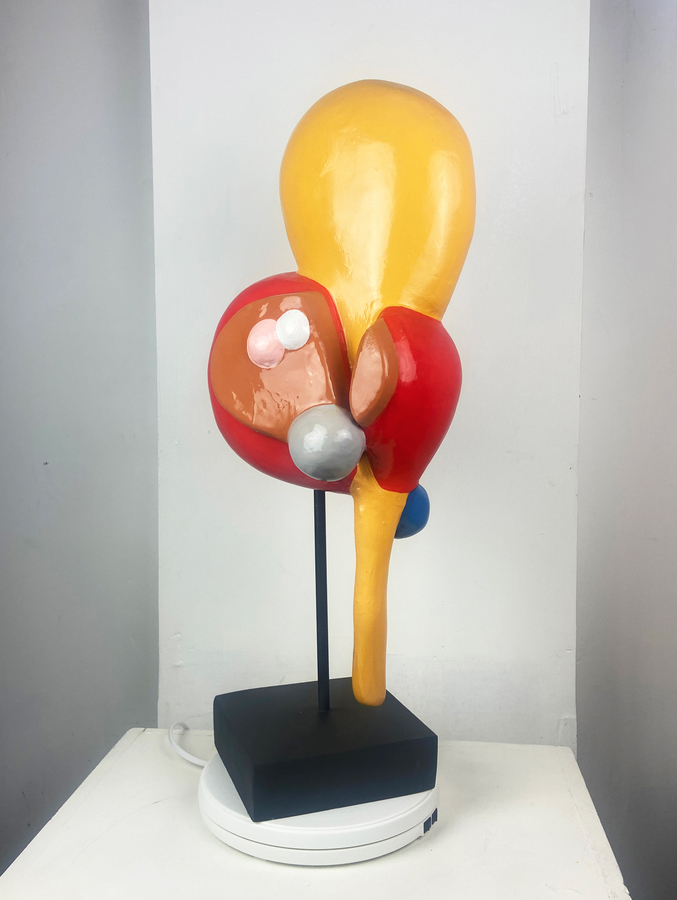
Mike Hansen, Reflections on Gnossienne No 3, 2023, acrylic on epoxy, 27 x 11 x 8 inches
I make the Klee reference since the painted forms of Hansen’s four-panel “A Love Supreme (Jazz Series)”, for instance, a tribute to Coltrane’s opus, draw no obvious parallel to the music that may have inspired them. Brightly coloured, amorphic cutout shapes that waft and melt in airy layers, possess a graphic life independent of sound – unless of course, a conscious inference is made to connect them. The positive for Hansen plays to the materially visual art in the exhibition, and that the gloss-candied surfaces of his sculpture production appear good enough to eat, can’t be held against the artist.