dArt Magazine Curated Content #4

by Steve Rockwell

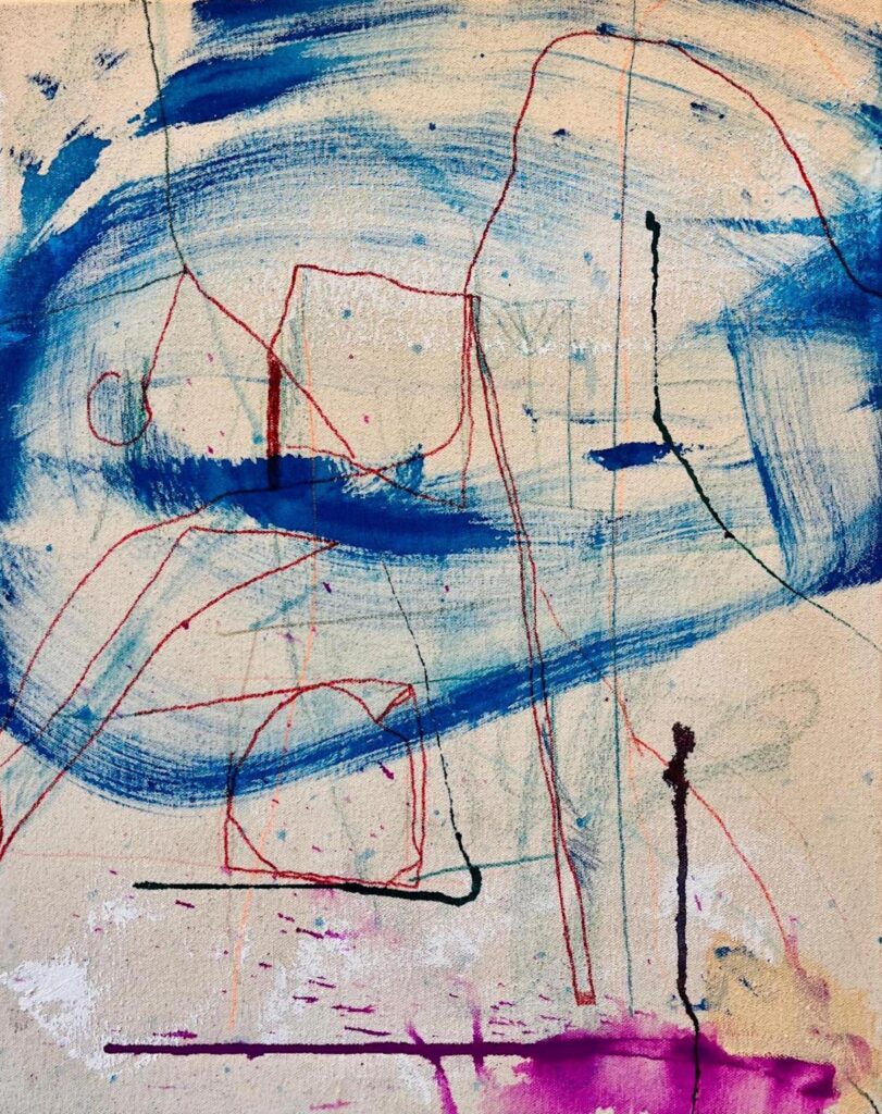
Hirst's Anatomy, Burning Man, The Pharmacist and Miami Flurry. 2024, dArt magazine pulp and paper, variously mounted on canvas, 8.5 x 7 inches. Citing the work of Damian Hirst, Matthew Ritchie, Micah Lexier, and Chris Scarborough.
Hirst’s Anatomy, Burning Man, The Pharmacist and Miami Flurry, 2024, dArt magazine pulp and paper, variously mounted on canvas, 8.5 x 7 inches. Citing the work of Damian Hirst, Matthew Ritchie, Micah Lexier, and Chris Scarborough.

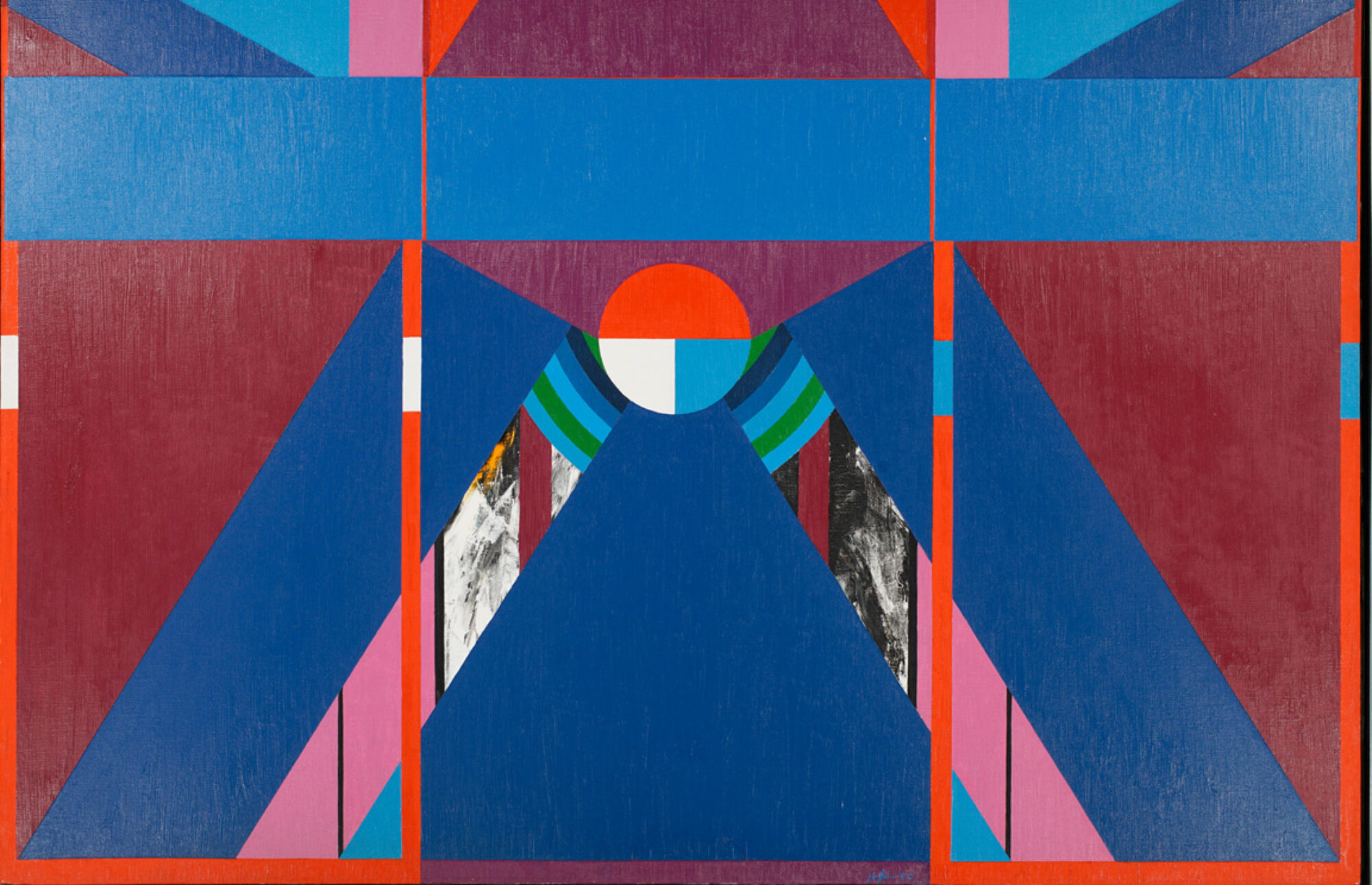
Panel One in dArt Magazine Curated Content #4 depicts a tiny figure gazing up to a 20-foot colossus. Though Damien Hirst’s Hymn sculpture appears here with green grass and blue sky, it is in fact an installation view of Damien Hirst’s 2000 exhibition at Gagosian’s New York Chelsea gallery, the white disk and colors having here been added in oils. The full exhibition title was on the wordy side: Damien Hirst: Theories, Models, Methods, Approaches, Assumptions, Results and Findings. The review of the exhibition was covered for dArt by Clayton Campbell.

dArt Magazine Curated Content #3

by Steve Rockwell

Hopper's Corn Hill, Stipl Squint, Jaan's Divide, and Johns Paint Tip. Citing the work of Edward Hopper, Richard Stipl, Jaan Poldaas, Barnett Newman, and Malcolm Arbuthnot (of Augustus Johns).
Steve Rockwell, Hopper’s Corn Hill, Stipl Squint, Jaan’s Divide, and John’s Paint Tip. 2024, dArt magazine pulp and paper, variously mounted on canvas, 8.5 x 7 inches. Citing the work of Edward Hopper, Richard Stipl, Jaan Poldaas, Barnett Newman, and Malcolm Arbuthnot (of Augustus John).

Hopper’s Corn Hill in the first panel makes use of an 1930 Edward Hopper oil that is part of the McNay Art Museum collection in San Antonio, Texas, of which I had a tour in 2005. The reproduction of the Truro, Cape Cod subject had occupied roughly the bottom half of the 8.5 x 7 inch page in dArt, which I had here expanded to the edges of the page in oils. It functions as an imaginary “framing” of what Hopper might have seen. The same device was used in the third panel, Jaan’s Divide, the original work by Jaan Poldaas, having been square, his stripes here extended to fill the rectangle. It was an adaptation to which the artist and I agreed for a dArt magazine back page to advertise his 1998 exhibition, Colours and Concepts.

The three stripes behind the image of Augustus John holding a brush allude to Barnett Newman’s 1967 Voice of Fire. The eighteen-foot acrylic on canvas had been a commission for Expo 67 in Montréal, Canada, and was part of the U.S. pavilion exhibition, American Painting Now, housed in a geodesic dome designed by Buckminster Fuller. It is not known to what extent Newman incorporated the aspect of three in Voice of Fire, aware that the work would figure prominently within a dome constructed of triangles. On principle, Jaan Poldaas would have objected this employment of the “three,” as he revealed in a discussion that contributed to a review about his Colours and Concepts work.

The image of Richard Stipl‘s sculpted self-portrait heads (panel 2), was used for advertisement of the artist’s work in the Fall 2002 edition of dArt. With the title, The Sleep of Reason, Stipl references the Goya series of aquatints, The Sleep of Reason Produces Monsters, an attribution generally read as Goya’s acceptance of Enlightenment values, that the absence of reason invites the monstrous to proliferate. Franz Xaver Messerschmidt, a German-Austrian sculptor most famous for his “character heads” was a contemporary of Goya, who produced a series of busts with contorted facial expressions, tapping into paranoid ideas and hallucinations from which he allegedly began to suffer. Messerschmidt and Stipl, it seems, would make for a formidable art history tag team.

Five artist temperaments are featured in Curated Content #3. Though an obvious correspondence could be made between the sculpted contortions of the faces by Stipl and Messerschmidt, an unlikely pairing would be Edward Hopper and Barnett Newman. Ralph Waldo Emerson had served as life-long touchstone to Hopper, his painting output imbued with an aura of the “transcendental.” In Peter Halley’s 1982 essay Ross Bleckner: Painting at the End of History, Halley ascribes the transcendentalist wing of modernism as having its roots in French Symbolism and Emerson, informing the work of Pollock, Rothko, and Newman.

With Malcolm Arbuthnot’s image of Augustus John, on the other hand, we have a stereotype of the typical “bohemian.” It is suggested that the character of eccentric painter Gully Jimson in the 1958 Alec Guiness film The Horse’s Mouth was modelled on John.

Motif: Creighton Michael. Schaffner Room Gallery, Pound Ridge, NY

by D. Dominick Lombardi

Opportunities for artists come in many different forms, especially when it comes to exhibition spaces. Once you understand your station on the outside looking in towards the big billion-dollar businesses at the top, it becomes like a chess game where countless artists vie for a variety of venues ranging from the more regional, community minded spaces to the secondary level of high-end galleries in major cities throughout the world. The higher you aim the more you need to be well connected, otherwise it’s best to have your own fleet of collectors to do your talking. But who has that? After all, the market is in constant flux; what’s in, who has the back story, where’s the new vision; it’s all subjective, controlled from the top down, often sociopolitical and rather unregulated.

Creighton Michael, Motif 1110, oil on acrylic on canvas, 40 x40 inches, 2010, (all images, courtesy of the artist named)

With the increased overhead, especially when there are economic downturns caused by natural or manufactured disasters, a noticeable percentage of mid and lower-level institutions close and opportunities decrease. I’ve often thought of the hybrid spaces, places where there are two businesses sharing a space or building that is common in places like Iceland, where a commercial gallery could lessen the strain of a fixed overhead when the level of needed population is not there. You see this in colleges and universities here, where not-for-profit galleries and museums are placed on campuses where it is a bit easier to keep the lights on, and where a very dedicated staff works tirelessly to keep their programs relevant and inspiring.

Libraries, locations commonly looked at as being for amateur artists, are more and more exhibiting seasoned professional artists with substantial careers, which in turn broadens the reach of both the institution and the artist. When I wrote for The New York Times from 1998-2005, I can recall reviewing excellent exhibitions at the Chappaqua Library gallery and the Manhattanville College Library Gallery. The Katonah Museum is a product of the Katonah Gallery, which was housed in the Katonah Village Library.

Works on Paper: Serdar Arat (installation view), 2023

What first piqued my attention to the Schaffner Room Gallery located adjacent to the Pound Ridge Library, was a recommendation of a friend that Serdar Arat was exhibiting there, and I should definitely take a look. Arat, also a long-time friend, an excellent artist, and a brilliant lecturer with titles like Creative Flows: Islamic and Western Art to The Harlem Renaissance and Modernism creates alluring painted reliefs, room-sized sculptural installations and refined prismatic prints that address a number of topics such as architectural fluidity, the spiritual effects of color and the depths of visual rhythms. His show at the Schaffner Gallery focused on his well-known prints.

That same friend who told me about Arat’s past exhibition, Creighton Michael, has the current show at the Schaffner Room Gallery, which features seven key paintings from his Motif series. As an attendee of the opening, I was immediately impressed by an audience of mostly accomplished artists all engrossed in the paintings at hand, which in turn prompted stimulating conversation. The artist mentions in his statement “…the Motif series are the product of two unique marking strategies both using a motion capture process but deviate in their use of time and color.”

Creighton Michael, Motif 1810, oil on acrylic on canvas, 48 x 48 inches, 2010

Michael’s approach is to first lay down what he refers to as his ‘deferred’ ground of vibrant color. Here we see leaf-like applications of transferred veneers of dried brush strokes that modulate slightly in intensity and opacity; all looking something like flattened fall leaves or flower petals only much more intense in color. Over this layer of acrylic ‘skins’ the artist applies the ‘direct’ half of his process: oil paint in a mesmerizing matrix of thin lines in a color complement, a powerful element that further triggers the underlying hues, which in turn creates a push/pull of optical sensations.

Creighton Michael, Motif 409, oil on acrylic on canvas, 40 x 40 inches, 2009

The Motif series is a tour de force of optical effects, as we easily see how visual stimulation entices thoughts of things experienced. Like Hans Hofmann’s paintings of the 1950’s and 60’s, when he was advancing as a teacher his “push and pull” theory, or “expanding and contacting forces” thesis, there was that same sort of non-representational dance in space we see in Michael’s paintings. But unlike Hofmann, Michael’s work has a more organic feel, suggesting things like ripples in a stream or a cluster of twigs atop fallen leaves. On the other hand, it is hard not to think of back-lighted stained-glass windows when viewing Michael’s paintings, as the background colors always penetrate the foreground, or what would be the lead lines of the window, even when the foreground is a ‘fast’ color like orange or red.

Creighton Michael, Motif 1710, acrylic on oil on canvas, 30 x 30 inches, 2010

In the end, the Motif series is about the artist’s deep understanding and distinctive use of color within the non-representational realm. Michael plays with our preconceptions of color, and how it manages space and time – what we may have experienced peripherally, that curious something that disappeared when we turned to look. That is what gets in our subconscious. That is why these works have a lasting effect, something all artists hope to achieve.

Motif: Creighton Michael runs through May 4th, 2024. For more information please visit https://poundridgelibrary.org/exhibit/

Three Short Takes on Painting Exhibitions in New York

by John Mendelsohn

Bobbie Oliver, RV Grey/Green, Orange, Pink, 2023 acrylic on canvas, 72 x 48 in.
Photo: KC Crow Maddux / courtesy of the artist and High Noon Gallery
Bobbie Oliver, RV Grey/Green, Orange, Pink, 2023 acrylic on canvas, 72 x 48 in. Photo: KC Crow Maddux. Courtesy of the artist and High Noon Gallery

The paintings of Bobbie Oliver have undergone a transformation. They have moved from monochrome to full-color, and from clouds of troubled washes to more defined shapes floating in humid atmospheres. The revolution in Oliver’s work goes beyond the formal – it is attitudinal, with the emergence of a complex of moods.

The four large paintings in the exhibition are six-feet tall, with strong passages on the left and right that open up to a central emptiness. The canvas surfaces are painted in a variety of tones, from soft pink to a range of subtly warmer and cooler grays. The grays evoke the colors of aged paper, while passages of diffused pigment suggest an affinity of Oliver’s work with the tradition of Chinese landscape painting, in which form is continually dissolving into space.

On top of the nearly neutral grounds are suspended blocky forms in fluorescent orange and yellow, and in highly saturated turquoise and pink. The forms variously recall signs of urban life such as road repairs and graffiti. There are echoes of earlier pictographic practices such as Mayan glyphs and Chinese seals.

Bobbie Oliver, RV Grey, Blue, Pink, 2023 acrylic on canvas, 72 x 48 in.
Photo: KC Crow Maddux / courtesy of the artist and High Noon Gallery
Bobbie Oliver, RV Grey, Blue, Pink, 2023 acrylic on canvas, 72 x 48 in. Photo: KC Crow Maddux / courtesy of the artist and High Noon Gallery

Transparent clouds of black pigment pass over the vivid shapes like disturbing thought or diesel exhaust. The fugitive forms suggest organic life, magnified, passing across a microscope slide. Oliver’s is an improvisational art, laying down forms, flooding them with water, allowing blotted color to appear in the wash, only to dissipate.

In the exhibition are four smaller works, which share many of the elements of the larger ones. However, here they are concentrated in the paintings’ centers with a few large entities filling our view.

The overall effect of the paintings, both larger and smaller, is a kind of joyful melancholy which recognizes that phenomena arising and passing away encompass many things – the weather, the city, the art of painting, and our life and times.

Bobbie Oliver: Found Objects. High Noon Gallery, 124 Forsyth Street, New York. March 7-April 21, 2024

Dana Gordon, Maze-L Tov, 2023, oil on canvas, 60x72 in.
Photo: Courtesy of the artist
Dana GordonMaze-L Tov, 2023, oil on canvas, 60×72 in. Photo: Courtesy of the artist

Dana Gordon’s exhibition of twenty-eight paintings, all from 2023, is too much. We are asked to navigate many walls of paintings that seem to slowly progress from one related mode to another. Why so many paintings? We could hazard a few guesses: the artist as obsessive completist, or as chronicler of his own productivity. Despite the challenge it may present the viewer, the best reason for the plethora of work is witness a painter’s progress – finding his way by impulse and invention, to some unanticipated place.

Early on, the paintings move in this sequence: first, fields of jangly, black linear gestures on white grounds, that then become arrays of colored lines, again on white. In both cases, the thick, brushed strokes do not touch, but move around each other like touchy guests at a cocktail party. These are energized, anxious marks, too charged to coalesce – distant relatives of Keith Haring’s graphic, social bacchanals.

Dana Gordon, Ariadne's Thread, 2023, oil on canvas, 60x72 in.
Photo: Courtesy of the artist
Dana GordonAriadne’s Thread, 2023, oil on canvas, 60×72 in. Photo: Courtesy of the artist

In their next phase, the colored lines become thicker, and begin to cross over each other many times, creating a dense tangle on patterned and then solid colored grounds, suggesting an anarchic play on Paul Klee. Then something interesting happens at painting eighteen in the exhibition – the restless, impatient brushstrokes take on a new deliberateness and solidity. The structure is labyrinthine, suggesting that a path out of life’s coils might somehow be possible.

The last turn in the exhibition is the simplest and most satisfying. The layered, competing lines have been combed smooth into a new order of discrete, concentric triangular webs. Resembling plowed fields crisscrossed by diagonal roads, these final seven works have a kind of resolution that is both formal and emotional. The blunt, brash attack is still there, but it is at the service of something that feels like hard-won grace.

Dana Gordon: Signs of Life. Westbeth Gallery, 55 Bethune Street, New York. February 3-24, 2024

Bill Pangburn, 7 Drawings #1, 2009, watercolor and gouache, 80x40 in.
Photo: Courtesy of the artist
Bill Pangburn7 Drawings #1, 2009, watercolor and gouache, 80×40 in. Photo: Courtesy of the artist

Bill Pangburn’s woodcuts, monoprints, and paintings on paper all evoke a watery world of perpetual movement. Sinuous lines suggest the liquid movements of undulating, streaming, and cascading. The fluid imagery offers a variety of ways to contemplate that which never stays still, and moves through and around the solid and the fixed in nature and in us, as well.

There are several distinct modes of Pangburn’s art in this exhibition, curated by Soojung Hyun. The large woodcuts are striking in their size and complexity. Typically, a dense ground of finely-detailed shapes or striations is riven by snaking black lines. In some of the prints, the shapes become gnarly and agitated. We sense the play of rippling water with bright reflections, and deep shadows. There is an ominous feeling that in these highly graphic images, nature is showing us how delight and danger are inextricably woven together.

Bill Pangburn, Jaguars Love to Swim, 2024, woodcut, 67x32 in.
Photo: Courtesy of the artist
Bill Pangburn, Jaguars Love to Swim, 2024, woodcut, 67×32 in. Photo: Courtesy of the artist

In twined, large-scale reduction woodcuts, with a narrow vertical format favored by the artist, fine lines with bulbous serrations create streaming fields. Figure and ground, in black and silver, are constantly changing identity. All of Pangburn’s black and white prints, with their intense, almost narrative quality, bring to mind the appropriation of art nouveau by the graphic artists of the psychedelic 1960s.

There are three series of work that employ the arabesque. A color relief monoprint displays interpenetrating vine-like curves in mottled indigo on a field of pale lines. Smaller works with tangled lines evoke both the island of Crete, and the currents of the Hudson River.

Among the strongest works in the exhibition are three large watercolor and gouache paintings on paper. Deep blue, thick and powerful lines connect us with the Five Elements of the exhibition’s title. In the Chinese philosophy of Wu Xing, wood, fire, earth, metal, and water embody the cosmic energy manifested in nature. In these works, we feel the writhing of dragons, the labyrinths of the psyche, and the flowing waters of the world.

Five Elements: Bill Pangburn’s Rivers. Artego Gallery, March 1–30, 2024. 32-88 48th Street, Queens, New York

The Fine Art of Grinding

by Steve Rockwell

The impulse to shred back issues of dArt magazine to make pulp and paper had yielded dozens of 21 x 16 inch sheets some five years after the 2011 dArt Burger exhibition at De Luca Fine Art in Toronto. The show co-producer Ben Marshall had insisted that we install an actual meat grinder in the show, its function having been symbolic. Practically speaking, neither grinding nor shredding paper is possible with it. A basic office shredder and a uniquely-designed blender are the sole equipment requirements for dArt magazine paper production. For James Cooper’s video on the collage potential of dArt click: Dart Onion.

Steve Rockwell, Minced dArt, 2011, meat grinder with shredded dArt magazine pages and cropped magazine

Steve Rockwell, Minced dArt, 2011, meat grinder with shredded dArt magazine pages and cropped magazine

A lingering colloquialism since the horse and buggy days has been the tale of glue factories killing old horses and grinding up their bones to make glue. The bubbling up of the saying, of course, arises generally in response to some human inkling of its own mortality. I sense that it might be into this very psychic cranny that San Antonio artist Hills Snyder casts his Dickensian shadow. Here is my account of meeting the artist at the 2005 Artpace Chalk It Up event in San Antonio:

Hills Snyder, Misery Shoppe Repairman

“Hills Snyder arrived in undertaker black to set up his Misery Repair Shoppe, comprised of a chair and a desk with a meat grinder with which to pulverize his chalk one stick at a time. He set up shop on the Houston bridge above the banks of the San Antonio River, in itself a bit chalky from limestone, I suppose. Grinding chalk is a dry, dusty job, as is purging despair. Snyder was making a connection with the white cliffs of Dover, specifically Shakespeare Cliff, where the Earl of Gloucester, blinded for his loyalty to King Lear, took his imaginary fall, demonstrating to the ages the cathartic power of tragedy.”

More can be said about the pulverizing of chalk over the centuries. Lessons have been sown and inculcated into the fertile cranial soil of blinking pupils facing dusty blackboards, generation upon generation, stick upon stick, scratched by the stern “chalk grinders” of yesteryear.

In the French city of Rouen in 1913, a young Marcel Duchamp chanced upon a chocolate grinder displayed in a confectioner’s window. The machine became the subject of two paintings, precise in the style of an engineering diagram with flattened planes, eschewing the artist’s hand. To the artist, however, its operational churning suggested something auto-erotic. Duchamp made it the subject of a major work, The Bride Stripped Bare by Her Bachelors (1915-1923), its mechanical subject matter conversing in the language of the sexes. Frequently the artist would sign his art with his alter ego, Rrose Sélavy, or “Eros, that’s life,” as he had done with his 1919 L.H.O.O.Q. work, signifying the extent to which sexuality was at the heart of his philosophy of life.

I selected Duchamp’s L.H.O.O.Q. as the “meat” for my own grinder, understanding that the gesture was consistent with at least one principle of Dada, the cycle of breaking and making – a shadow cast by Snyder’s chalk grinder. We all go to the same place. We all come from dust, and to dust we all return.

Above: Front cover dArt International #19 Fall 2006, : L.H.O.O.Q by Marcel Duchamp, 1919, rectified readymade of da Vinci’s Mona Lisa. Courtesy Private Collection. ©2006 Marcel Duchamp /Artists Rights (ARS), New York / ADAGP, Paris